· retrotech · 3 min read
Revisiting Lycos: What Can We Learn from 90s Web Design?
A nostalgic walk through Lycos's cluttered, colorful homepage that asks a surprising question: what of the 90s web should we preserve, and what should we leave in the era of dial‑up? This post teases out practical UX lessons from an era that thought animated GIFs were a legitimate branding strategy.
It starts with a dial‑up chime. Not the real sound - the memory of it. A slow, patient handshake that announced you were about to enter something simultaneously wondrous and indecipherable.
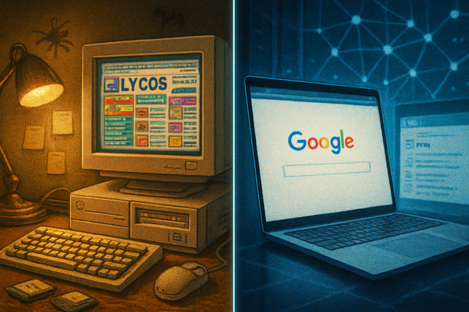
I remember opening Lycos in 1996 on a battered CRT and feeling two emotions at once: awe at how much lived on a single page, and mild terror that the page would never finish loading. The Lycos homepage was everything the 90s web wanted to be: loud, proud, obsessed with links, and aggressively generous with blinking graphics.
Lycos as a case study in 90s web aesthetics
Lycos began in 1994 as a university research project and quickly morphed into one of the dominant search portals of the late 90s. Its name - yes, like the wolf spider - is a reminder that the web’s pioneers loved obscure references almost as much as they loved horizontal rules and under construction GIFs. See the company history on Wikipedia.
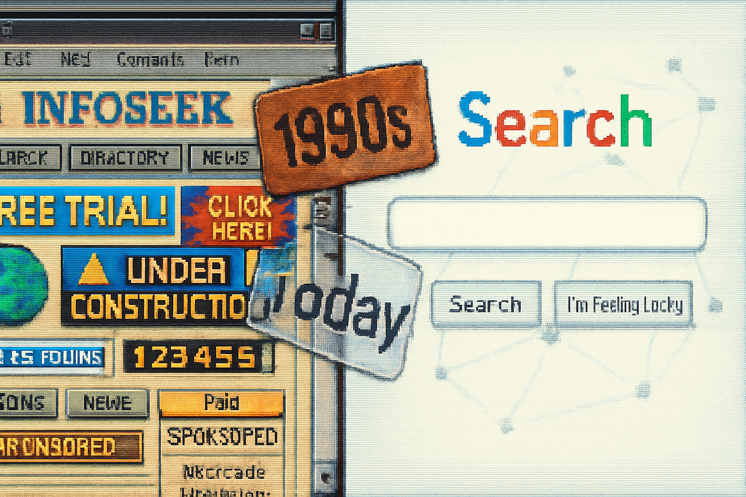
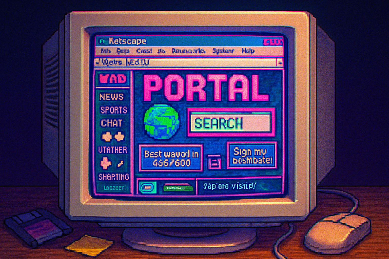
Pull up a snapshot on the Wayback Machine and you’ll see the hallmarks of the era:
- Gridlike, table‑based layouts masquerading as structure. Layout was achieved with nested tables because CSS was either nascent or still experimental.
- Bright, saturated backgrounds or busy tiled patterns.
- Animated GIFs and small decorative graphics used as signposts rather than embellishment.
- Dense navigation - everything important (and unimportant) got its own link.
- Prominent search box - Lycos knew search was its heart and put the organ on display.
The result: pages that felt like vending machines - jammed with options, clickable, and offering immediate gratification in the form of discovery.
Why Lycos looked the way it did
Design is always a response to constraints - technical, social, and commercial. The 90s aesthetic wasn’t accidental. It was the product of:
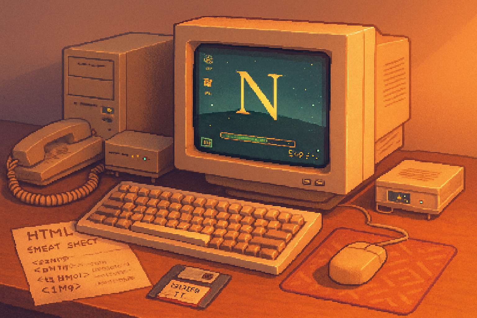
- Technical limits - dial‑up modems (28.8k–56k) meant designers prioritized small images and inline HTML tricks to simulate breaks and boxes. See the era of
- Browser inconsistency - Netscape and Internet Explorer implemented HTML differently; designers used tables and inline styles to force consistency. (Netscape’s dominance is chronicled on
- Commercial pressure - portals like Lycos were vying for user attention and ad dollars. Packing the page with content increased click opportunities.
- Cultural taste - the web inherited a DIY zine culture - if you could paste a glittery star GIF into a page, you did.
Those constraints created a visual language: dense, immediate, and unapologetically noisy.
Four useful bones to pick from Lycos (and four to bury)
Lycos isn’t a museum piece we should idolize whole. But there are durable lessons hiding under the clutter.
What to keep
- Content promiscuity (but curated)
- Lycos served an appetite for discovery. Today’s algorithmic feeds hide serendipity in favor of personalization. Designers should intentionally create spaces for exploration - curated