· retrotech · 6 min read
Nostalgia for the 90s Web: Why Netscape Still Matters to Today's Internet Users
Remember the dial‑up chirp, the Netscape splash, and pages that felt like tiny cities? Far from mere sentiment, the design instincts of the 90s web-pioneered by Netscape-contain lessons for modern designers: clarity, visible affordances, forgiving defaults, and open standards. This post explains what to keep, what to abandon, and how Netscape’s legacy still shapes usable web today.
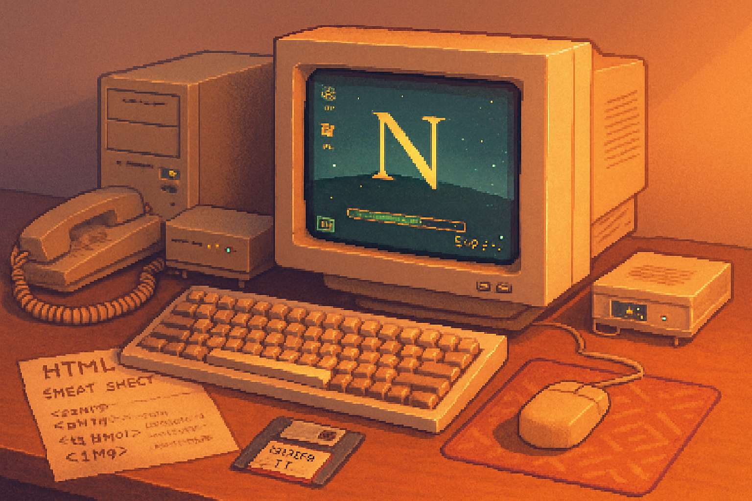
They tell you the 90s web is quaint. They tell you it was pixelated, patched together with animated GIFs and bad taste. But if you remember the first time you hit the Netscape splash screen and waited while that little progress bar crawled across the window, you also remember something else: a clear promise. Click, and something would happen. Wait, and the browser would tell you where it was in the process.
That promise-of immediate feedback, clear affordances, and predictable behavior-is the thread that runs from dial‑up to today’s single‑page apps. Netscape Navigator wasn’t just software; it was a set of design decisions made under constraints. Those decisions are worth revisiting.
A tiny history lesson (because context matters)
Netscape Communications shipped Netscape Navigator in 1994 and quickly became the face of the early web https://en.wikipedia.org/wiki/Netscape. It stood on the shoulders of Mosaic, introduced mainstream browser features, and later gave birth-indirectly-to JavaScript when Brendan Eich built a scripting language for the browser https://en.wikipedia.org/wiki/JavaScript. When Netscape open‑sourced its codebase it spawned Mozilla and, eventually, today’s web engines and standards.
The browser wars that followed were noisy and sometimes ugly https://en.wikipedia.org/wiki/Browser_wars. But out of that noise came practices-both good and terrible-that shaped how people expect software on the web to behave.
What Netscape can still teach us: the principles, not the pixels
Let’s be blunt. Fashionable nostalgia for pixel fonts and MIDI soundtracks is useless. But the underlying principles that informed early browser design still matter. Here are the ones I keep returning to.
Visible affordances and clear feedback
- Netscape’s chrome (menu bars, status bars, progress indicators) spelled out what the browser was doing. Users didn’t have to guess. Today’s apps often hide status behind spinners or obscure notifications. Visibility matters.
Forgiving design and error tolerance
- The web then ran on fragile connections and tiny budgets. Forms and links needed to tolerate timeouts and partial states. That led to patterns that prioritized recovery and clear error messaging.
Predictability and consistent metaphors
- The back button worked. Bookmarks were explicit. Links behaved like links. Predictable behavior is a usability superpower; breaking it is a fast route to user frustration.
Performance as UX
- Under dial‑up constraints, every kilobyte mattered. That scarcity forced discipline - minimal payloads, simple pages, sensible defaults. Today we have bandwidth to burn, and many designers do; but users still value speed above ornamentation.
Progressive enhancement and graceful degradation
- Early pages needed to work without fancy client features. The result - content-first thinking. If your page’s content is the point, it should be accessible even when JavaScript fails, or CSS is slow to load. See MDN’s definition of progressive enhancement
Standards and openness
- When Netscape released code and the community pushed for open specs, the web began the slow march toward standards. That culture-collaboration over lock‑in-still underpins a healthy web.
Concrete takeaways for designers and developers
Nostalgia is only useful when it turns into action. Here are practical things you can steal from Netscape’s unglamorous toolbox.
Show progress clearly
- Use deterministic progress bars for long operations. Avoid infinite spinners that promise little and annoy much.
Respect the back button and URLs
- Treat navigation as state. Deep links, proper history management, and visible URLs are usability anchors. Users expect the web’s linking model to work; don’t replace it with opaque routing unless you have a very good reason.
Design for flaky networks
- Cache aggressively, design offline‑first UI flows, and prefer incremental rendering. If your app can show usable content quickly, people will forgive aesthetic roughness.
Prioritize content over chrome
- Start with HTML that makes sense on its own. Layer CSS and JavaScript on top. This ensures accessibility and reduces fragility.
Make errors kind and actionable
- Don’t dump console‑level jargon at users. Offer simple recovery steps, retry options, and context for why something failed.
Keep affordances visible
- Don’t hide interactive elements behind hover states alone. Mobile and accessibility require clear, persistent cues.
Embrace open standards and inspectability
- Favor interoperable formats, document APIs, and make your UI debuggable. A healthy ecosystem is one where users and developers can reason about behavior.
What to leave in the 90s
Not everything from the early web deserves resurrection. Nostalgia can be dishonest. Here are things to leave where they belong.
- Table layouts for entire pages - abandon them.
- Blink, marquee, and other typographic atrocities - never again.
- Reliance on plugin ecosystems (think - NPAPI) - plugin hell is a historical footnote.
- Security‑blind defaults - the 90s web trusted the network. We must not.
Usability matters more than pretty pixels
There’s a seductive fantasy in modern design: that visual polish equals better product. Sometimes it does. Often it doesn’t. Usability is not decoration. It’s a promise that your product will meet people where they are: slow connection, short attention, limited time, and finite patience.
Jakob Nielsen summarized heuristics for usable interfaces decades ago; they still apply: visibility of system status, match between system and the real world, user control and freedom, error prevention and recovery, recognition rather than recall, and accessibility https://www.nngroup.com/articles/ten-usability-heuristics/. Netscape’s UI, for all its rough edges, respected many of those instincts because it had to.
The cultural argument: why remembering Netscape matters
Beyond code and UX patterns, Netscape symbolizes a cultural moment: the web as an open, interoperable commons. When it split from proprietary silos and invited community input, it made possible the ecosystem we test on, build for, and take for granted. Remembering Netscape is remembering a decision: the web should be participatory and inspectable, not a set of sealed apps.
Mozilla-Netscape’s heir-made that explicit when it championed standards and developer tooling https://en.wikipedia.org/wiki/Mozilla_(organization). That mission still matters in an era of walled gardens and platform lock‑in.
Final lesson: nostalgia as a corrective, not a blueprint
If you’re tempted to recreate the 90s web for aesthetic reasons, go ahead - retro pages can be delightful. But don’t confuse a retro look for a retro mindset. The real gift Netscape offers is not its buttons; it’s its commitments: clarity, recoverability, openness, and speed under constraint.
Make interfaces that tell users what’s happening. Make defaults that protect them. Build systems that work when things go wrong. Those are the lessons from the Netscape era that still push the web forward.
And if you ever feel pompous about the latest UI trend, remember the little progress bar that used to mean, simply and honestly: we are working on this for you. Do that, and you’ll be doing something Netscape would have approved of-which, for a piece of software birthed amid chaos and dial‑up, is high praise indeed.
