· culture · 6 min read
The Rise of Retro-Futurism: How Past Visions of the Future Shape Today's Design Trends
Retro-futurism is more than nostalgia dressed in chrome. From Googie coffee shops and Capsule towers to Courrèges miniskirts and vaporwave graphics, the past’s visions of tomorrow are shaping contemporary architecture, fashion and digital art-sometimes in ironic riffs, sometimes as serious design language.
On a sticky July afternoon in 1964 a six-year-old wandered the New York World’s Fair and stared at a gleaming model of a tomorrow that smelled faintly of optimism and plastic. Space-age pavilions promised jetpacks, cities on the moon and cars that would fold into briefcases. The child left convinced that the future would be curved, chrome-plated, and utterly inevitable.
That conviction-equal parts naïveté and appetite-is what retro-futurism harvests. It’s not only about longing; it’s a design language built from the specific visual grammar of past futures: sweeping curves, atomic motifs, grid graphics, neon gradients, and a willful confidence that progress is always imminent.
What is retro-futurism (and why does it feel so theatrical?)
Retro-futurism is the practice of imagining the future using aesthetics and cultural expectations from a previous era. It’s a theatrical reconstruction: the future as a costume party where the guests have shown up wearing 1950s and 1970s ideas about technology.
Two impulses drive it:
- Nostalgia for optimism - a wish to recover the audacity of past futures when technology promised liberation rather than surveillance.
- Critical play - designers reuse and rework those aesthetics to comment on what actually came to pass.
If you want a compact history lesson, start here: the term and movement are well summarized in the Retro-futurism entry on Wikipedia and explored through architectural case studies in design press like Dezeen. See also the cultural framing in the vaporwave movement, which treated commercial futurism as raw material for ironic art.
Visual grammar: the motifs that keep turning up
Across the 1960s and 70s you start to notice the same vocabulary popping up:
- Rounded geometry and aerodynamic silhouettes (think rockets and car tailfins).
- Chrome and glossy plastics - materials that signaled progress in mass culture.
- Starbursts, boomerang shapes and atomic motifs borrowed from scientific iconography.
- Bold, synthetic color palettes - avocado greens, sunset oranges, and later neon magentas.
- Grid-based, glowing vector graphics - the ancestor of today’s digital skeuomorphism.
These motifs showed up everywhere: architecture, product design, fashion, advertising, and television. They weren’t accidental; they were the visual shorthand of an era that believed in technical destiny.
Case studies from the 60s and 70s (the building blocks)
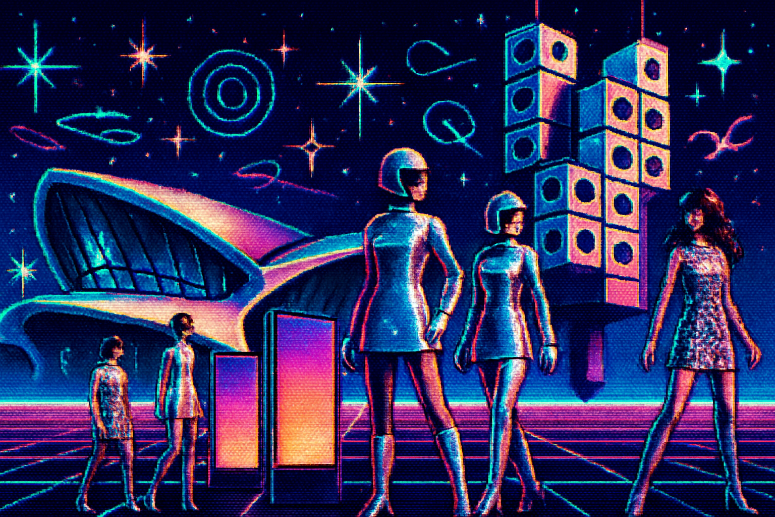
Architecture: Googie, TWA and Capsule living
- Googie architecture - the flamboyant commercial style of mid-century America - gave us upswept roofs, neon, and the visual vocabulary of perpetual motion. It’s best summed up in the Googie architecture articles and the Los Angeles coffee shops that still wear it like armor.
- Eero Saarinen’s TWA Flight Center (1962) is pure theatrical futurism - a sculptural terminal that looks like a bird mid-flight, an attempt to make airports feel like portals rather than passages. The
- Japan’s Metabolist movement and Kisho Kurokawa’s Nakagin Capsule Tower (1972) embodied a techno-utopian belief in modular, replaceable living units - a literal capsule of the future.
Fashion: Space Age clothes and metallized dresses
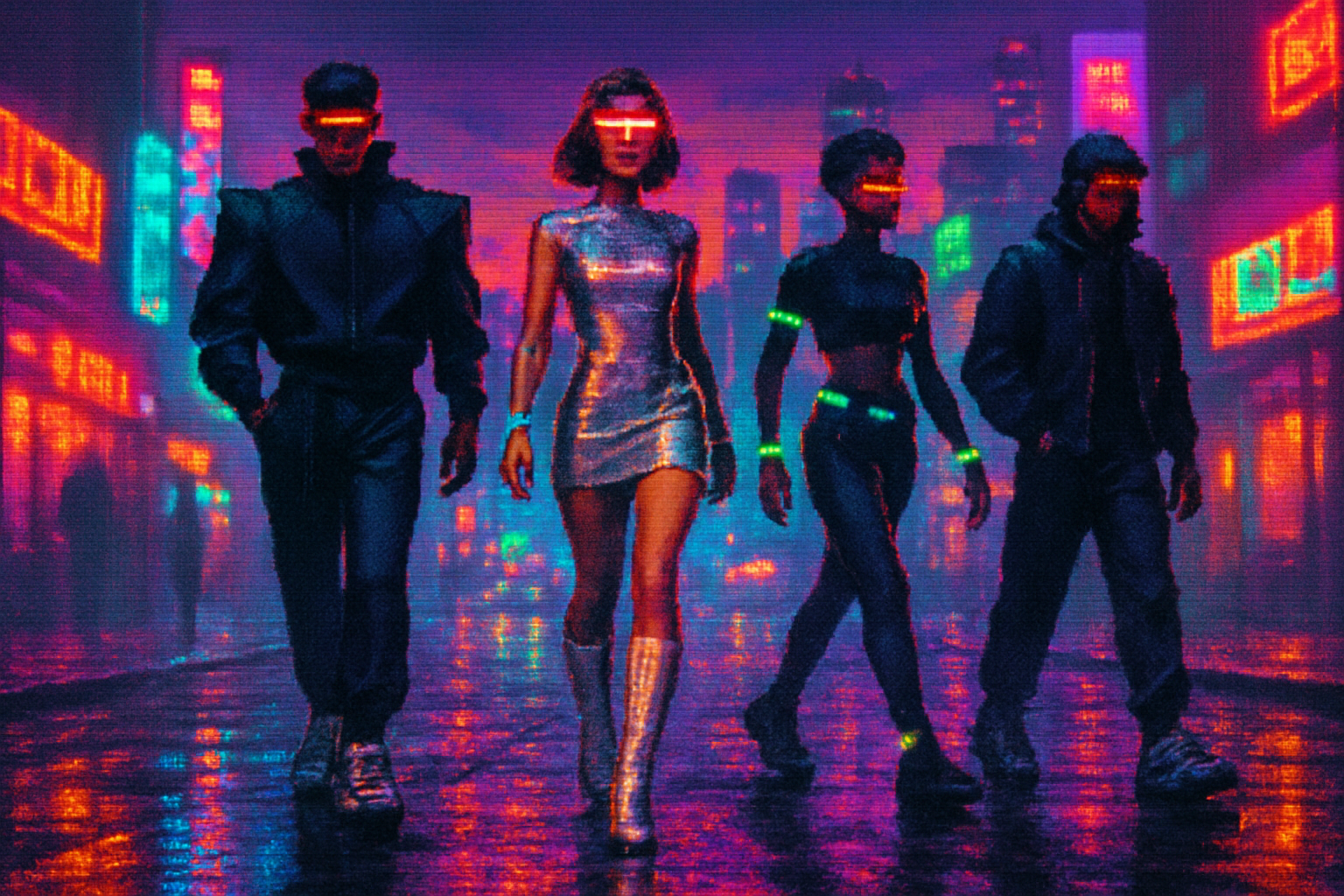
Designers like André Courrèges and Paco Rabanne cut short hemlines and wrapped models in chainmail-like plastic and metal - fashion that performed velocity and high tech. The Space Age fashion movement made clothing into a manifesto: the future would be sleek, efficient, and washable.
Product design and cinema: plastics, dashboards, and speculative UI
The Countach (1974) and the wedge-shaped cars of the 70s looked like they were carved from a comic book about speed. Meanwhile, early sci-fi films and TV-Star Trek, The Jetsons-provided iconography for interfaces: consoles, glowing buttons, and the seductive idea that humans would talk to machines through code-less gestures.
The Memphis Group of the late 70s/early 80s (Ettore Sottsass et al.) deserves a shout: a reaction against sober modernism that amped up color, pattern, and ornament. Memphis’ wild palettes and playful forms laid the groundwork for the postmodern maxims designers revisit today. See Memphis Group.
How 60s/70s futures are influencing today - concrete connections
Retro-futurism isn’t just a museum piece; it’s a live feed into contemporary aesthetics.
Architecture - Neo-futurist buildings use parametric curves and fluid forms (think Zaha Hadid) but with a different ideological bent: computational power replaces faith in industrial progress. The visual lineage to Saarinen or Fuller is unmistakable. Read more about neo-futurism in architecture on
Fashion - Contemporary designers reference Courrèges and Paco Rabanne not to recreate the past but to mine its optimism. Look at metallic fabrics, modular accessories, and outerwear that reads like armor. Sustainability also re-reads the Space Age promise-materials that once symbolized disposable progress are now being reinvented.
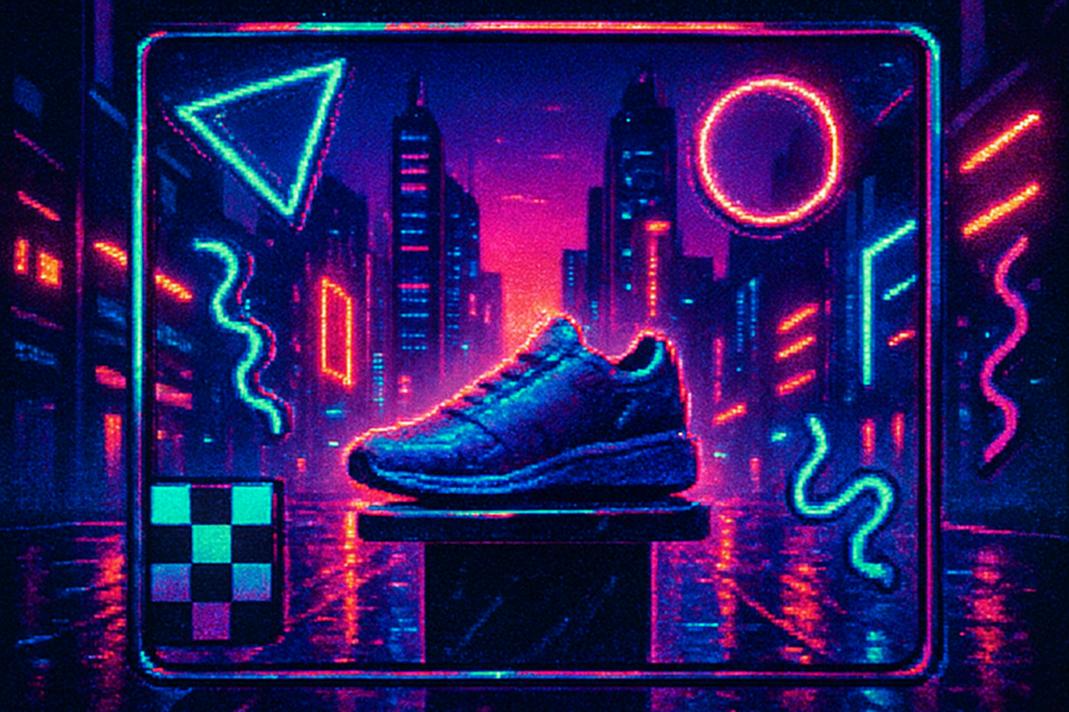
Digital art and UI - Vaporwave and synthwave aestheticize 80s/90s digital futurism with gradients, neon, and nostalgic interfaces. What began as ironic internet art has bled into album covers, video games, and brand identities. The
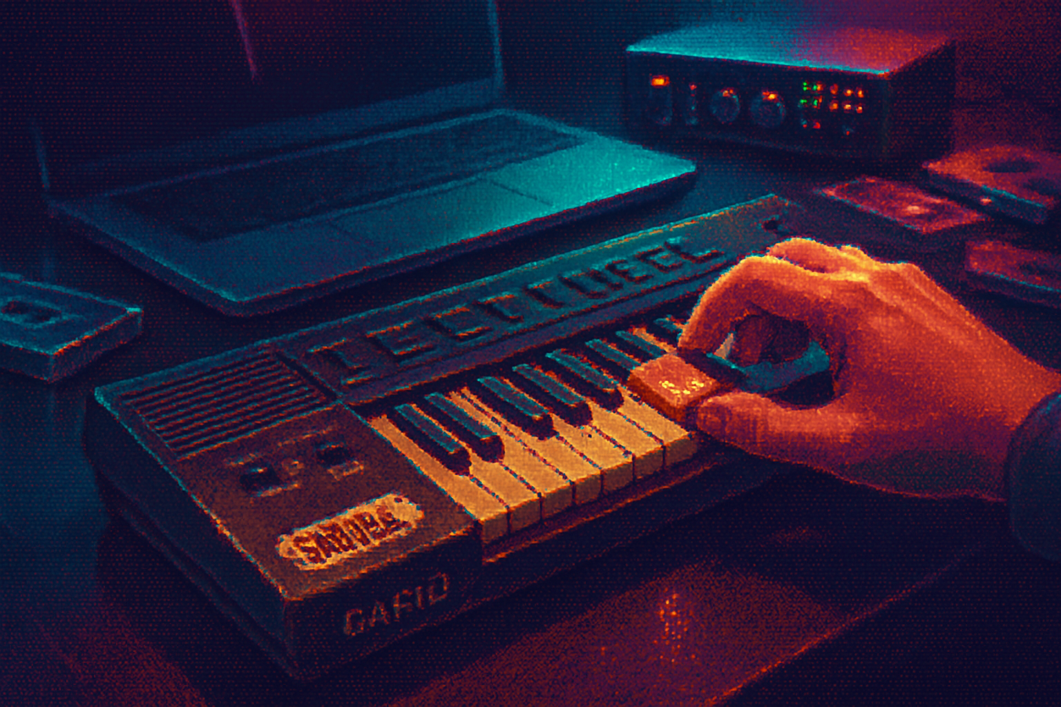
Consumer electronics - The revival of tactile hardware design - knobs, rounded shapes, and warm plastics - is a conscious antidote to cold minimalism. Retro-inspired synthesizers, camera bodies, and gaming consoles trade slick minimalism for personality.
Product & branding - Tech companies borrow retro cues to seem friendly. A curved silhouette, warm color palette, or playful typeface can humanize a company that otherwise sounds like a data broker.
Why the past keeps being a resource for future-looking design
There are three complementary reasons:
- Emotional shorthand - Retro-futures are shorthand for optimism. They evoke a time when technology promised liberation rather than friction.
- Visual clarity - The optimistic rhetoric of past futures was highly legible-distinct shapes, colors and metaphors that are easy to remix.
- Critical distance - Designers reuse retro-futurism to critique outcomes. Repeating a failed prediction can be a way to ask: what did we get wrong, and what can we do better?
In short: the past supplies both the clothes and the punchline.
Risks and ethical notes
Retro-futurism can be seductive-and misleading. Past futures were often bound up with consumerism, extractive resource use, and political blind spots. Glorifying an era’s aesthetics without confronting its politics risks aestheticizing harm. Smart designers borrow the visual energy while refusing the wasteful assumptions.
Practical takeaways for designers and creatives
- Use retro-futurist motifs to evoke optimism-but pair them with concrete statements of sustainability and inclusivity.
- Reframe materials - metallics can read as luxury or as recyclability, depending on context.
- Consider narrative - is your retro-futurist riff celebratory, ironic, or critically reflective? Be deliberate.
Final thought: optimism as a design problem
Retro-futurism teaches a simple lesson: people will always need futures they can imagine. A future that looks like chrome and rockets might be naïve, but it’s useful-because it gets people to believe in change. The job of contemporary designers is not simply to reheat those images, but to reforge the optimism into something honest: less about colonizing space or conspicuous consumption, and more about making everyday life better without wrecking the planet.
The past didn’t fail us because it was wrong about flying cars. It failed because it mistook technological possibility for moral inevitability. Retro-futurism gives us the shapes of hope. It’s our responsibility to give them better content.
References
- Retro-futurism overview: https://en.wikipedia.org/wiki/Retro-futurism
- Googie architecture: https://en.wikipedia.org/wiki/Googie_architecture
- TWA Flight Center: https://en.wikipedia.org/wiki/TWA_Flight_Center
- Nakagin Capsule Tower: https://en.wikipedia.org/wiki/Nakagin_Capsule_Tower
- Space Age fashion: https://en.wikipedia.org/wiki/Space_Age_fashion
- Memphis Group: https://en.wikipedia.org/wiki/Memphis_Group
- Vaporwave: https://en.wikipedia.org/wiki/Vaporwave
- Design press (examples): https://www.dezeen.com/