· culture · 7 min read
The Neon Renaissance: How 80s Aesthetics Are Shaping Modern Design
From neon gradients and geometric motifs to vaporwave and synthwave visuals, 80s aesthetics are back - powering campaigns, product design, and cultural movements. This post traces the revival, explains why brands are embracing neon, shows real-world examples, and gives practical guidance for using the trend thoughtfully.
Introduction
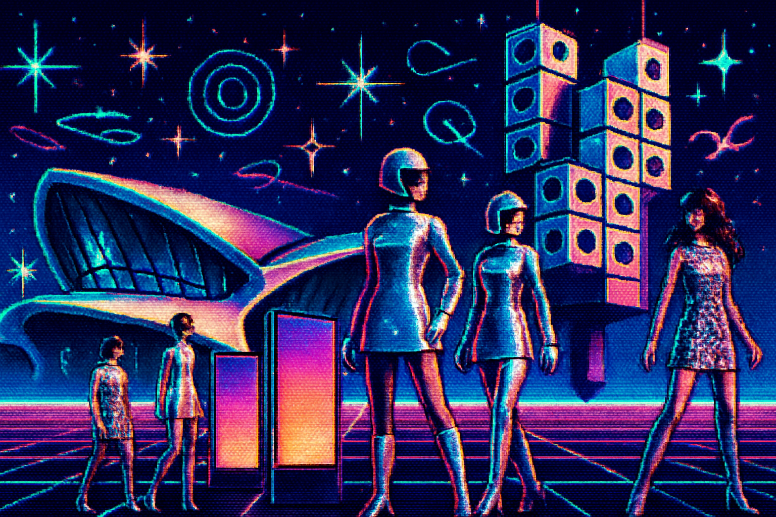
In the last decade neon colors, bold geometric patterns and glossy chrome finishes once emblematic of the 1980s have migrated from thrift-store finds and niche subcultures into mainstream design. Whether it’s a streaming show’s title sequence, a sneaker drop, or a website hero banner, fragments of 80s visual language - gradients that glow like cathode-ray tubes, Memphis-style shapes, and synthwave palettes - have become familiar again.
This post looks at why the neon renaissance is happening, how brands are using these cues in marketing and product design, what it means culturally, and practical advice for designers who want to use the trend without leaning on clichés.
A quick visual history: what counts as “80s aesthetics”?
The 1980s weren’t a monolith, but certain visual currents define the era in contemporary memory:
- Neon and high-contrast color palettes - electric pinks, cyan, electric purple and acid greens.
- Geometric patterns and playful shapes (in part popularized by the Memphis Group and late modernist graphics).
- Chrome and reflective surfaces inspired by consumer electronics and automotive design.
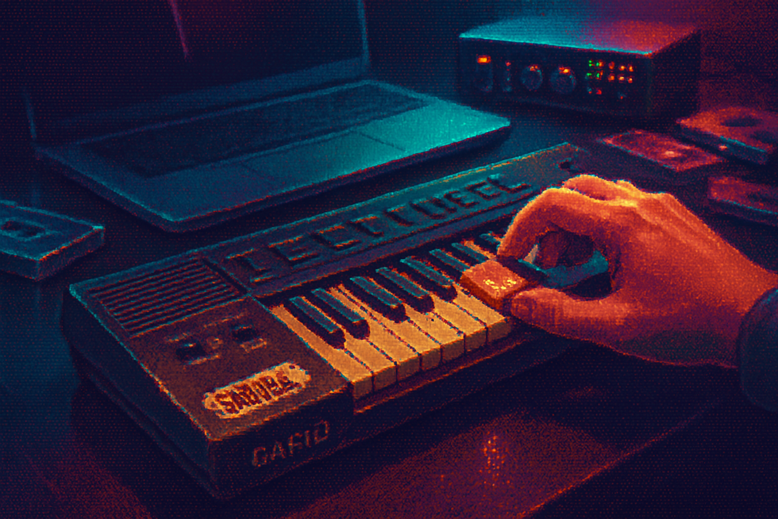
- Early digital motifs - pixelation, raster scanlines, low-res typography, VHS artifacts.
- Synth-driven music culture and arcade/gaming imagery that informed packaging and posters.
These elements combined into a recognizable cultural shorthand. Contemporary design repurposes that shorthand with modern tools and production values.
Why the revival now? Key drivers
- Nostalgia as a marketing engine
Nostalgia sells. Brands increasingly use retro cues to create emotional resonance across demographics - older consumers who remember the era first-hand and younger audiences who experience nostalgia through media remixes. This is part of a broader trend of cultural recycling explained in marketing studies and coverage on nostalgia-driven strategies Fast Company.
- Cultural catalysts - media and music
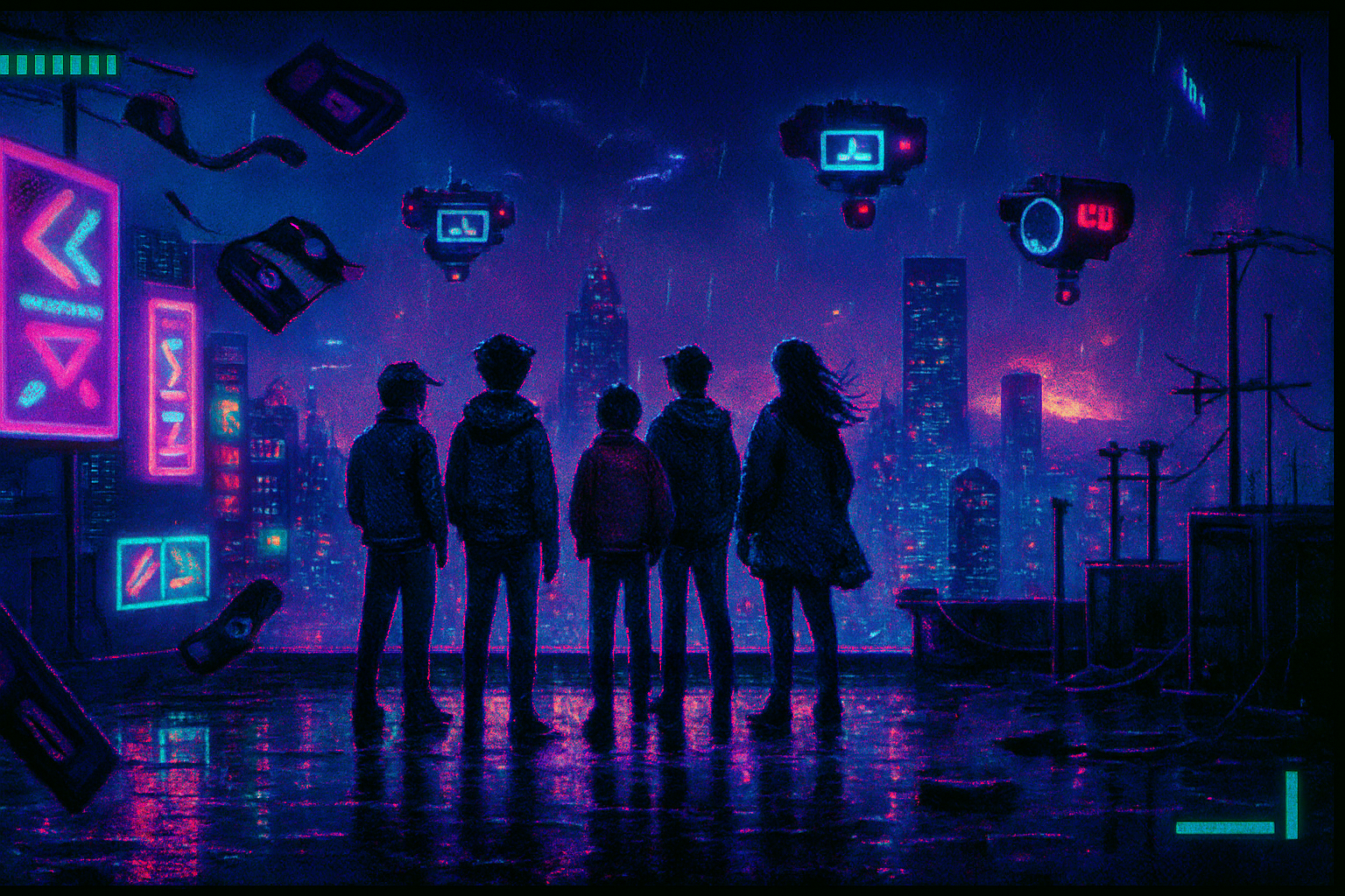
Shows like Stranger Things and the resurgence of synth-heavy music have amplified 80s textures in mainstream culture, making the look desirable again The New Yorker. Vaporwave and synthwave - internet-born aesthetics that remix 80s and early-90s signifiers - also propagated the palette and mood online Wired.
- Digital affordances and motion
Modern tools make it easy to create convincing neon glows, animated gradients and reflective surfaces. Motion design and microinteraction trends benefit from neon’s strong contrast and drama - glow and blur effects read clearly in animation, which helps convey energy and personality in UIs.
- Generational cross-pollination
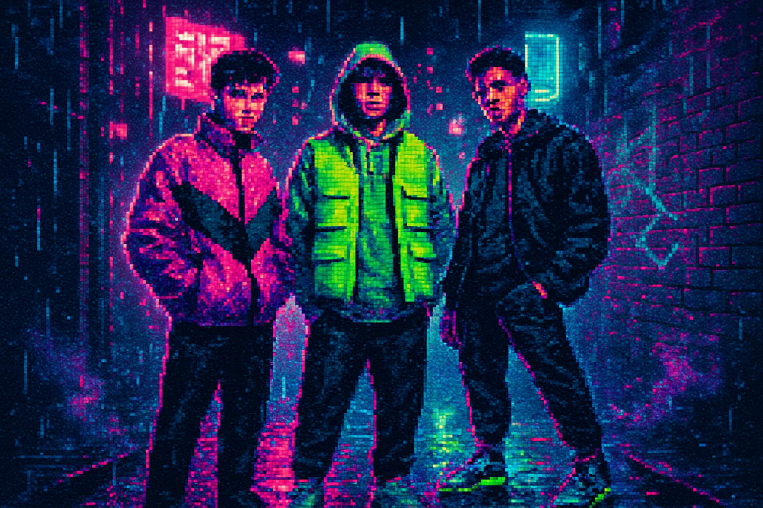
Gen Z has embraced retro aesthetics ironically and sincerely, turning them into new fashion codes. Social platforms (TikTok, Instagram) accelerate trend cycles and allow retro visuals to be remixed rapidly.
How brands are applying 80s aesthetics
These elements show up across industries in three main ways: advertising and campaigns, product/design, and experiential spaces.
Advertising & campaigns - Brands use neon palettes in hero imagery, social-first videos, and limited-edition packaging to suggest playfulness, speed, or futurism. Nostalgia-driven campaigns can create instant cultural shorthand without lengthy explanation.
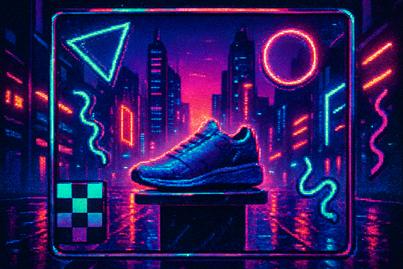
Product & packaging - Apparel and sneaker companies reissue retro silhouettes with neon accents (or release new products styled with 80s palettes). Cosmetics often use iridescent finishes and neon typography for limited runs.
Digital product design - UI trends borrow 80s colors for gradients, glowing buttons, and dramatic hero sections. Even enterprise brands are selectively applying neon for sub-brands, product lines, or seasonal theming to feel contemporary.
Examples:
- Netflix’s Stranger Things marketing reintroduced 80s typography and color palettes to millions, making the look fashionable again [New Yorker piece].
- Fashion houses and streetwear brands collaborate on retro reissues and capsule collections. Sneaker drops with neon colorways create collectible urgency and social content.
- Tech products sometimes launch “retro” editions or UI themes that nod to early digital interfaces, leveraging user nostalgia to build loyalty.
Cultural impact: more than a color trend
- Identity and community
Revived 80s aesthetics intersect with subcultures (vaporwave, outrun, retro gamers) that repurpose nostalgia for critique, irony, or community building. These communities have shaped how the aesthetic gets reused and recontextualized.
- Generational bridging (and appropriation)
The trend can bridge generational tastes but also risks flattening complex histories. What looks like a playful throwback may obscure the socio-economic realities of the original era.
- The politics of nostalgia
Nostalgia can comfort but it can also sanitize the past. Designers and marketers should be mindful: referencing the past is different from idealizing it uncritically.
- Sustainability and consumption
Revival-driven consumption (endless reissues, limited drops) has environmental implications. Brands leaning into retro must balance hype with responsible production choices.
Design vocabulary: how to use 80s cues effectively
If you want to use neon and 80s motifs, follow principles that keep your work contemporary and accessible.
Palette - Start with a dominant neon hue (magenta, cyan or electric purple), pair with deep navy or near-black for contrast, and add one neutral to breathe (off-white or warm gray). Use gradients that move between neon tones and darker anchors to create depth.
Typography - Choose geometric sans-serifs or display types with an 80s flavor - but always prioritize legibility. Reserve novelty or heavily styled type for headlines; use cleaner type for body copy.
Geometry & patterns - Employ Memphis-inspired shapes sparingly as accents, backgrounds or separators. Combine simple grids with rotated shapes and drop shadows for that retro feel without clutter.
Motion & effects - Animations amplify neon. Subtle glow, parallax, and VHS-like grain can sell the mood. Don’t over-animate; microinteractions should improve clarity, not distract.
Texture - Add noise or scanline overlays for authenticity, but keep them optional (provide a toggle) - they can reduce readability if overused.
Accessibility - High-contrast neon on white can be harsh and fail contrast tests. Test color combinations against WCAG standards; provide accessible alternatives for critical UI elements.
Brand fit - Confirm the aesthetic aligns with brand values. A financial services company might use a muted neon accent within a sober palette rather than full-on Memphis maximalism.
Avoiding clichés and tokenism
- Be intentional - Don’t slap on neon just because it’s trending. Use 80s cues to reinforce a clear idea (energy, futurism, playful nostalgia).
- Layer meaning - Combine retro elements with contemporary materials - modern photography, clean layouts, or socially conscious copy - to avoid pastiche.
- Respect origin communities - Many internet-native aesthetics (vaporwave, outrun) grew from niche scenes with political or critical intent. Acknowledge or collaborate rather than simply commodifying.
Practical case study ideas (mini briefs)
Streaming release - For a show that leans on retro themes, create a marketing system that uses neon hero gradients for posters, animated VHS-style trailers for social, and limited-edition merch with Memphis-inspired motifs.
Product launch - Launch a tech gadget with an anodized neon limited edition. Pair the product reveal with a microsite that uses animated gradients and a synth soundtrack to create an immersive reveal.
Retail pop-up - Design a pop-up with neon-lit signage, geometric wall treatments and 80s playlist curation. Include tactile retro collectibles and AR filters that let visitors “ride” into a synthwave environment.
Tools, resources and references
- For color work and palettes - experiment with Adobe Color or Coolors. Create accessible contrast tests with tools like WebAIM Contrast Checker.
- For historical context and cultural analysis - read pieces on nostalgia and specific aesthetics, e.g., “Why nostalgia is one of the most powerful marketing tools”
- For underground aesthetic histories - the Wired overview of vaporwave is a useful primer
Conclusion
The neon renaissance is more than a palette choice - it’s a cultural cycle where memory, technology, and commerce intersect. When used thoughtfully, 80s aesthetics give brands and designers a rich visual toolkit: attention-grabbing color, kinetic motion, and a shared cultural shorthand. But the trend rewards nuance. The best uses blend retro cues with contemporary clarity and ethical consideration, creating work that feels both familiar and fresh.
References
- Fast Company - Why nostalgia is one of the most powerful marketing tools: https://www.fastcompany.com/90361610/why-nostalgia-is-one-of-the-most-powerful-marketing-tools
- The New Yorker - Stranger Things and the power of 80s nostalgia: https://www.newyorker.com/culture/cultural-comment/stranger-things-and-the-power-of-80s-nostalgia
- Wired - What is Vaporwave?: https://www.wired.com/story/what-is-vaporwave/
- HubSpot - Color Psychology in Marketing (for color and branding insights): https://blog.hubspot.com/marketing/color-psychology