· culture · 8 min read
Neon Nostalgia: The Psychological Effects of 80s Patterns on Today's Youth
Why are Gen Z and millennials decorating dorm rooms like a Miami Vice set, blasting synthwave, and favouring zig-zag geometrics? This piece explores how neon and 80s patterns shape mood, creativity, and productivity - and how to use them without frying your attention span.
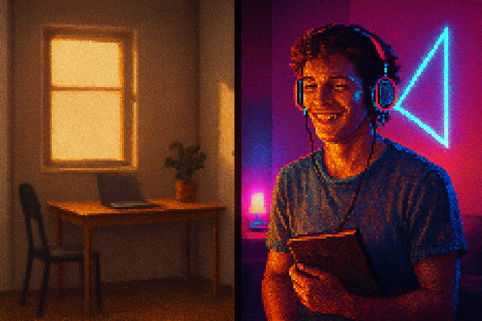
On a late-August afternoon a few years back a friend painted one wall of her studio a fluorescent fuchsia, hung a blacklight, and called the setup “an investment in vibes.” She spent three hours admiring it, posted a perfect shot for Instagram, then went back to finishing her tax return at the kitchen table - which, crucially, remained resolutely beige.
That little mismatch - maximalist neon on the wall, minimal willpower at the desk - says everything useful about the 80s revival. The aesthetic is immediate, electric and tempting. But how does it actually affect us when the novelty wears off and the deadlines pile up? Do geometric patterns and synth-pop lighting make us more creative, irritable, or productive? The short answer: yes - and also no. The long answer below is more interesting.
What do we mean by “80s patterns”?
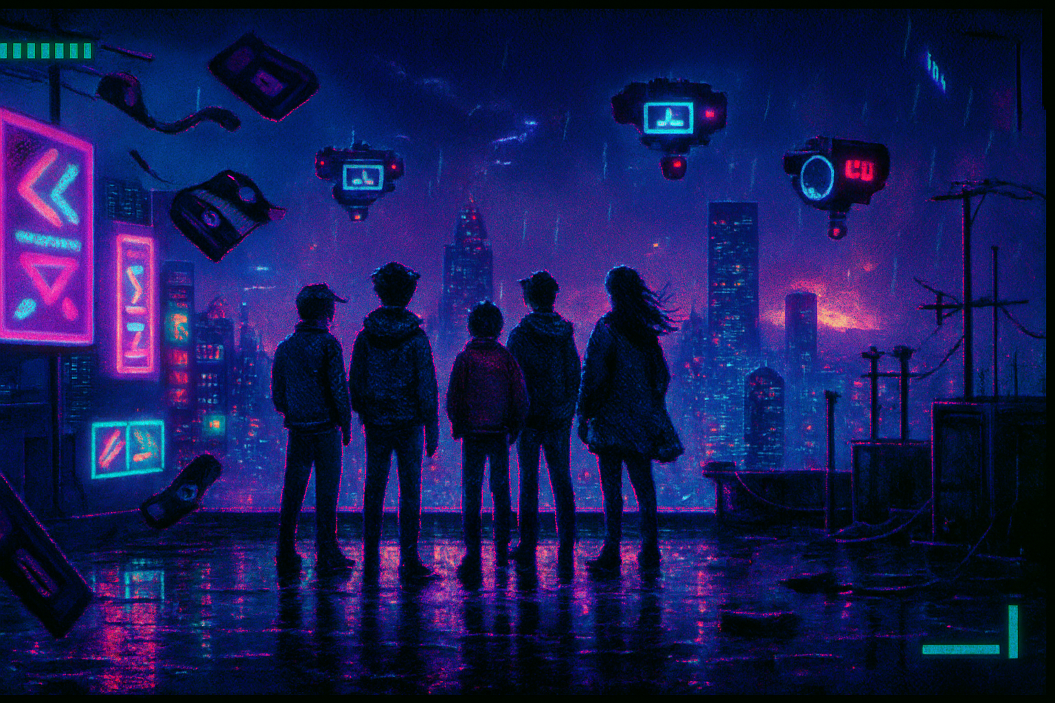
The term bundles a few specific visual cues that have returned in fashion, UI, and décor:
- Acid neon colors and high-saturation palettes (think hot pink, electric cyan).
- Bold geometric motifs - zig-zags, grids, checkerboards, and Memphis-group–style shapes, often in clashing arrays.
- Low-fi digital textures and faux VHS gradients (the aesthetic cousin of vaporwave and synthwave). See the cultural lineage in the vaporwave and Memphis Group movements.
These elements re-emerged in the 2010s as nostalgia, meme culture, and fashion cycles collided. Shows like Stranger Things and playlists labeled “80s revival” helped make the look feel simultaneously retro and novel.
Why nostalgia isn’t just kitsch - it’s psychological fuel
Nostalgia is not mere sentimental schmaltz. Research shows nostalgia can buffer stress, strengthen social connectedness, and increase perceived meaning in life. Classic social-psychological reviews (and accessible summaries) have cataloged these effects: nostalgia often comforts and motivates people when they feel threatened or lonely see overview on nostalgia.
For millennials and Gen Z, 80s aesthetics offer a double dose of nostalgia: it’s retro for parents’ playlists and also new as ironic aesthetic. That bittersweet mix matters. Nostalgia can reduce anxiety and heighten optimism - which primes creative risk-taking. But it also has limits: it soothes, rather than solves, and it can distract.
Color, pattern, and the brain: basic mechanisms
Three cognitive and physiological mechanisms explain why neon and geometrics have outsized effects:
Arousal and attention. Bright, saturated colors increase physiological arousal. That’s not conjecture - color influences affect and alertness in predictable ways see general reviews on color psychology and classic arousal theories such as the Yerkes–Dodson law, which says performance peaks at moderate arousal and collapses at extremes.
Visual complexity and cognitive load. Repeating, high-contrast geometrics increase visual complexity. Our perceptual systems parse patterns automatically; if the pattern is dense or flickery, it uses working memory and attentional resources - the same resources you need for a complex report or coding task. The result - potentially reduced capacity for focused analytic work.
Attention-capture through novelty. Retro elements that mix unfamiliarity with familiarity - neon colors rendered in old-school pixel gradients - trigger curiosity and keep attention lingering on the environment rather than the task.
The interplay of these mechanisms explains why a neon poster can make you feel energized and creative for 20 minutes and fatigued for the next two hours.
Effects on mood: wired, wistful, or warmed?
Short-term positivity - Bright neon palettes reliably elevate arousal and can boost short-term mood and confidence. That jolt of sensory pleasure often translates into a burst of optimism - the same emotional fuel that makes brainstorming sessions louder and wilder.
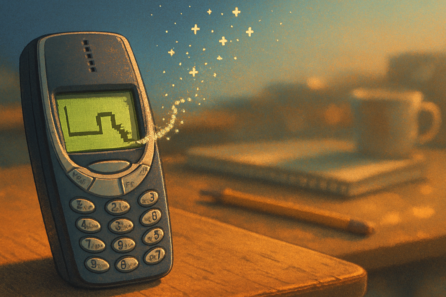
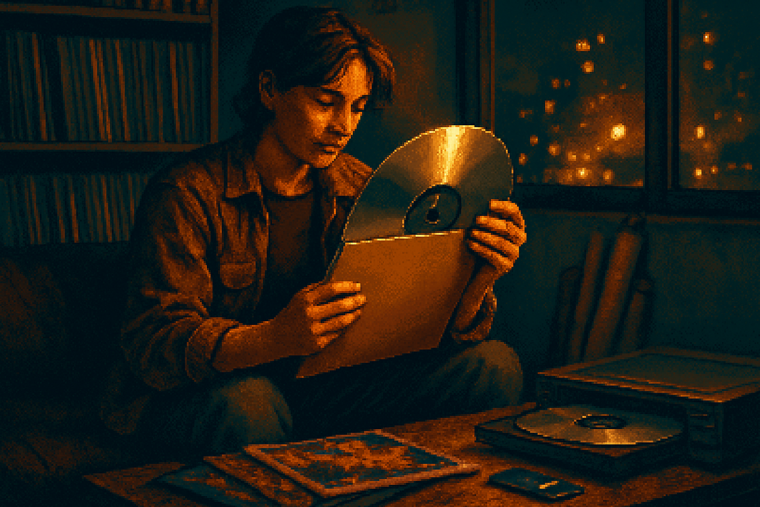
Comfort through reminiscence - For older millennials, the 80s look can cue concrete memories (family TV rooms, mixtapes), which nostalgia research links to comfort and social connectedness. For Gen Z it’s often mediated through second-hand cultural taste - an ironic and affectionate borrowing that still yields positive affect.
Risk of irritability - Extended exposure to high-contrast neon, especially under artificial lighting, can cause sensory fatigue, headaches, or mild agitation in some people. This is pronounced in those with sensory sensitivities.
Practical read: use neon for accents and brief exposures if your goal is sustained calm. Use larger doses when the goal is to party, energize, or emotionally prime a creative session.
Effects on creativity: a genuine boost (with caveats)
There’s a tidy logic linking neon-and-80s visuals to creativity:
- Novel, surprising environments reduce functional fixedness and encourage associative thinking. A zig-zag wall is a visual interrupt; it breaks autopilot.
- Elevated arousal and positive mood are established facilitators of divergent thinking - that is, coming up with many different ideas quickly.
Studies on environment and creativity show that playful, nontraditional spaces (colorful, textured, or quirky) produce more idea generation than bland rooms. But creativity is not just ideation: it’s also iteration and evaluation. Bold 80s aesthetics tend to help the first half (divergence) and hinder the second half (quiet, focused editing).
So if you want to ideate, invite neon. If you want to iterate, create a quieter zone.
Effects on productivity: the split personality of neon
Productivity is task-dependent. The same decor will help or hurt depending on what “productivity” means in the moment.
- Tasks benefiting from moderate arousal and positive affect (sales calls, ideation meetings, social content creation) may improve under neon-driven atmospheres.
- Tasks requiring deep concentration, sustained working memory, or meticulous error-checking (proofreading, coding, accounting) will suffer as visual complexity leaks into cognitive load.
Environmental psychology research demonstrates that workplace design affects both mood and performance - but not uniformly. The key is matching the environment to the task demand and the individual see general work on workplace design and performance.
Who is helped or harmed? Individual differences and context
Not everyone reacts the same way:
Neurodivergent people - individuals with ADHD or sensory processing sensitivity may find neon or busy patterns distracting or overwhelming. Conversely, some people with under-arousal prefer high-stimulus environments to reach an optimal activation level.
Personality and taste - openness to experience predicts better creative uptake from novelty. People lower in this trait may find the aesthetic irritating rather than inspiring.
Cultural framing - if neon triggers concrete, positive memories (childhood bedrooms, arcade nights), it amplifies nostalgia’s benefits. If it reads as forced irony or corporate trend-chasing, it can feel hollow.
Practical guidelines - how to use 80s elements without sabotaging work
Accent, don’t wallpaper - pick one or two neon focal points - a poster, a lamp, a throw pillow - rather than saturating an entire field of view.
Zone the space - use neon and geometrics in communal or ideation zones; keep deep-focus areas muted. In co-working, that might mean a neon brainstorming alcove and quiet acoustically treated booths.
Control exposure time - use neon for warm-up rituals (10–30 minutes) to boost arousal before diving into deep work, then retreat to lower-stimulus settings.
Modulate lighting - high-saturation colors under soft, warm lights are less harsh than under stark white LEDs or blacklights.
Consider the scale and repetition - large, simple neon shapes are less mentally fatiguing than high-frequency, high-contrast patterns. Think a single lightning bolt instead of a relentless checkerboard.
Respect neurodiversity - offer alternatives and opt-outs. What energized one person can derail another.
Quick experiments you can run this week
A/B your productivity - spend two work sessions in a neutral setup and two in a neon-accented space. Track minutes of uninterrupted work and subjective mood.
Brainstorming boost test - run a 30-minute ideation session with neon lighting and synthwave tracks, then a matched session in a neutral room. Count idea fluency and novelty (even crude counts tell a story).
Social check - invite friends over to a neon-lit room and ask whether the space feels nostalgic, energizing, kitschy, or exhausting. Social valence matters for designs meant to host.
Conclusion - nostalgia as a tool, not a lifestyle mandate
The 80s aren’t coming back in full. They never will. But the return of neon and geometric patterns gives younger generations emotional shortcuts - quick nostalgia, a hit of arousal, and a new palette for creative provocation. Those are useful. They’re not miraculous.
What makes 80s design psychologically productive is the calibration: use neon to prime, not to persist; use geometrics to provoke, not to occupy every corner of perception. Like sugar, neon is delicious in small doses - and cramps the brain in large ones.
If you want a final, slightly cruel observation: the aesthetic is a brilliant piece of cultural engineering. It makes you feel more interesting, even when you are not. Use it to get interesting. Don’t pretend it will make you industrious.
References and further reading
- A readable summary of nostalgia research: Nostalgia - Wikipedia
- Vaporwave and cultural lineage: Vaporwave - Wikipedia
- Memphis Group, an 80s design influence: Memphis Group - Wikipedia
- Overview of color and psychological functioning: Color Psychology - Verywell Mind
- Arousal and performance: Yerkes–Dodson law - Wikipedia
- Environmental psychology and workplace design (general overview): Environmental psychology - Wikipedia
- Cultural discussion of Stranger Things and nostalgia: The Atlantic - Stranger Things and American Nostalgia