· retrotech · 6 min read
Reviving Windows Write: A Modern Take on Minimalist Writing Software
A nostalgic yet practical blueprint for building a modern, minimalist writing app inspired by Windows Write - balancing the charm of simplicity with contemporary design, privacy, and performance.

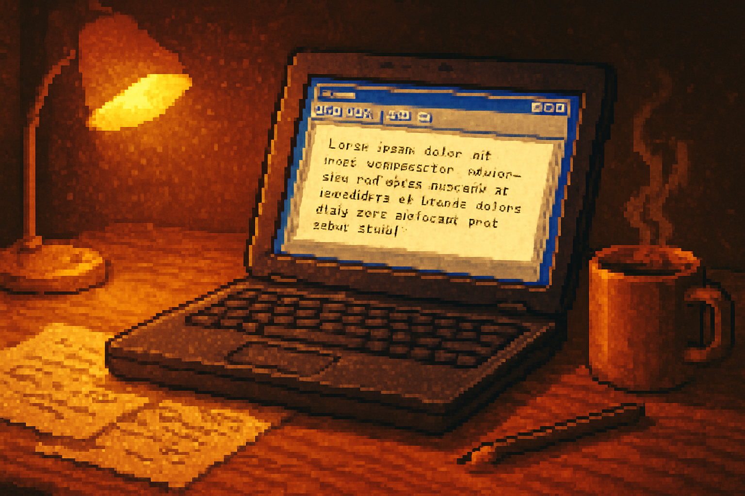
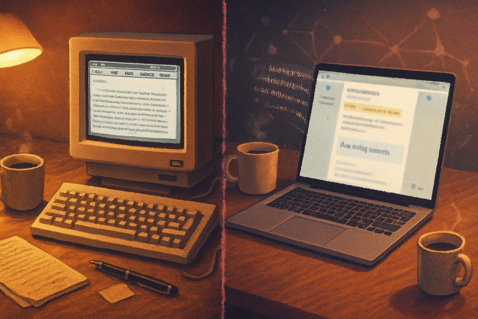
I remember the first time I opened Write on a clunky Windows 3.x machine: the cartoonish icons, the reassuringly empty page, and the absurd sense of possibility. No sliders, no sidebars, no endless preferences that promised productivity but delivered anxiety. Just a cursor, a blinking promise.
That feeling is what this article wants to bottle: a modern, tasteful revival of the spirit behind Windows Write - not a museum piece, but a working tool for writers who prize focus, clarity, and speed.
Why resurrect Windows Write’s spirit?
The world now offers more features than any human can reasonably wield. We live in a productivity bazaar: collaboration baked into every app, settings that mutate into ecosystems, and notifications that behave like needy houseguests. Meanwhile, good writing still starts with a blank, mildly intimidating rectangle.
Minimalist writing software isn’t about austerity for its own sake. It’s about returning oxygen to attention. Cal Newport calls it “Deep Work” - concentrated, undistracted effort producing real output. A modern Write would be a practical, attractive vehicle for that effort.
Sources and context:
- Microsoft Write history: Microsoft Write (Wikipedia)
- The case for deep focus: Cal Newport - Deep Work
Who needs this?
- Novelists and journalists who want long stretches of uninterrupted text.
- Students and academics drafting essays or notes.
- Note-takers who prefer plain text and reliable export.
- Minimalists who recoil from feature-bloat and bright chrome.
Short listing: people who want to write without feeling like they’re in a productivity arms race.
Design principles - the code of restraint
- Radical clarity - every control exists for a single, obvious purpose.
- Local-first, opt-in sync - the primary mode is private, local storage; cloud features are explicit and optional.
- Minimal affordances, maximal power - the surface is simple; power features exist under clear, discoverable layers.
- Empathetic defaults - large type, comfortable line length, good typography out of the box.
- Performance at any scale - instant load, snappy typing, and no spinning wheels.
Feature set - the modern Write manifesto
Core (MVP):
- Plain text with optional Markdown support (toggleable when needed).
- Distraction-free full-screen editor with a single-column layout and configurable line width.
- Typewriter mode (centered line or rolling cursor).
- Focus mode (fade non-focused paragraphs).
- Minimal toolbar - document title, word/character count, undo/redo, basic formatting toggles if Markdown is off.
- Automatic local save + simple version history (snapshots every N minutes).
- Export - plain text, Markdown, PDF, RTF.
- Keyboard-first - every action accessible by keyboard, discoverable shortcuts overlay.
Nice-to-have (phase 2):
- Themes - light, dark, sepia, dyslexia-friendly.
- Minimal citation mode / quick footnote insert.
- Inline statistics - session word count, reading time, and goal timer.
- Gentle ambient options - optional typewriter sound, subtle background visuals (not animated), and focus soundscapes (muted options for the distractible).
Power features (optional; hidden by default):
- Local-first sync with end-to-end encryption (E2EE) using the user’s preferred cloud (Dropbox, iCloud, WebDAV) or an optional server.
- CRDT-based real-time collaboration for those who actually need it.
- Plugin API for power users (syntax highlighters, grammar checkers) - plugins run in a sandbox.
UX details and flows
- New document flow - File > New (or ⇧⌘N), enters full-screen focus mode immediately with an ephemeral title: “Untitled - Session 1”.
- Quick switch - Cmd/Ctrl+P to open a command palette (new file, search, export, toggle theme).
- Autosave + timeline - local snapshot every 30 seconds, with a simple visual timeline (not git - approachable, reversible).
- Exportable snapshot - share a PDF or Markdown file instantly without cloud involvement.
Visual metaphors: a clean white or parchment-like canvas, a thin status bar at the top with only essential metadata, and no left-hand navigation unless the user opens a minimalist document list.
Typography and microcopy
Typography is not decoration. Choose one readable serif for long-form (e.g., Merriweather / Charter) and a neutral sans for UI. Defaults must be readable at 18–22px with comfortable line length (55–75 characters). Microcopy should be human: short confirmations, forgiving undo language, and a little wryness when appropriate.
Example microcopy: “Saved locally - breathe easy.” or for destructive actions: “This will permanently delete the snapshot. No regrets?”
Platform and technology choices
Native vs Web:
- Electron - fastest to market but heavy. Would please no one who cares about memory.
- Tauri or Rust + WebView - leaner, good cross-platform compromise.
- Native (Swift for macOS/iOS, Kotlin for Android, WinUI for Windows) - best experience per platform, but higher engineering cost.
Data format - plain text with optional Markdown front matter. Store metadata in a small SQLite DB for search and snapshots.
Sync - local-first with optional E2EE sync using a well-documented protocol (e.g., Matrix or a simple tokenized upload). Prioritize privacy - nothing uploaded without explicit consent.
Collaboration - if added, use CRDTs for robust conflict handling.
Monetization and licensing
Choices matter because the business model shapes product decisions:
- One-time purchase + free minor updates - respects users who hate subscriptions.
- Freemium - free core editor, paid for sync, themes, and pro features.
- Open core - core app open-source; paid cloud and premium plugins for revenue.
- Subscription - recurring revenue, easier to sustain smaller dev teams - but off-putting to purists.
A clean compromise: make the core editor permanently free or low-cost; charge for sync and advanced collaboration features.
Accessibility, privacy, and ethics
- Keyboard navigation and screen-reader compatibility are non-negotiable.
- Color contrast and font size options for visual accessibility.
- Make privacy explicit - local-first means the default is that your words don’t leave your machine.
- No behavioral dark patterns - no manipulative trial tactics or nagging upsell overlays.
Roadmap (practical timeline)
MVP (0–3 months):
- Cross-platform minimal desktop app built with Tauri/React or native Swift+WinUI skeleton.
- Basic editor with full-screen focus, typewriter mode, Markdown toggle, autosave, and export.
Phase 2 (3–9 months):
- Themes, snapshots timeline, keyboard palette, preferences.
- Basic local search and tags.
- Optional cloud sync (manual opt-in).
Phase 3 (9–18 months):
- CRDT collaboration and plugin API (sandboxed).
- Mobile companion apps with seamless sync.
- Marketplace for themes and productivity plugins (curated).
Positioning and go-to-market
Tagline: “Write. No fuss. No tracking.”
Position between iA Writer’s polished Markdown approach and OmmWriter’s ambient distraction minimizer.
- Launch with a small, sympathetic audience - writers’ newsletters, indie authors, college writing centers, and communities on Reddit (/r/writing, /r/minimalism) and Hacker News.
- Emphasize privacy, speed, and the immediate feel of the app (videos > screenshots).
- Offer an importer for legacy docs (RTF, DOCX) to make migration painless.
References and inspiration:
- iA Writer: ia.net/writer
- FocusWriter: gottcode.org/focuswriter/
- OmmWriter: ommwriter.com
- Apple Human Interface Guidelines: developer.apple.com/design/human-interface-guidelines/
- Material Design: material.io/design
A few design trade-offs worth naming
- Feature minimalism vs discoverability - hide too much and new users will be lost; show too much and you ruin the calm. The answer is a progressive disclosure model with an intelligent command palette.
- Native feel vs development velocity - native apps are buttery; cross-platform frameworks get you launched. Choose pragmatically.
- Sync convenience vs privacy - offer sync, but never as a default.
Closing: the case for a small, well-made app
Windows Write was small because it trusted the user. A modern revival need not pretend smallness is romantic - it should be strategic. Tiny scope, chosen well, produces focus. Beautiful defaults and no grand claims let the writer do the hard, boring work of writing.
Build it to be quiet. Make it fast. Make the words louder.