· retrotech · 5 min read
The Revival of Retro Graphics: How Early Adobe Illustrator is Shaping Modern Design Trends
Designers are digging into the aesthetic DNA of early Adobe Illustrator - its pen tool ethos, path-first workflows, and the accidental textures of low‑fi printing - and turning those constraints into contemporary style. This article traces the features being resurrected, explains why nostalgia fuels creativity, and gives practical ways to use retro vector techniques today.
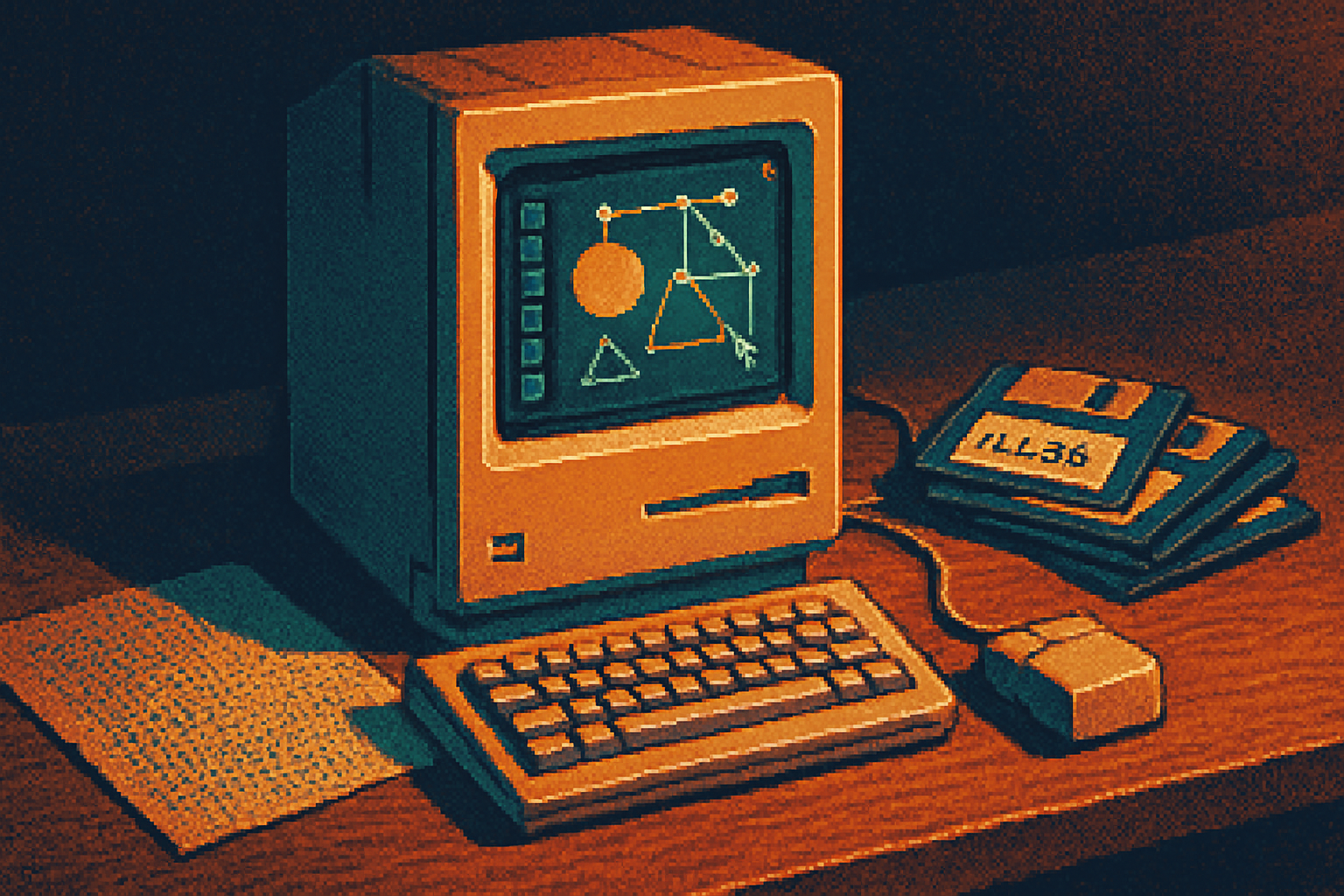
I found the floppy in a shoebox. The label read “ILL88 LOGOS.” I popped it into a dusty old Mac, opened a file, and there it was: a stubbornly beautiful logo built from a handful of paths, harsh fills, and anchor points like punctuation marks. It looked both primitive and impossibly confident-every curve declaring a decision.
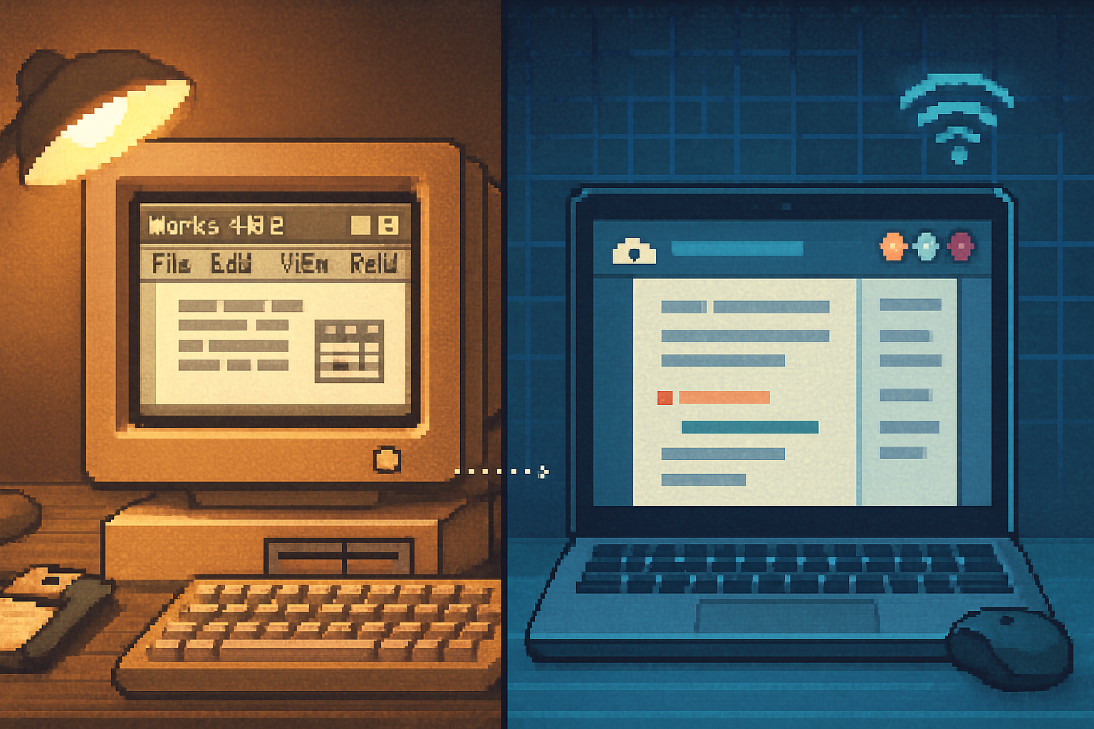
That tension-between deliberate minimal geometry and the visible marks of early digital craft-is exactly what’s resurfacing in contemporary design. The retro graphics trend isn’t just about nostalgia for pixelated icons or membranous CRT glow. It’s a revival of a mindset that grew out of early Adobe Illustrator’s limits and strengths: path-first thinking, precision by hand, and an aesthetic shaped by hardware and print realities.
A short history: what early Illustrator actually gave designers
Adobe Illustrator launched in the late 1980s as a dedicated vector drawing program built around PostScript and Bézier curves. It made it possible to draw clean, infinitely scalable shapes with a precision that felt mathematical and artisanal at once. It also came with constraints: clunky UIs, limited color workflows, and output that often introduced halftone dots, banding, or printing artifacts.
Read the basics here: Adobe Illustrator - Wikipedia and Adobe’s overview of the tool: Adobe Illustrator | Adobe.com.
These early conditions created a distinct look:
- Pen-tool-led geometry - Everything is built from paths and anchors. The pen tool wasn’t a convenience; it was the craft.
- Flat fills and bold strokes - Limited palettes and screen-to-print translation favored hard-edged color blocks and confident outlines.
- Accidental textures - Printer halftones, low-resolution scans, and dithering left residue-grain, banding, and moiré-that designers either hid or leaned into.
- Mechanical irregularities - Clumsy handles, imperfect curves, and snapped points became visual character, not mistakes.
Constraints rarely produce laziness. They produce style.
Which early features are being resurrected - and how
Modern designers aren’t literally reinstalling Illustrator 88 and refusing to update. They’re selectively resurrecting the habits and visual artifacts that came from those early features.
The pen tool ethic (but smoother) - The discipline of constructing shapes with anchor points is back. Today’s pen tool is kinder - curvature tools, smoothing, and better handles - but designers deliberately preserve anchor visibility and structure to make objects feel hand-composed.
Boolean thinking (pathfinder revived, often non‑destructively) - Clean geometric logos and icons are once more built from unions, subtractions, and intersections. Modern tools add non‑destructive boolean layers, but the visual language is pure pathwork.
Flattened palettes and limited systems - Early print meant working with a small set of colors. Contemporary retro palettes emulate that economy: two or three dominant hues, a neutral, and a pop color. The result reads both vintage and modernly optimized for brand systems.
Grain, halftone, and scan texture - Those printing artifacts that once frustrated designers are now cosmetic choices. Vector halftones, scanned paper textures blended over crisp vectors, and chromatic banding are intentional layers meant to humanize digital perfection.
Outlined strokes and technical illustrations - The prevalence of outline-based iconography and schematic infographics owes a debt to the stroke-first mechanics of early vector art.
Limited UI cues and skeuomorphic echoes - Early tools showed wireframes, grids, and handles. Modern micrographics sometimes mimic those cues (handles, visible guides) as aesthetic signifiers of craft.
Why nostalgia fuels this revival - and why that’s not shallow
Nostalgia is usually reduced to a marketing gimmick: vintage logos, retro filters, and ‘70s colorways. But nostalgia is also cognitive shorthand. It reduces choice. It invites trust. It evokes craft.
Think of nostalgia as a lens that blurs irrelevant detail. Suddenly a designer doesn’t have to invent a whole visual language; they can adapt a ready-made grammar (bold strokes, limited palettes, halftones) and layer modern meaning on top. That’s efficient. That’s persuasive. That’s creative.
Psychologically, nostalgia can be restorative: it connects us to continuity, to memory, to identity. For brands it offers authenticity without attending a reenactment of authenticity.
But there’s a moral line. Copying raw historical work-replicating someone’s exact mark-slides from homage into laziness or worse, plagiarism. The smart revivalist translates: borrows the rule, not the artifact.
Concrete examples (what you see in the wild)
- Indie record sleeves - Geometric logotypes plus halftone portraits; vector shapes with tactile overlays.
- Tech branding - Clean, monoline wordmarks that embrace anchor-visibility and non-perfect curves to feel human at scale.
- Packaging - Two-tone print with deliberate registration shift and grainy gradients for a tactile, analog feel.
- Web and UI - SVG icons that proudly show outline variants and hand-tweaked anchors rather than auto-generated glyphs.
These aren’t niche tricks. They’re mainstream signals that an identity is crafted, not algorithmically sourced.
Tools and techniques to capture that early‑Illustrator spirit (without being a costume designer)
- Limit your palette early. Use fewer colors and make them count.
- Build with paths. Draft logos and icons by placing anchors; keep some handles visible as compositional choices.
- Add texture as a layer, not as a crutch. Scan paper, add vector halftone fills, or use noise blended subtly over flat color.
- Use non‑destructive booleans. Keep your construction visible so the geometry reads even when reduced.
- Embrace imperfect curves selectively. A slightly wobbly spine on a logotype can make a brand feel handmade.
- Remember production realities. If something is meant for print, test for registration shifts, halftone behavior, and paper grain.
Quick palette cheats inspired by old-school print:
- Two + accent - Dominant color, neutral, single bright accent.
- Duotone - Two contrasting colors (one warm, one cool) for depth without gradients.
A warning about kitsch and sincerity
A floppy-disk motif isn’t a strategy. A halftone texture isn’t a brand personality. The difference between a smart revival and costume design is intent.
If you’re choosing retro because it’s trendy, it’ll show. Use the aesthetic because it amplifies a core attribute of the work: craft, longevity, analog heritage, or playful irony.
The bigger lesson: constraints breed character
Early Illustrator was a set of constraints that forced decisions. Those constraints made designers think in paths, not pixels. The revival isn’t mere nostalgia; it’s a rediscovery of a productive discipline. In an era of endless options, the discipline of “one pen, one path” is oddly subversive.
So do what that shoebox of floppies taught me: make fewer choices, make each one matter, and let small technical residues-grain, anchor marks, halftone ghosts-tell the story that perfect vectors cannot.
References
- Adobe Illustrator - Wikipedia: https://en.wikipedia.org/wiki/Adobe_Illustrator
- Adobe Illustrator product page: https://www.adobe.com/products/illustrator.html