· retrotech · 6 min read
From Crashes to Creativity: Learning to Navigate Early Adobe Illustrator in Today’s Creative Landscape
How the bugs, memory limits and oddball features of early Adobe Illustrator can be turned from nuisances into deliberate creative tools-practical workflows, emulator techniques, and conceptual moves for modern designers.
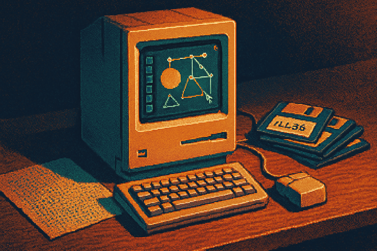
A Mac Plus hums. A designer taps the pen tool, and the app freezes mid-curve. The file refuses to save. Someone yells “Control‑Option‑Escape” and the drawing comes back as a jagged, beautiful mistake - a shape that didn’t exist until the software failed. That was how a lot of vector aesthetic history got made: accidents and limits, turned into style.
There’s a weird romance to early Adobe Illustrator. It was slow, crashy and stubborn. But from those limitations came aesthetics - buckled paths, ragged boolean joins, and a heavy reliance on composition over polish. The modern designer, drowning in unlimited layers and infinite undo, can learn a lot from these quirks. This article explains the why and the how: what made early Illustrator odd, how to emulate and exploit those quirks today, and concrete workflows that turn limits into a creative advantage.
Why revisit early Illustrator now?
- Constraints breed invention. Limitations force decisions. When you can’t tweak forever, choices get bolder.
- Vintage vector has cultural cachet. The retro interface, PostScript feel and halftone-friendly output tap into nostalgia while remaining fresh.
- Artifacts are expressive. Imperfect booleans, jagged curves and dithering carry texture and human presence in a world of hyper-slick design.
If you want a look that reads as human-made rather than algorithmically perfect, these constraints are not an obstacle - they are a toolkit.
(For a quick historical frame, see the timeline of Adobe Illustrator and related vector tech.)
Adobe Illustrator - Wikipedia
What made early Illustrator “quirky”? (Short checklist of affordances and bugs)
- Memory and CPU limits - simpler, smaller shapes; fewer anchor points.
- Primitive boolean/pathfinder operations - results could be messy and unpredictable.
- PostScript-based file format - shapes were described as instructions, not pixel maps.
- Limited layer and artboard support (early workflows were flat and manual).
- Basic gradients and fills with no advanced blending modes.
- Crashes and corruption - sometimes recovered files produced odd artifacts.
Those limitations weren’t all bad. They forced artists to think in bold shapes, single paths and clever workarounds.
Principles: How constraints translate to creative advantage
- Reduce options to increase originality. Narrow palettes, fewer tools, stricter rules.
- Make failure visible and meaningful. Turn a crashed render or a messy union into texture.
- Think of artifacts as materials. Jagged joins, half-subtracted shapes and dithering are design ingredients, not defects.
Practical workflows: Emulate and exploit early Illustrator quirks in modern projects
Below are reproducible techniques you can paste into today’s Illustrator (or any vector editor) to recreate vintage behavior and produce useful, unexpected results.
1) Recreate the low‑fidelity vector look
- Start in a single layer. Turn off fancy snapping and smart guides.
- Restrict yourself to the Pen tool + Direct Selection. Aim for fewer anchor points.
- Use strokes converted to shapes - create a thick stroke, Object > Expand, then tweak nodes manually.
- Purposefully reduce path precision - Object > Path > Simplify with a high error tolerance to create jagged curves.
Why: early drawings had fewer anchors and rougher curves. Simplifying introduces those charming, imperfect arcs.
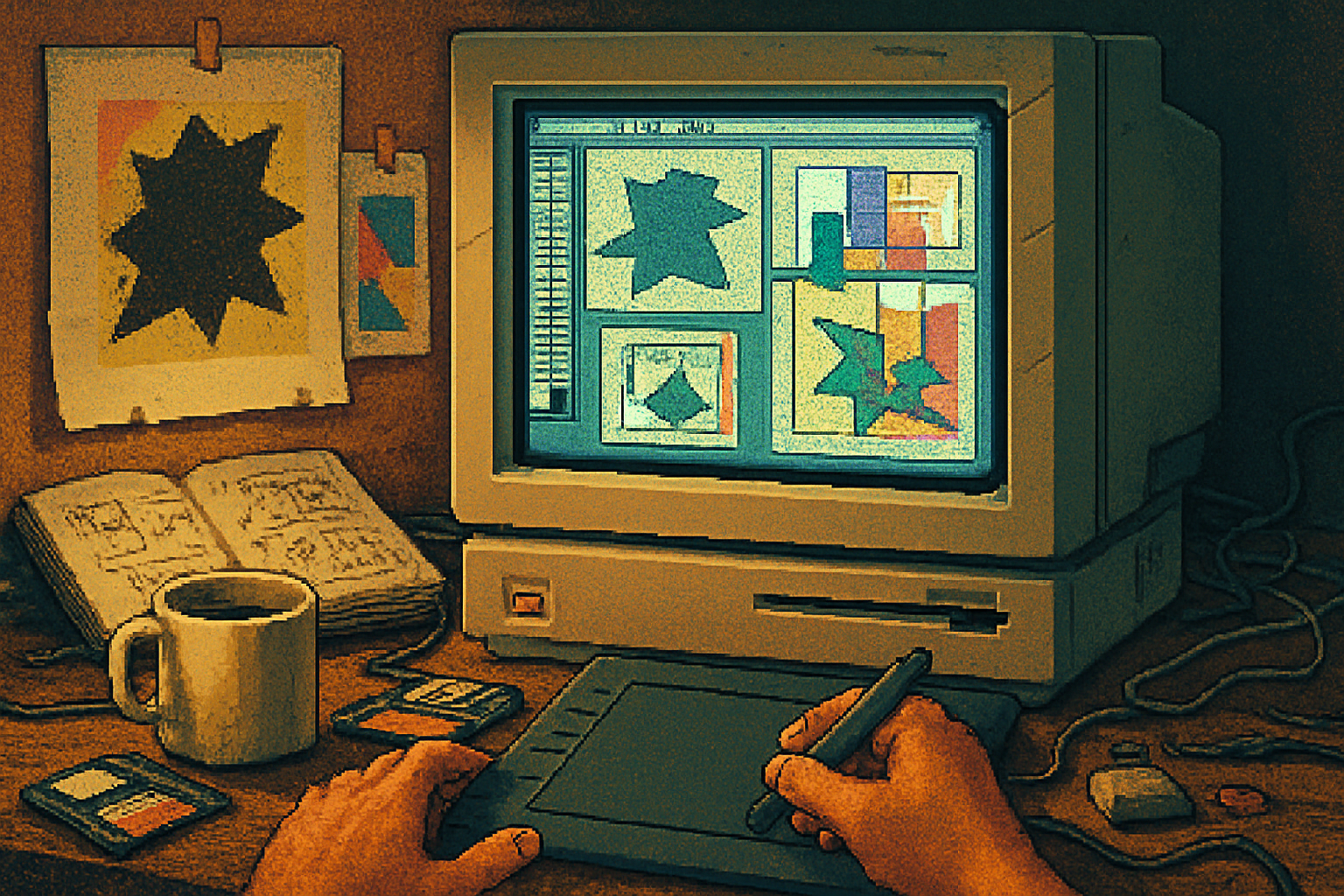
2) Use brittle boolean operations as texture makers
- Create overlapping shapes and use Pathfinder > Minus Front or Divide. Don’t merge - keep compound paths with visible artifacts.
- Intentionally misalign shapes by a pixel or two before boolean operations to create hairline gaps and odd micro-shapes.
- After a boolean, don’t clean up - duplicate the result, offset it slightly, and make it semi-transparent to simulate printing misregistration.
Why: early boolean algorithms created odd nodes and tiny slivers you can treat as decorative texture.
3) Low‑fidelity Image Trace for “vectorized crash” textures
- Draw or collage a high-contrast sketch or printed scan.
- Object > Image Trace > preset - Black and White Logo or create a custom preset with Threshold set low and Paths low.
- Expand and clean up only briefly - leave rough edges.
Why: Image Trace is a modern way to produce the blocky, erratic outlines that used to happen when vectors were reconstructed after a crash or export.
4) Embrace halftone, dithering and raster artifacts
- Rasterize a vector object at low resolution (72–150 ppi), apply a halftone or posterize in Photoshop, then re‑vectorize with Image Trace set to low fidelity.
- Alternatively, apply Effect > Pixelate > Color Halftone directly in Illustrator (if available) and then trace the result.
Why: printing and screen limits of the era produced dot patterns and stepwise color. Those textures read as vintage and tactile.
5) Simulate corrupt files and “happy accidents” safely
- Work on copies. Save an “experimental” version and intentionally apply destructive actions (Expand, Compound Path, Pathfinder > Divide) without undo.
- Create random perturbations - Select > Transform > Transform Each with small, randomized rotate/scale values and check “Random.” Do it repeatedly.
- Use scripts (or Actions) that nudge anchors, delete a small percentage of points, or offset paths to simulate crash artifacts.
Why: you want the surprises without losing the master file. This lets you extract the serendipity of a crash while remaining sane.
6) Use typography as shape (the classic early‑vector move)
- Convert type to outlines and treat glyphs as vector blocks. Don’t kern obsessively - let colliding counters create texture.
- Use compound path subtractions - cut letters out of shapes to make negative-printed elements.
Why: many early vector pieces used type as bold, carved shapes rather than finely tuned text.
Mini projects to practice these moves
- Poster exercise - Limit palette to two colors. Build shapes with the Pen, simplify wildly, use Pathfinder minus operations to create gaps, and layer a halftone background.
- Identity sketch - Design a logo using only strokes converted to fills. Avoid gradients, focus on single-path clarity with deliberate imperfections.
- Type poster - Use a scanned headline, Image Trace low-fidelity, and overlay rough vector shapes with misregistered color blocks.
Each practice forces quick decisions and rewards accidental beauty.
When to keep modern tools (and when to throw them away)
Keep: nondestructive backups, artboard management, and proper export profiles. Modern tooling is kind to clients and production.
Discard (temporarily): infinite undo, precision snapping, auto-trace defaults that smooth too much. Turn off what makes things perfect and sterile.
Save a flattened copy for clients, but present the rougher version first. People respond to character.
Case notes from design history (short & useful)
The 1990s grunge and indie editorial scenes often prized the rough, hand‑made feel - imperfect vector decisions contributed to that look (see grunge typography and designers like David Carson)
David Carson - WikipediaGlitch and lo‑fi practices in digital art intentionally co-opt software failure as aesthetic technique. Treat software limitations like a collaborator, not an enemy.
Glitch art - Wikipedia
Deliverables and production best practices
- Always - save a clean master before you start intentional destruction.
- Export strategy - keep a vector master (AI or PDF) for production; export rasterized, halftoned proofs for presentation where the texture matters.
- Communication - explain to stakeholders that the roughness is intentional. Use mood boards showing historical precedents.
Final thought - the craft of choosing limits
You can fix every flaw. You can smooth every node and align every pixel. Or you can accept that some beauty only exists because of stubborn software and inconvenient memory budgets. The craft is not in removing constraints - it’s in choosing them.
Turn crashes into features. Not metaphorically. Literally: keep one document where you let the app break, and learn to harvest the resulting shapes. That’s how new forms appear.
References
- Adobe Illustrator - Wikipedia: https://en.wikipedia.org/wiki/Adobe_Illustrator
- David Carson - Wikipedia: https://en.wikipedia.org/wiki/David_Carson
- Glitch art - Wikipedia: https://en.wikipedia.org/wiki/Glitch_art