· retrogaming · 6 min read
Rediscovering the Watara Supervision: A Hidden Gem of the 90s
A nostalgic deep-dive into the Watara Supervision: why this cheap Game Boy alternative mattered, what its obscure games taught designers, and how its aesthetic and market position left a quiet mark on portable gaming.
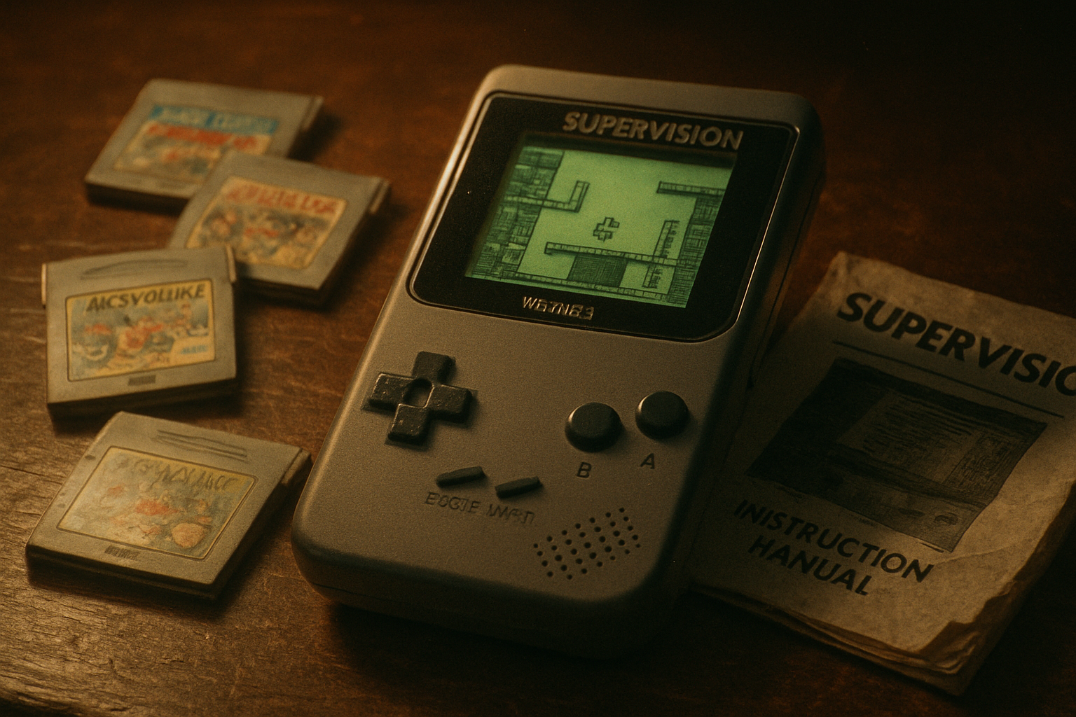
In the corner of a flea market I used to haunt there was always one small cardboard box that fascinated me: a jumble of cheap cartridges, a grey plastic handheld with a tiny screen, and a few instruction booklets with broken English and ambitious typography. It wasn’t a Game Boy. It wasn’t even pretending to be one. It was a Watara Supervision - a pale, stubborn footnote in the story of portable gaming.
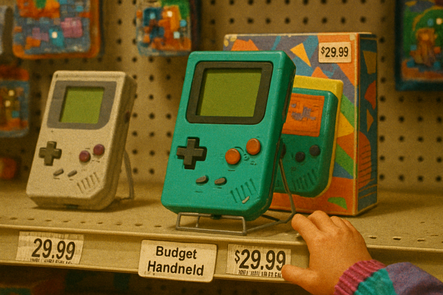
The Supervision arrived in the early ’90s as a deliberate, economical alternative to Nintendo’s juggernaut. It failed to dethrone the Game Boy. It did something quieter and, in retrospect, more interesting: it exposed how little hardware had to be sacrificed to create a portable play experience, and it created a small catalog of odd, creative, and sometimes incompetent games that deserve reappraisal.
For a quick primer on the system’s place in history, see the short overview on Wikipedia: https://en.wikipedia.org/wiki/Watara_Supervision
Why the Supervision matters (even if you never played it)
- It was democratisation by plastic. The console’s low price and liberal rebranding meant handheld gaming didn’t belong exclusively to big licensors and deep pockets. That altered expectations about price elasticity in the market.
- It forced design trade-offs into the open. Limitations - crude displays, small palettes, sluggish controls - pushed developers toward mechanics and aesthetics that survived on clarity rather than spectacle.
- It left a messy, fascinating library. Many titles were unlicensed ports, clones, or regionally rebranded releases. Tracking provenance is a hobby and a headache in equal measure, and that chaos itself is a cultural artifact.
Short version: the Supervision was not a triumph. It was influence delivered in cheap, clumsy packaging.
Hardware and design: what players actually held
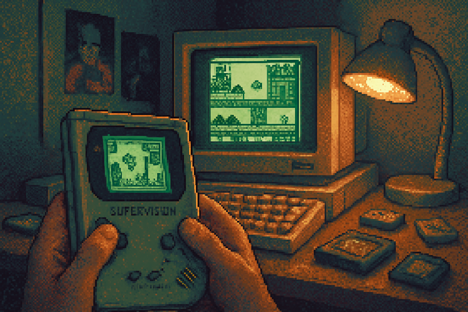
The Supervision was built to undercut. Think of it as functional minimalism with aesthetic compromises: a small, monochrome LCD, squint-friendly sprite work, and a build quality that frequently leaned toward the brittle. Design choices were pragmatic:
- Display and palette - limited colors and contrast meant strong silhouettes and bold shapes were necessary. Designers often used thick outlines and high-contrast sprites to make characters readable.
- Input and performance - simple control schemes (D-pad, two buttons) encouraged tight, mechanical gameplay. Frame-rate and input lag varied wildly across titles.
- Cartridges and regional rebrands - the same game could appear under different names and covers depending on the distributor - a pratfall for historians, a treasure map for collectors.
This led to a visual language that still looks distinct: economical pixels, unapologetic dithering, and typography that screams ‘desktop publishing in a basement, 1992.’
Gameplay mechanics: how limitations made games interesting
Constraint breeds creativity. Here’s how the hardware nudged game design on Supervision titles:
- Tile- and pattern-driven levels - when memory is tight, levels are built from repeating tiles. This produced compact, readable stages where platforming is about pattern recognition rather than spectacle.
- Rule-focused systems - many games traded visual fidelity for mechanical clarity - Tetris-like puzzlers, Pong/Arkanoid riffs, and simple sports simulations thrived.
- Short loops, high repetition - with meager content budgets, designers leaned into short, replayable sessions. Levels were often short but demanded precision, which fit portable gaming’s ‘pick up and play’ ethos.
The result: gameplay that often felt closer to arcade rationalism than to the sprawling adventures of home consoles.
Art direction: the aesthetic of doing more with less
If the Game Boy produced the soft, blocky charm of contemporary handheld design, Supervision art was a harsher cousin - pragmatic, sometimes ugly, occasionally brilliant:
- Bold silhouettes - thick outlines and clear poses were common. Readability trumped nuance.
- Limited color palettes - artists compensated with strong composition and texture-dithering, cross-hatching, and repetition.
- Manual art and packaging - many of the system’s most memorable visuals live on its covers and booklets - overambitious box art that promises rocket-fueled epics but contains a chunky puzzle game.
There’s an aesthetic honesty to it: what you see on the box is often what you get, and what you get is. The mismatch can be comic, but it’s honest.
The lesser-known titles: not stars, but important teachers
The Supervision’s library is a mosaic of clones, original experiments, and regional oddities. Rather than list titles as if they were canon, it’s more useful to look at representative types and one or two instructive case studies.
Puzzle and logic games - These were the system’s bread-and-butter because they required fewer resources. Small rule-sets, repeatable patterns, and escalating difficulty made them ideal for the hardware.
Arcade conversions and clones - Expect stripped-down takes on arcade hits. These taught developers how to preserve core loop and feel when fidelity was impossible.
Sports and management - Simplified sports games - football, basketball, racing - emphasized pacing and scoring systems over animation.
Experimental oddities - Some cartridges tried to do something weird: hybrid genres, unusual perspectives, or quirky control schemes. Not all succeeded. Some are painfully earnest. Others presage indie sensibilities decades before the indie boom.
Why study these titles? Because they show how mechanics can be distilled to their essence. Where a large studio might hide thinness behind spectacle, a Supervision title often had to stand naked under a glaring screen. If a mechanic survived that exposure, it probably had merit.
Cultural impact: a small echo, not a tidal wave
The Supervision didn’t topple Nintendo. But its existence nudged the market in a few measurable ways:
- Price pressure - cheaper handhelds made arguments about affordability unavoidable.
- Distribution experiments - rebranding, regional repackaging, and white-label cartridges were more visible because of systems like this.
- Developer learning ground - smaller teams and third-party shops cut their teeth on low-end porting and rapid prototyping - skills that later migrated to other platforms.
And on a softer level: it taught a generation the pleasure of compromise. You didn’t need gorgeous sprites to fall in love with a control scheme.
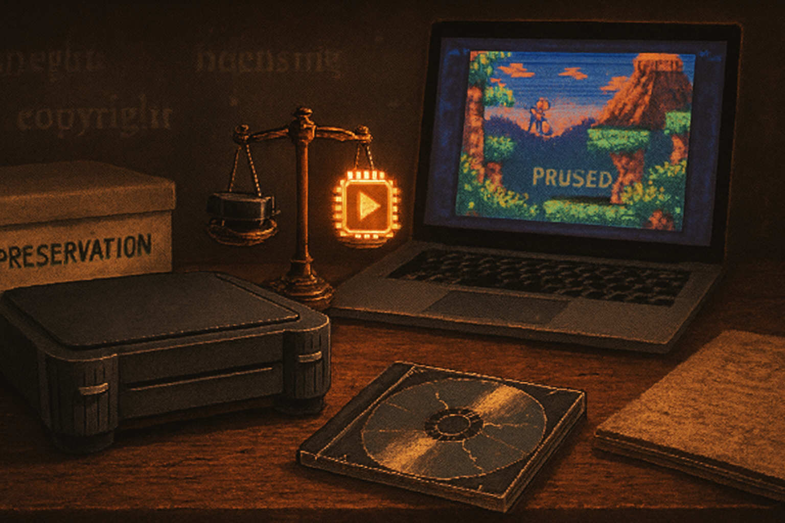
Collecting and preservation: resurrecting the small voices
Collectors prize the Supervision for reasons that are both nostalgic and curatorial. The system’s regional rebrands create a detective-game aspect - tracking variant covers, odd translations, and exclusive releases. Emulation helps, but it can’t fully capture the tactile failures (sticky buttons, poor contrast) that shaped the experience.
If you care about preservation, the Supervision is an appealing microcosm: a tiny market, lots of shoddy documentation, and a library that rewards patient reconstruction.
What the Supervision teaches modern designers
- Design for clarity first. When the ornamentation is stripped away, mechanics must be robust.
- Constraints sharpen choice. Limited palettes and memory force priorities and can lead to more coherent experiences.
- Cheap hardware is fertile ground. Today’s mobile and minimalist indie scenes echo the Supervision’s lesson - constraints can be liberating, not merely limiting.
Final thoughts
The Watara Supervision is the sort of device that rewards anyone willing to forgive clunky execution in exchange for honest, unglamorous lessons. Its games are not masterpieces. Many are misguided. But the system is like a thrift-store short story collection: uneven, occasionally brilliant, and worth leafing through if you want to understand how designers cope when the world says “no” to fancy graphics.
If you’re curious, start with a few short puzzlers and a sports title and pay attention to what the games ask you to do, not how they ask you to look. You’ll begin to hear the Supervision’s real line: small, insistent, and stubbornly human.