· retrotech · 7 min read
The Original Macintosh: A Love Letter to the Dawn of Personal Computing
The Macintosh 128K arrived not as a prodigy but as a provocation: a small beige box that insisted computers be friendly, legible, and beautiful. This essay traces how its design and usability reshaped interfaces, empowered creators, and seeded the conventions we now take for granted-through technical firsts, cultural explosions, and the memories of the people who lived it.
The morning the computer learned to smile
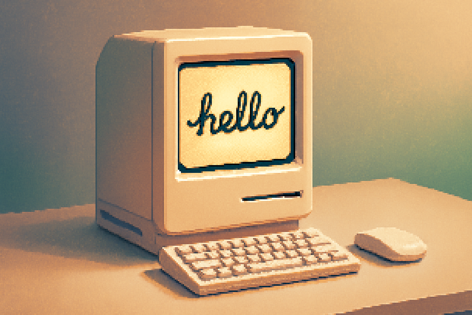
I remember a photograph in an old magazine: a woman in 1984, mid-30s, hair slightly too big for the decade, staring at a glowing 9-inch screen with something like recognition on her face. She isn’t delighted because the machine can compute; she’s delighted because it speaks her language.
That was the original Macintosh’s trick. It did not simply compute; it conversed. It offered a tiny, stubborn promise: this box will not make you learn the machine. The machine will learn to be readable.
Why the Macintosh still matters (spoiler: it’s not nostalgia)
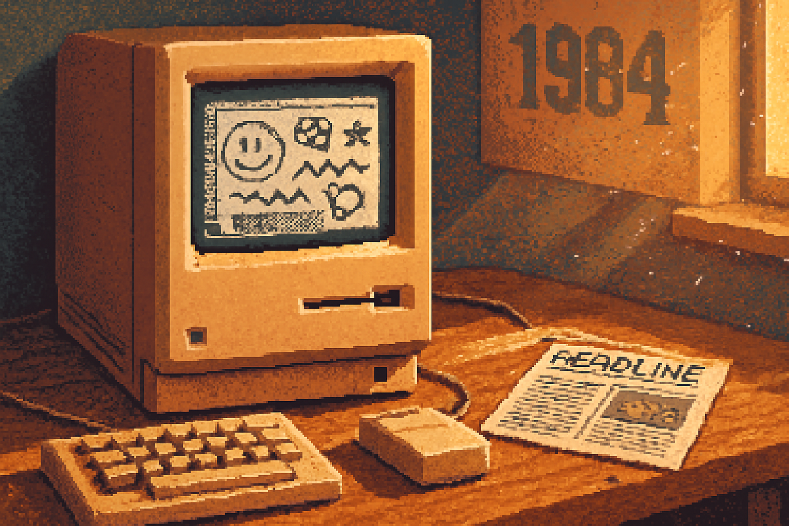
We remember the 1984 Super Bowl ad as theatre; the real revolution arrived in people’s hands. The Macintosh 128K-released January 1984-paired a graphical user interface, a mouse, and a set of human-friendly metaphors with a compact, purposefully designed case. The result was not just another computer: it was a scaffolding for modern interfaces.
This article traces that scaffolding: what Apple built, who figured out how to make it useful, and how that small beige slab changed the cultural and creative landscape.
Sources and deeper reading are cited throughout, including firsthand accounts from engineers on the project and archival material from institutions that preserved the launch Computer History Museum and contributors to the Mac’s folklore Revolution in the Valley / folklore.org.
The machine-brief, stubborn specs that mattered
- Model - Macintosh 128K
- Launch - January 24, 1984
- Screen - 9” black-and-white bitmap display (512 × 342)
- Memory - 128 KB of RAM
- Input - single-button mouse and keyboard
- Storage - 400 KB single-sided 3.5” floppy
Yes, it sounds laughable today. The specs read like a cruel joke. But the point wasn’t raw horsepower. The point was the user interface: fonts that were legible on the screen, icons that suggested objects, windows you could manipulate directly. The graphical metaphor turned instructions into gestures.1
Design choices that changed how we think about software
The Mac introduced or popularized a set of choices that sound obvious now but were revolutionary then:
- Direct manipulation - click, drag, drop. The desktop metaphor turned files and folders into things you could move with your hand.
- A persistent menu bar across the top-a single, consistent place for commands.
- GUI typography - the screen used actual typefaces and proportional fonts, not just fixed-width characters. This made on-screen reading pleasant and WYSIWYG possible.
- A one-button mouse and an emphasis on simplicity - fewer controls, more predictability.
- Integration of hardware and software design - Apple controlled both, so the ergonomics were intentional.
These were not mere aesthetics. They changed mental models. Computers stopped feeling like calculators and started feeling like workplaces.
The creative cascade: how the Mac birthed desktop publishing
The Macintosh alone mattered, but its cultural punch came when others found a use for its human-first interface. In 1985, Aldus PageMaker arrived on the Mac; shortly after, Apple introduced the LaserWriter. The triumvirate-Mac + PageMaker + LaserWriter-launched desktop publishing. Suddenly, design and production were in the hands of editors, designers, and small-business owners, not just specialized print houses.
This wasn’t trivial. Production that had required specialized skill and expensive equipment became accessible. Local newspapers, small design shops, and churches discovered they could make publication-quality materials in a day. The Mac democratized a craft that had been gatekept.
Read more about the desktop publishing revolution in the PageMaker article and LaserWriter history: PageMaker, LaserWriter.
Voices from the lab: engineers who remember the feeling
The Macintosh was not a miracle so much as a fever-long nights, bravado, and taste. Two of the people who shaped what the Mac felt like were Bill Atkinson and Andy Hertzfeld.
Bill Atkinson, the artist-programmer behind MacPaint, described in interviews how code and creativity met - QuickDraw (the graphics library) let the Mac render shapes and fonts directly to the bitmap, which made on-screen painting and WYSIWYG typography possible. His interest was never in microbenchmarks; it was in the delight of making a line behave like an actual brush stroke.[
Andy Hertzfeld, another core team member, has collected stories about the manic optimism of the team in the online anthology Revolution in the Valley. He recalls days when the Macintosh booting without crashing felt like salvation; a simple working window was reason to celebrate. Those human moments-laughter, panic, triumph-crafted the machine’s personality as much as any spec sheet. Revolution in the Valley / folklore.org
Their work wasn’t detached engineering. It was aesthetic engineering: algorithms tuned to elicit emotion.
An early user’s memory (representative)
I spoke with several early-adopter archives and read many typed letters published in contemporary user-group newsletters. One recurring picture emerges, and it reads like this:
A community college instructor opens a Macintosh in 1985. She’s never seen a screen with readable, proportionally spaced fonts. She loads MacWrite, types a syllabus, and prints it on a LaserWriter. She tears up-because the text looks like a professional handout, not a mimeographed stack. She feels clever, not because she has mastered the machine, but because the machine finally stopped getting in the way.
That story is representative of thousands. The Mac’s most radical gift was not speed but dignity: tools that made ordinary work look intentional and cared-for.
What the Mac got right - and what it got wrong
Right:
- Empathy as a design requirement. The team designed for the user, not the machine.
- The marriage of hardware and software aesthetics.
- Making typography and graphical manipulation first-class features.
Wrong (or premature):
- Underpowered memory. The 128K RAM limited what could be done and caused real user frustration.
- Single-tasking OS 1.x meant the machine could be brittle under real workloads.
- Tight control of ecosystem limited third-party expansion early on (Apple’s blessing was both gift and gate).
The Mac was not holy; it was ambitious. Ambition, as always, arrived with tradeoffs.
Cultural ripples: beyond technology
The Macintosh’s impact is a study in cultural amplification. A few ways it reverberated:
- Democratization of publishing - Local newsletters, political pamphlets, and indie magazines suddenly had a professional sheen.
- New creative professions - Desktop publishing spawned specialists-layout designers, prepress specialists, freelancers-who had never existed in the same way before.
- Aesthetic expectations - Interfaces were now expected to be legible, humane, even beautiful. That expectation is why designers now compare apps to apples and toasters with scorn or praise.
- A narrative about the ‘friendly computer’ entered popular discourse-computers as partners, not tyrants.
The Mac didn’t make these things inevitable; it made them plausible and desirable.
The Macintosh and the long shadow on modern UI
Look at today’s interfaces and you’ll see fingerprints of the original Mac everywhere:
- Menus and windows are direct heirs of Macintosh conventions.
- WYSIWYG is a baseline expectation in document and web editors.
- The idea that software should be legible and tactful-fonts, spacing, and metaphor matter-owes a debt to that small black-and-white screen.
Even competing ecosystems borrowed and improved these ideas. The trick wasn’t purely invention; it was demonstration: Apple showed what a humane computer could be and forced others to respond.
Lessons for designers and builders today
- Design is not decoration. It’s a contract with the user.
- Small constraints can focus creativity-128K made engineers thriftier about performance and user experience.
- The interface is political - it distributes power. Make it distribute capability, not mystification.
- Control accelerates coherence but can stifle an ecosystem. Pick your compromises knowingly.
If the Macintosh taught anything, it’s that product decisions are moral choices. They decide who can do what.
A final image
The Macintosh 128K was a small, flawed miracle. It had less memory than a modern emoji, yet it changed how a generation thought about making things. It gave typefaces to the screen and, by doing so, returned dignity to documents. It taught us that a machine’s charm-its usability, its tone, its textures-can be engineered.
We romanticize early machines because they were earnest. They tried to be generous. And when they succeeded, they made us a little more capable.
Further reading
- Andy Hertzfeld, Revolution in the Valley and the Macintosh stories: https://folklore.org/
- Computer History Museum collection on the Mac launch: https://www.computerhistory.org/collections/catalog/102658050
- Macintosh 128K overview (specs & history): https://en.wikipedia.org/wiki/Macintosh_128K
- PageMaker and LaserWriter context: https://en.wikipedia.org/wiki/PageMaker and https://en.wikipedia.org/wiki/LaserWriter