· culture · 6 min read
Newton Nostalgia: Why This Obsolete Device Still Matters
The Apple Newton-deeply mocked, quietly mourned-wasn't merely an expensive paperweight. Its pen-first UI, tolerance for messy input, and insistence on being a personal information manager prefigured many modern ideas. Here's why designers should still study its failures and borrow its principles.
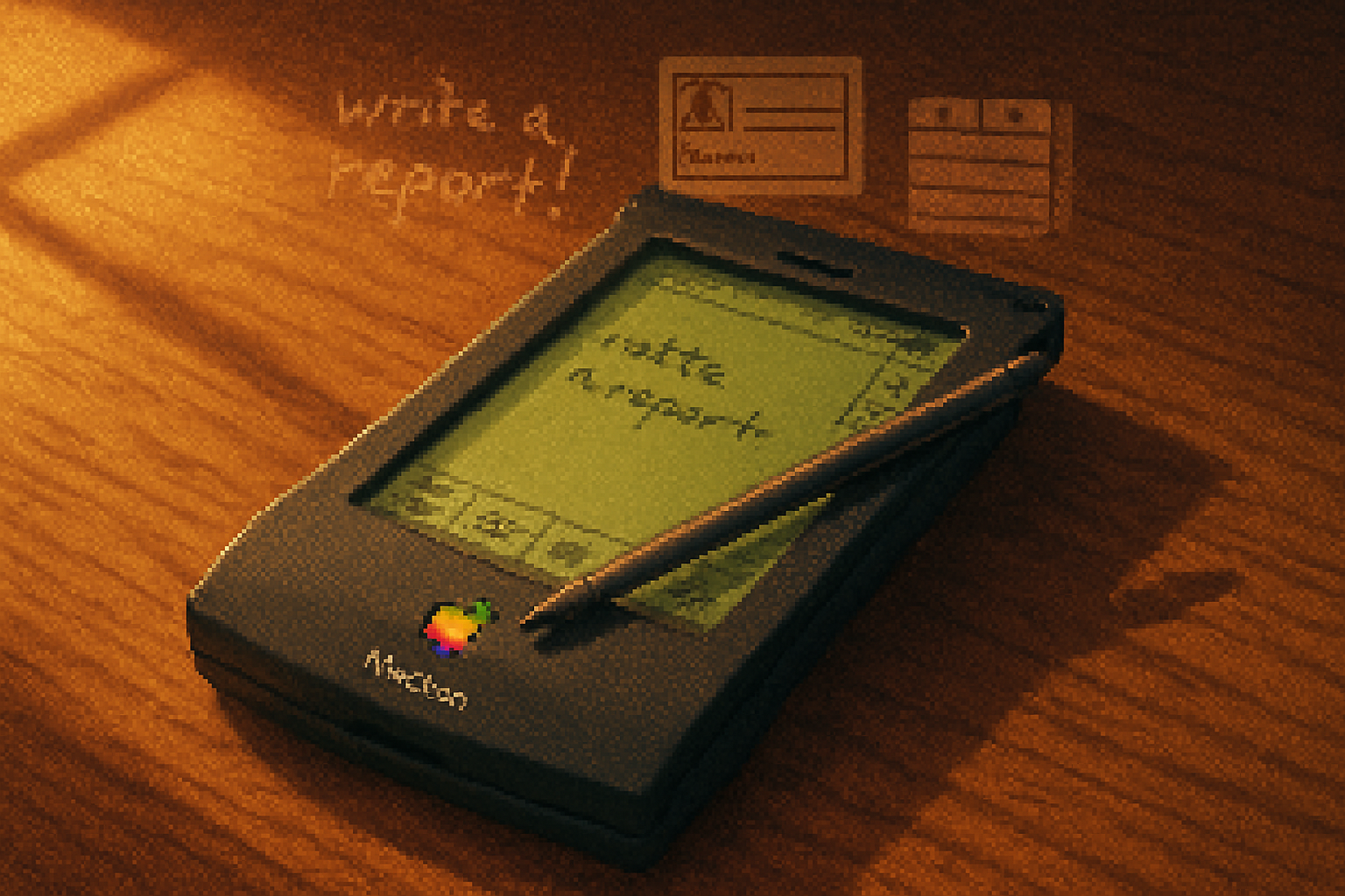
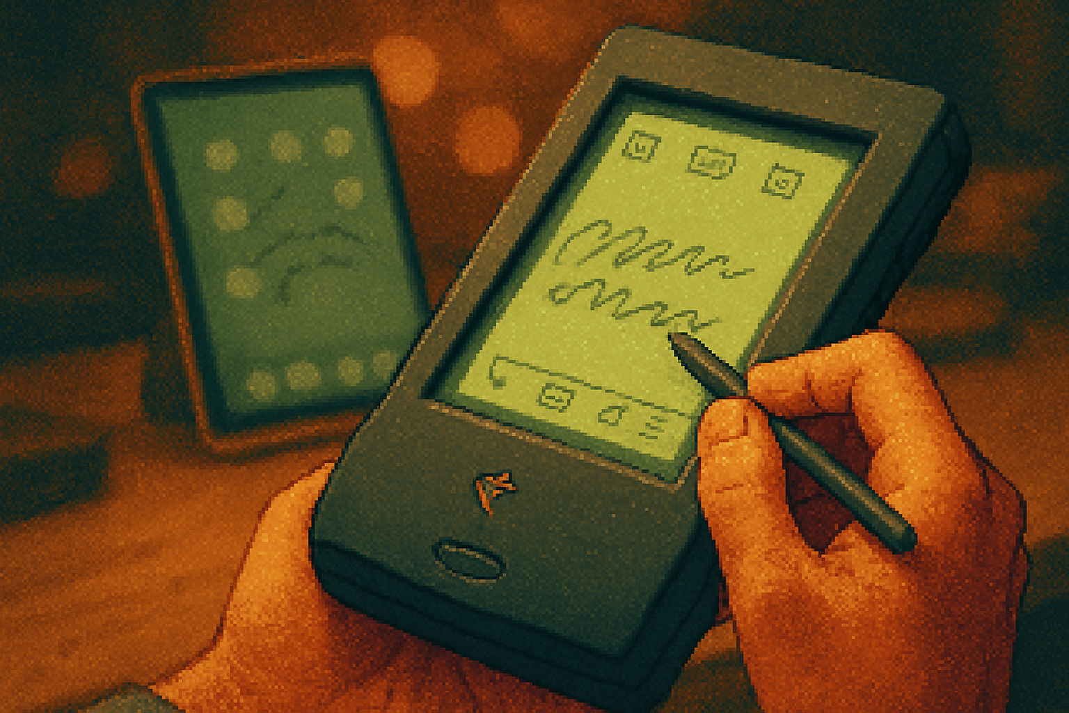
I found mine in a cardboard box between a sun-faded loaner novel and a pile of cassette tapes. The rubbery stylus still felt like a relic from an era that thought computing should be personal, portable, and a little obstinate.
I tapped the screen. The Newton blinked back. Its handwriting recognition, the same feature that once furnished late‑night comedians with jokes, was the device’s promise and its torment. But that single, fumbling promise is why the Newton still matters.
The Newton story in a sentence
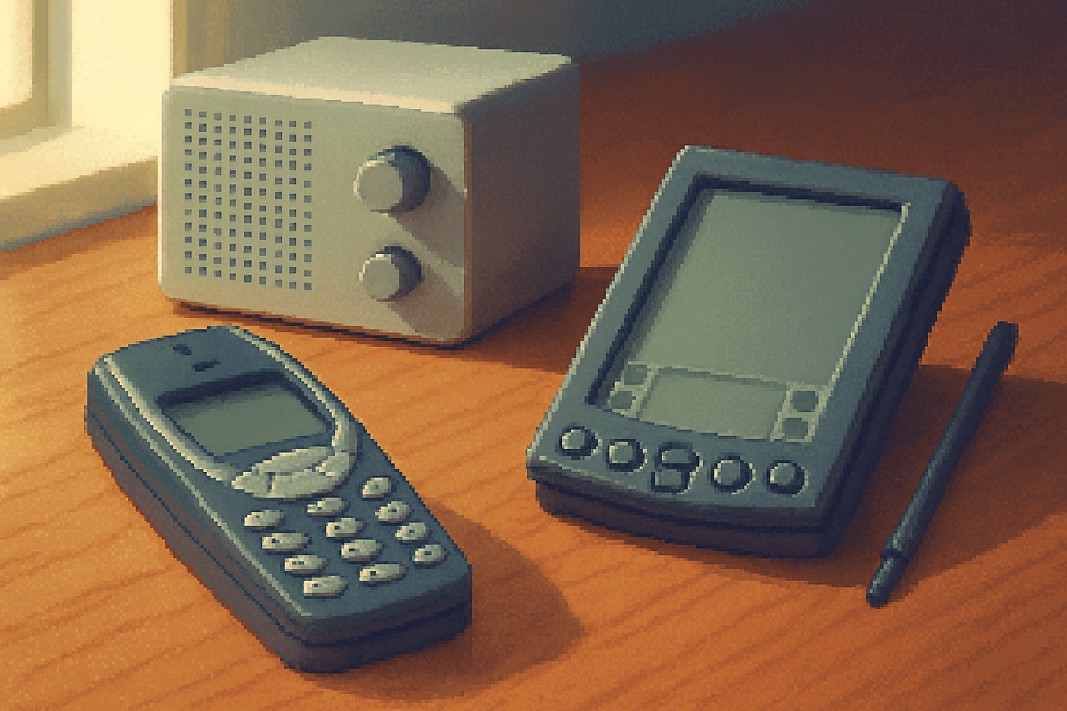
Launched by Apple in 1993, the Newton MessagePad was one of the first serious attempts at a pen-based personal digital assistant: a pocket computer that understood handwriting, organized your notes and contacts, and tried, messily and bravely, to be a personal assistant long before Siri was a glint in an engineer’s eye. It was canceled in 1998 amid product missteps and corporate reinvention under Steve Jobs, leaving behind a reputation as a glorious flop and a surprising design laboratory. See a concise account on Wikipedia and a thoughtful retrospective at Ars Technica.
Why we still talk about the Newton (beyond nostalgia)
Technology remembers the winners and forgets the experiments. The Newton is worth remembering because it codified a set of user‑experience choices that the modern stack keeps re-inventing: pen-first input; forgiving recognition; local, personal data storage; and a design that privileged human intent over machine precision. Those are not quaint footnotes - they’re active design ingredients missing from many current products.
The key ideas the Newton tried (and why they mattered)
- Pen-first, direct manipulation - It treated handwriting and sketches as first-class input, not a second-class hacked-on option. In an age when touchscreens were still exotic, Newton argued that the pen could be as natural as a spoken sentence.
- Forgiving recognition - The system accepted ambiguity. Instead of demanding pristine input, it offered a probabilistic interpretation and let users choose. That’s a humane design stance: accept humans as sloppy, not broken.
- Personal data as a model of the self - The Newton stored notes, addresses and memos in ways that reflected an owner’s messy life - a personal archive, portable and persistent.
- Local intelligence and privacy - Many Newton apps did recognition and organization locally. The device assumed intelligence could live on-device, not on a distant cloud.
- Extensibility and openness for developers - Despite Apple’s wobbles, Newton OS provided APIs that let developers build unusual, personal applications.
These were not merely engineering choices. They were moral choices: about trust, about whose errors we tolerate, and about where intelligence should live.
Where the Newton failed (and why we shouldn’t romanticize it)
Failure is instructional. The Newton’s glitches were public, dramatic, and expensive.
- Handwriting recognition was inconsistent. Public ridicule followed, and the product became a comedy staple. That spectacle harmed adoption more than the technical limits themselves.
- Hardware and battery constraints made the device clunky by pocket standards of the day.
- Price and market timing - It arrived before networks, tablets, and inexpensive flash memory had matured.
- Product focus - The product tried to be many things and did none of them perfectly enough to capture mass users.
Those failures teach a tidy lesson: pioneering ideas need careful execution and a realistic mapping of user expectations. Boldness without polish invites mockery.
What modern designers should steal from the Newton (concrete principles)
The Newton is not a museum piece; it’s a sketchbook of ideas we should borrow, refine, and integrate.
Embrace messy input
- Treat ambiguity as data. Instead of rejecting imperfect input, surface the most likely interpretations and let users confirm or correct them.
- Example - A note app that accepts sloppy handwriting and presents three ranked transcriptions with confidence scores and quick tap-to-select corrections.
Make recognition a cooperative process
- Design interfaces that teach back to the machine and let the machine teach back to the user. Incremental learning beats brittle one-shot systems.
Prioritize local-first features
- Support offline function, local privacy, and on-device inference. Users appreciate speed and control; the cloud can be optional, not a requirement.
Honor physical affordances
- Stylus, haptics, texture, and weight send semantic signals. A digital pen isn’t just an input method; it’s a social and cognitive cue.
Design for graceful failure
- Public errors are mortal - design interfaces to recover gracefully. Offer transparent explanations and easy undo paths.
Reclaim the personal database
- Modern apps often treat data as transient. The Newton’s insistence on organizing personal artifacts is a model for apps that want to be truly useful over time.
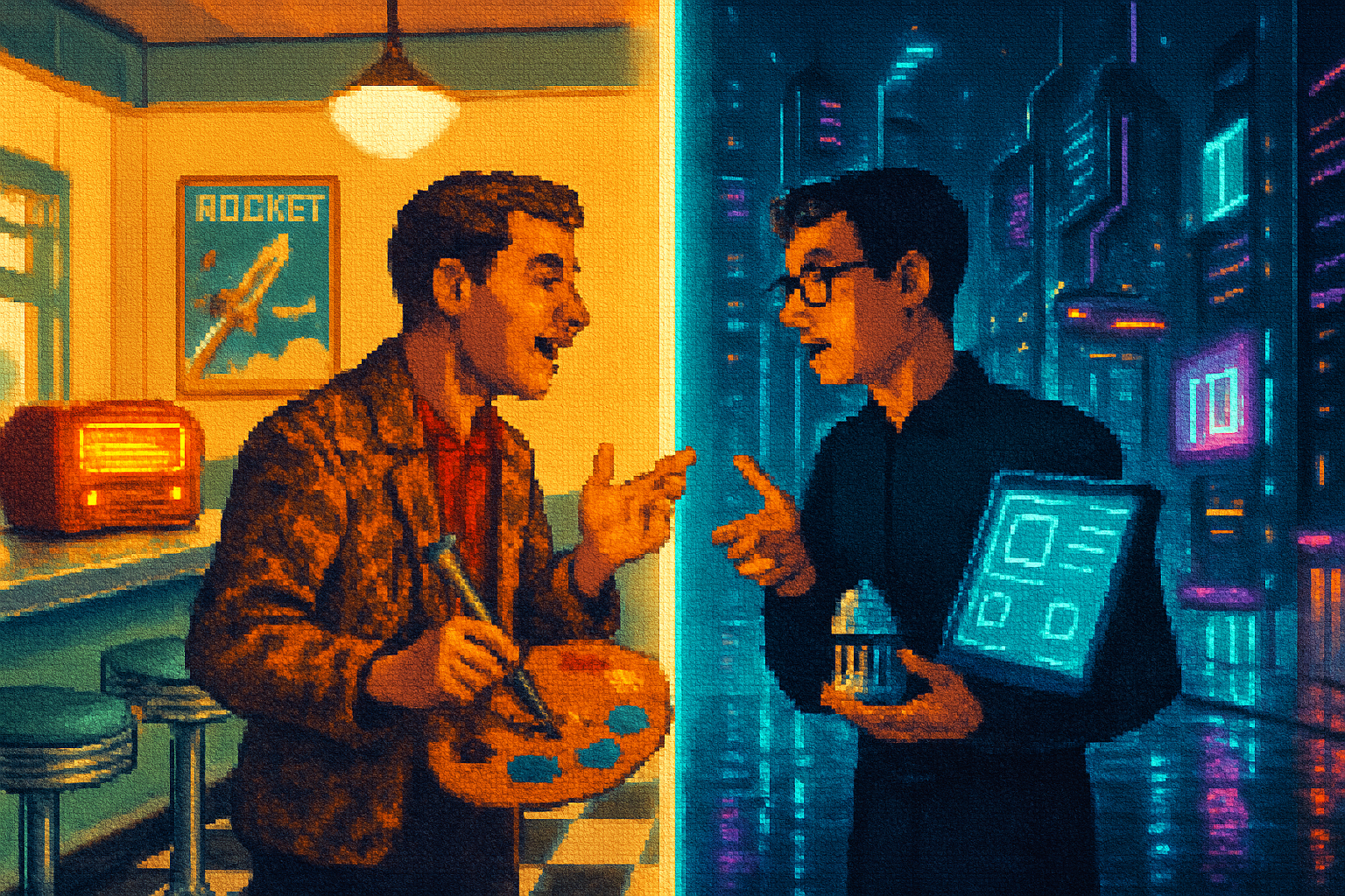
How these principles show up today
- Apple Pencil and iPad Pro - The pencil proves the market wanted a pen-like instrument all along - but with better latency, pressure, and ecosystem polish.
- Surface and Samsung Notes - Pen-first tablets are mainstream, but few foreground recognition as Newton did.
- On-device ML - Phones now run complex models locally, aligning with Newton’s privacy-first experiments.
- Voice assistants - Siri, Alexa, and Google Assistant operationalize the Newton’s dream of a personal assistant - but they often flounder in privacy and intent understanding where a Newton-style, local-first approach might excel.
A small UX spec inspired by Newton
Here’s a minimal product idea capturing Newton’s lessons. Imagine a cross-platform note app called “Palimpsest” with three commitments:
- Smart ink - Handwriting is captured as ink plus lightweight on-device transcription. Each stroke is a first-class object.
- Cooperative recognition UI - The app shows three likely transcriptions under the handwriting with confidence percentages; a quick tap chooses the correct one and trains the model locally.
- Local-first sync - Notes are encrypted on device; sync happens peer-to-peer when authorized.
A tiny pseudocode sketch of the cooperative recognition workflow:
onStrokeEnd(stroke):
  candidates = localModel.recognize(stroke)
  displayCandidates(candidates)

onUserChoose(candidate):
  localModel.train(stroke, candidate)
  commit(transcription=candidate)
Yes, this is simple. That’s the point: Newton’s best ideas were deceptively straightforward and demanded craftsmanship more than complex engineering theater.
The human argument: why sentimental tech matters for moral design
We fetishize novelty and deride failure. The Newton sits between those poles: an earnest, flawed effort that insisted computers should be as tolerant and idiosyncratic as their humans. That insistence has ethical implications. If we design systems that cannot tolerate human messiness, we design systems that demand perfection - and that’s a moral stance. The Newton argued for a kinder contract between machine and human: I will try to understand you, even when you’re clumsy.
Designers who ignore that contract end up with polished, efficient tools that are cold and brittle. The Newton’s greatest lesson is not its UI innovations in isolation, but its ethos: design with humility toward human foibles.
Final verdict: obsolete? Yes. Irrelevant? Not at all.
The Newton lost the marketplace and the punchlines. But its design DNA is in the devices we now accept as normal: pen-enabled tablets, on-device machine learning, and assistants that try (clumsily) to understand us. The Newton matters because it reminds us that some product ideas are ahead of their ecosystem, and some failures forge the path for future success.
If you ever come across one in a box, tap the stylus against the screen and pretend your handwriting is poetry. The Newton may not understand every word, but it will approve of the attempt.
References
- Apple Newton - Wikipedia: https://en.wikipedia.org/wiki/Apple_Newton
- Ars Technica retrospective on early PDAs and the Newton: https://arstechnica.com/