· culture · 5 min read
The Silent Symphony of 90s Minimalism: Why Less is More in Today's Tech
How the pared-back, function-first products of the 1990s offer a blueprint for modern tech design - reducing cognitive load, extending product lifespan, and creating more humane digital experiences.
Introduction
The 1990s were an odd paradox: explosive technological innovation wrapped in a surprisingly restrained aesthetic. While the decade delivered new functionalities - mobile phones, PDAs, early web browsers - many devices favored clarity over ornament. That restrained approach, which I call “the silent symphony of 90s minimalism,” offers lessons that feel urgent today: remove noise, highlight purpose, and build for longevity.
What 90s minimalism looked like (and why it mattered)
In the 90s, minimalism showed up in hardware and software alike:
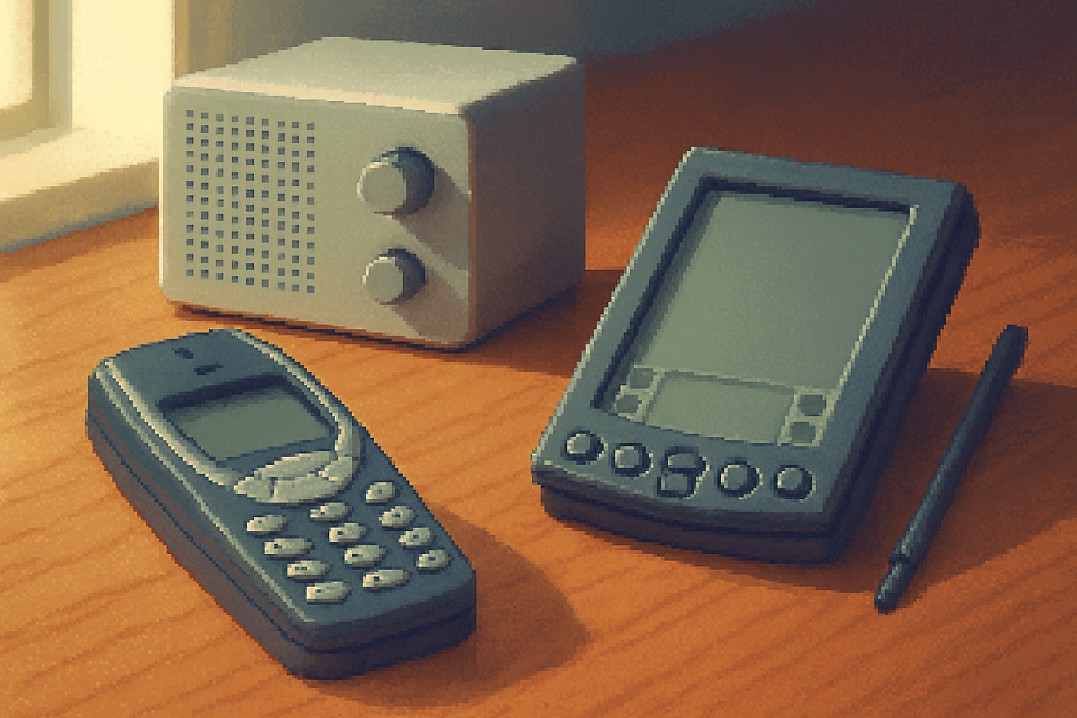
- Devices with clear, legible displays and tactile buttons (Nokia 3310, Motorola StarTAC).
- Single‑purpose portable computers like the Palm Pilot emphasizing the job to be done.
- Industrial design that favored simple geometry, restrained color palettes, and visible, honest materials (the heritage of Braun and designers like Dieter Rams).
These choices did more than look calm - they reduced cognitive load, made devices reliable, and let users accomplish tasks without distraction.
See a concise set of design principles from Dieter Rams here: Dieter Rams’ 10 principles.
The core principles behind that aesthetic
The 90s’ minimalist spirit rests on a handful of repeatable principles designers can apply today:
- Purpose-first
- Every element exists to support a clear user task. If it doesn’t, it doesn’t belong.
- Constraints as creativity
- Limited screen size, simple input methods, and lower processing power forced better prioritization.
- Legibility and affordance
- Type, icons, and controls communicated function directly - no guesswork.
- Feedback and predictability
- Actions yielded immediate, understandable responses - clicks, beeps, battery icons.
- Durability and repairability
- Products were often built to last - simpler mechanisms, fewer fragile parts.
- Aesthetic honesty
- Materials and function matched appearance - no faux chrome or gratuitous gloss.
These ideas echo older architectural tenets - “less is more” - associated with Ludwig Mies van der Rohe (source).
Why ‘less’ is more important than ever
Technology today can do almost anything. That freedom makes restraint valuable for several reasons:
- Attention scarcity - Users are overwhelmed; simpler choices reduce decision fatigue.
- Sustainability - Fewer features can mean fewer resources used, longer lifespans, easier repair.
- Speed and reliability - Less surface area for bugs and performance issues.
- Differentiation - In a world of feature bloat, simplicity stands out.
- Ethical design - Reducing addictive or manipulative elements supports healthier user relationships.
The concept of designing technology that recedes into the background and respects attention ties into the idea of Calm Technology.
Concrete ways to apply 90s minimalism to modern products
Here are practical patterns you can adopt, whether you’re designing hardware, a mobile app, or a web service:
- Make core tasks frictionless
- Identify the 1–3 tasks your product truly exists to accomplish. Make them quicker than any alternative.
- Use progressive disclosure
- Surface essential controls first; hide advanced options behind deliberate choices.
- Default well
- Sensible defaults remove configuration burden for most users and reduce errors.
- Reduce visual noise
- Limit palette, reduce competing type sizes, and embrace whitespace.
- Emphasize affordances
- Controls should suggest interaction. Microcopy and subtle motion help here.
- Optimize for recoverability
- If things go wrong, provide clear undo paths and transparent feedback.
- Prioritize performance over polish
- Fast, reliable experiences feel simpler and more trustworthy than flashy but laggy ones.
- Design for longevity
- Modular hardware, clean APIs, and clear data export paths help users keep and move their data.
Example micro-UX decisions inspired by the 90s
- Replace a complex toolbar with a contextual action sheet.
- Swap a decorative animation for an instant state change and a clear success message.
- Present a single, primary CTA instead of multiple competing actions.
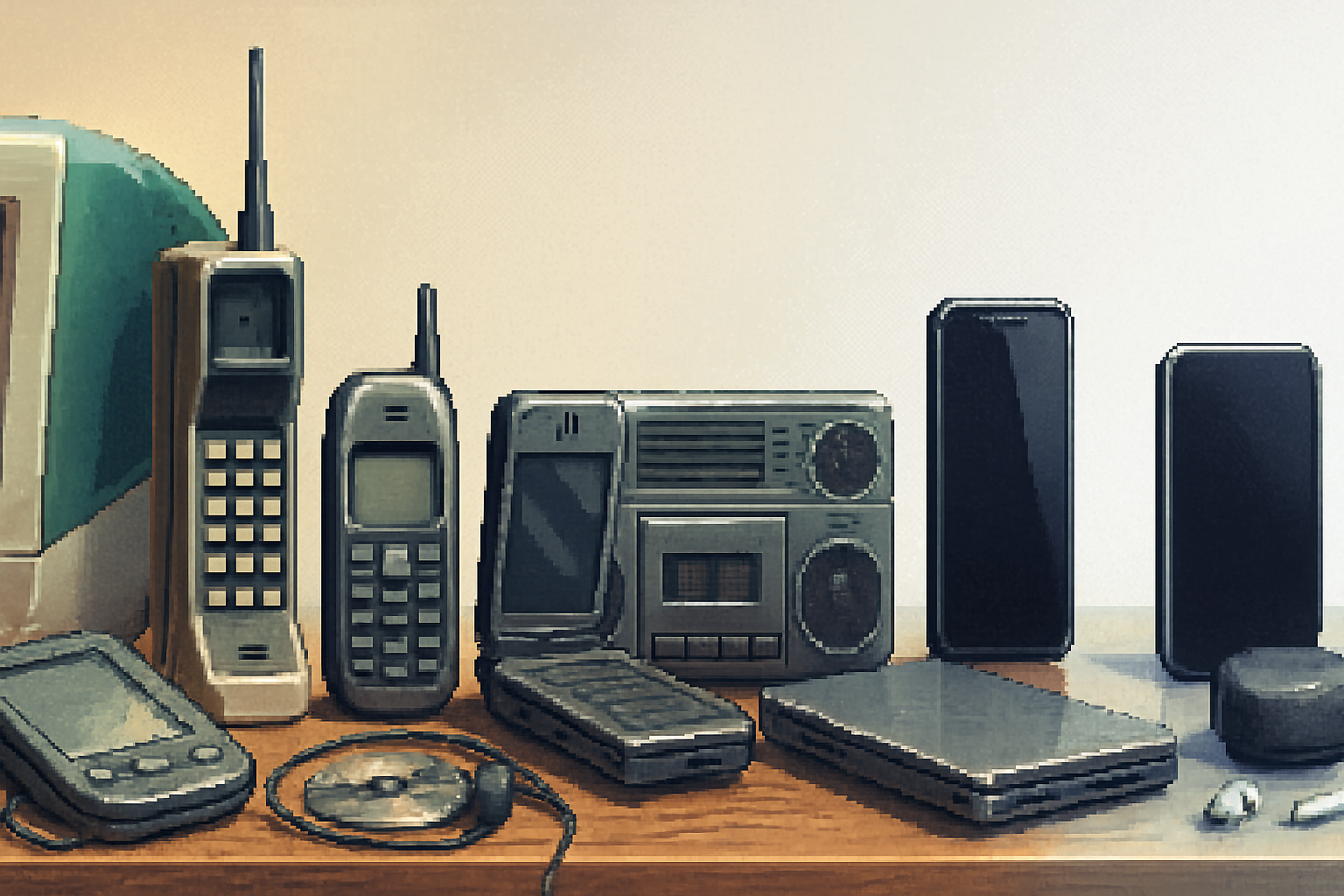
Mini case studies: 90s devices that still teach us something
Nokia 3310 - legendary for battery life, durability, and a clutter-free interface. Its success came from prioritizing core communication functions and making them extremely reliable (Nokia 3310).
Palm Pilot - a focused PDA that emphasized core workflows (contacts, calendar, notes). Its tight focus and simple sync model made it incredibly useful despite minimal horsepower.
Braun (inspiration for many later designers) - industrial design that favored clarity and function; its influence is visible across modern consumer electronics (Dieter Rams reference).
A practical checklist for designers and product teams
Use this as a quick audit before adding new features or redesigning flows:
- Does this feature enable a primary user task? If not, remove or postpone.
- Can the UI present the same information with fewer elements?
- Are the most common actions one tap/click away?
- Is the language simple, direct, and free of jargon?
- Does the component have a clear affordance and predictable feedback?
- Will this scale well under constrained networks or older hardware?
- Can this be made repairable, migratable, or exportable for sustainability?
If you answer “no” more than twice, you likely need to simplify.
Challenges and trade-offs
Minimalism isn’t a silver bullet. Some pitfalls to avoid:
- Oversimplification - Removing necessary features frustrates power users.
- Aesthetic minimalism vs. functional minimalism - A sparse UI can still hide complexity behind poor flows.
- Misapplied nostalgia - Imitating the look of 90s devices without adopting their functional clarity results in hollow retro design.
Balance is the goal: simplicity that supports capability, not capability sacrificed for a look.
Conclusion
The 90s showed that powerful technology needn’t scream for attention. The quiet confidence of those products came from explicit choices: reduce noise, make intent visible, and build for real human needs. Today, when attention is the most precious resource and sustainability matters more than ever, those choices no longer feel quaint - they feel essential.
Apply the silent symphony of 90s minimalism by prioritizing tasks, constraining creatively, and designing for longevity. In doing so you’ll create products that don’t just do more - they do what matters, more gracefully.
References
- Dieter Rams - 10 principles: https://www.vitsoe.com/us/about/dieter-rams
- Calm technology: https://en.wikipedia.org/wiki/Calm_technology
- Ludwig Mies van der Rohe (“Less is more”): https://www.britannica.com/biography/Ludwig-Mies-van-der-Rohe
- Nokia 3310: https://en.wikipedia.org/wiki/Nokia_3310