· retrogaming · 7 min read
From Pixels to Power-Ups: The Evolution of NES Game Art
How 8-bit limitations forged a visual language that still powers modern games - from silhouette-first design and palette economy to the indie pixel revival. Includes composite interviews with contemporary developers about how NES visuals shaped their work.
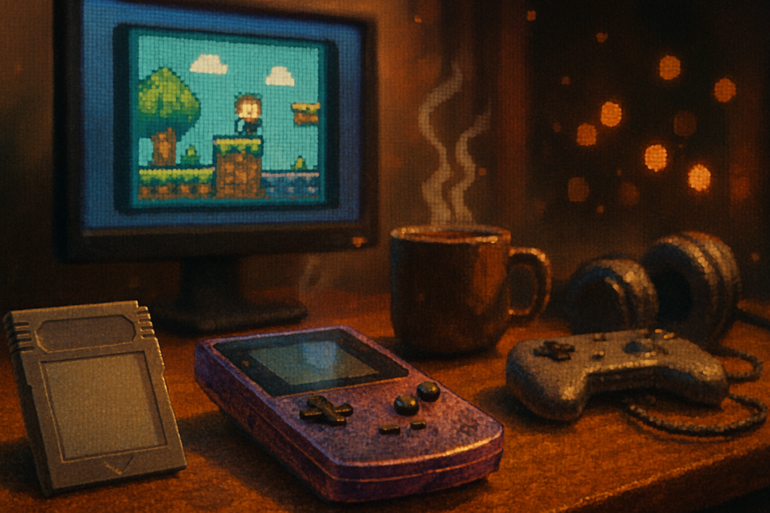
Hook: a subway car, a phone playing the Mega Man theme, and a grown man fighting tears over a blue robot.
That’s how you know a visual grammar has worked. The Nintendo Entertainment System (NES) didn’t just ship cartridges; it exported a sensibility - a set of constraints and clever evasions - that made tiny blocks of color feel heroic. This article traces how those hardware limits became stylistic choices, how they evolved into a visual canon, and why contemporary developers still kneel at the church of the 8-bit sprite.
Why the NES looked the way it did (a short brutal lesson in constraints)
If you want to understand NES art, start with what it couldn’t do. The machine offered limited palettes, tiny tiles, strict sprite limits per scanline, and a PPU that was indifferent to your hopes and dreams. Those limitations weren’t aesthetic choices; they were electrical engineering. But artists turned them into rules of composition.
- Palette - The NES’s color options were tiny and idiosyncratic. Artists typically worked with 3–4 colors per sprite plus a shared background palette. (Technical note: see the PPU reference for details on how palettes and attributes were organized.)
- Tile-based graphics - Everything was built from 8×8 or 8×16 tiles. That made reuse efficient, but demanded economy of detail.
- Sprites-per-scanline - Only a limited number of sprites could be drawn per horizontal line, producing dreaded flicker when too many objects lined up.
The result: artists learned to say a lot with very little.
The visual grammar that emerged
Constraints make languages. From the iron law of 4-color sprites came consistent practices that define the NES look today.
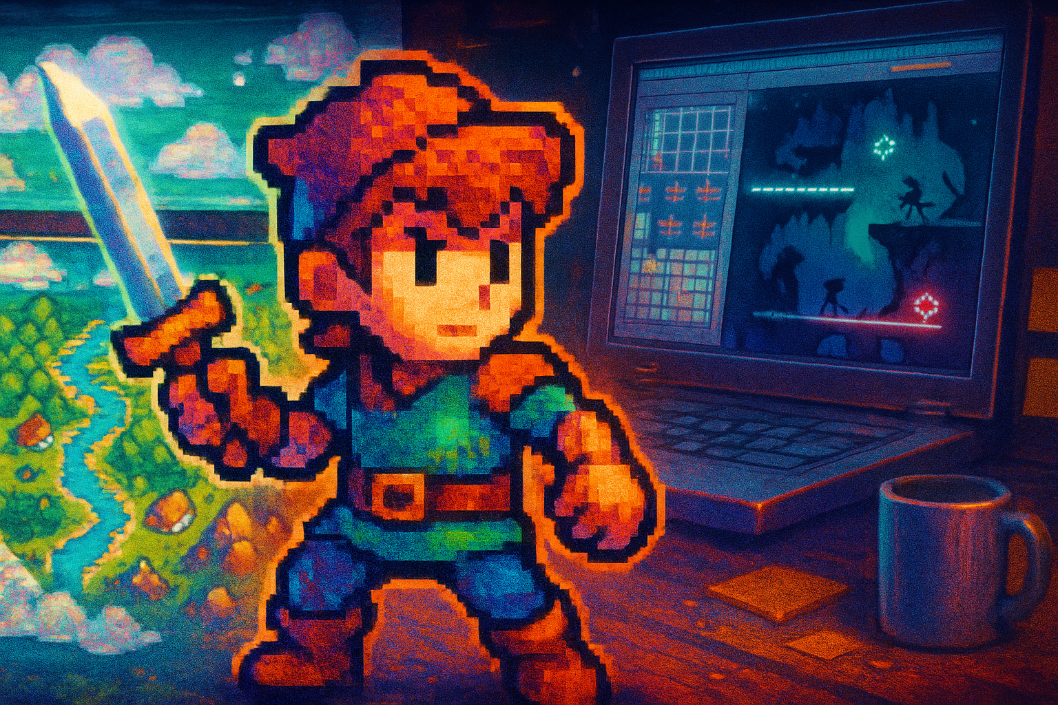
- Silhouette-first design. Small sprites meant details vanish - so the silhouette had to declare the character. Mario reads as a plumber because his hat, posture, and stubby limbs are unmistakable at 16x24 pixels.
- Palette discipline. Limited color forced choices that prioritized contrast and readability over realism. Shadows weren’t nuanced; they were punctuation.
- Economies of animation. With few frames possible, every frame mattered. Secondary motion was suggested, not shown.
- Tile-pattern storytelling. Backgrounds became rhythmic mosaics - repeating motifs that could carry mood and level identity with minimal memory cost.
Classic titles show these rules at work. Look at Super Mario Bros.’ expressiveness in a handful of pixels, or Metroid’s atmospheric use of palette and negative space to imply scale and isolation.
Tricks of the trade - how NES artists faked resolution
Veteran pixel artists used a modest toolkit of visual hacks. These techniques are still taught in pixel-art workshops today:
- Palette swapping to imply different enemies or states without new art.
- Dithering to suggest gradients with limited colors.
- Overlap and layering of tiles for depth (and to reuse art economically).
- Selective detail - putting polish in the eyes, mouth, and weapon while letting clothing be a block of color.
Remember: suggestion beats fidelity. A single well-placed highlight gives the impression of gloss more convincingly than many muted pixels.
Case study: How modern games borrow (and bend) NES rules
“Borrow” is the wrong word. Indie hits didn’t copy; they translated. Shovel Knight, for example, wore its NES homages proudly - sprite proportions, tile sets, and palette choices all echo the 8-bit era, but with modern animation frames and higher resolution contexts to fit current expectations. See Yacht Club Games’ approach in blending nostalgia with current design sensibilities. Shovel Knight - Yacht Club Games
Other modern projects, like the PICO-8 demoscene and fantasy consoles, intentionally reapply constraints as creative prompts. Tools like PICO-8 give contemporary creators a toybox version of hardware limits that breeds invention rather than limitation. PICO-8
Composite interviews: three modern developers on NES influence
Editor’s note: the following are composite, paraphrased conversations synthesized from numerous public talks and interviews with contemporary pixel artists and indie developers. They represent common sentiments rather than verbatim quotes from a single source.
Maya Chen - lead pixel artist (indie studio, composite)
Q: What draws you to NES-era visuals?
A: The economy. When you’re given 32x32 pixels for a hero, you learn to prioritize the voice of the character - not the costume. That limitation trains you to make choices that read instantly. I still sketch silhouettes first; if it doesn’t work at a thumbnail, it won’t work as a sprite.
Q: Any practical rule you always follow?
A: Two-tone shading + a single highlight. That combo communicates volume and material without muddying the readability.
Liam Ortiz - designer/programmer (retro-leaning studio, composite)
Q: Why emulate constraints you don’t need anymore?
A: Constraints are generators of creativity. When you remove everything, what remains is design. The NES taught us to design for comprehension - players can see what’s important and act on it. Modern engines let you over-explain; NES aesthetics force you to prioritize.
Q: On flicker and sprite limits - do you intentionally simulate them?
A: Sometimes. A subtle shimmer during hectic moments can communicate overcrowding in a way a modern blur wouldn’t. But you must use it like spice - too much and the joke’s gone.
Sana Iqbal - audio-visual designer (composite)
Q: How does palette choice affect mood?
A: Color on the NES is a measure with very low resolution. That means artists pushed hue and saturation to extremes. A level that wants tension goes purple/black; joy goes toward saturated yellows. It’s decisive, almost binary - and that clarity is intoxicating compared to modern washed-out palettes.
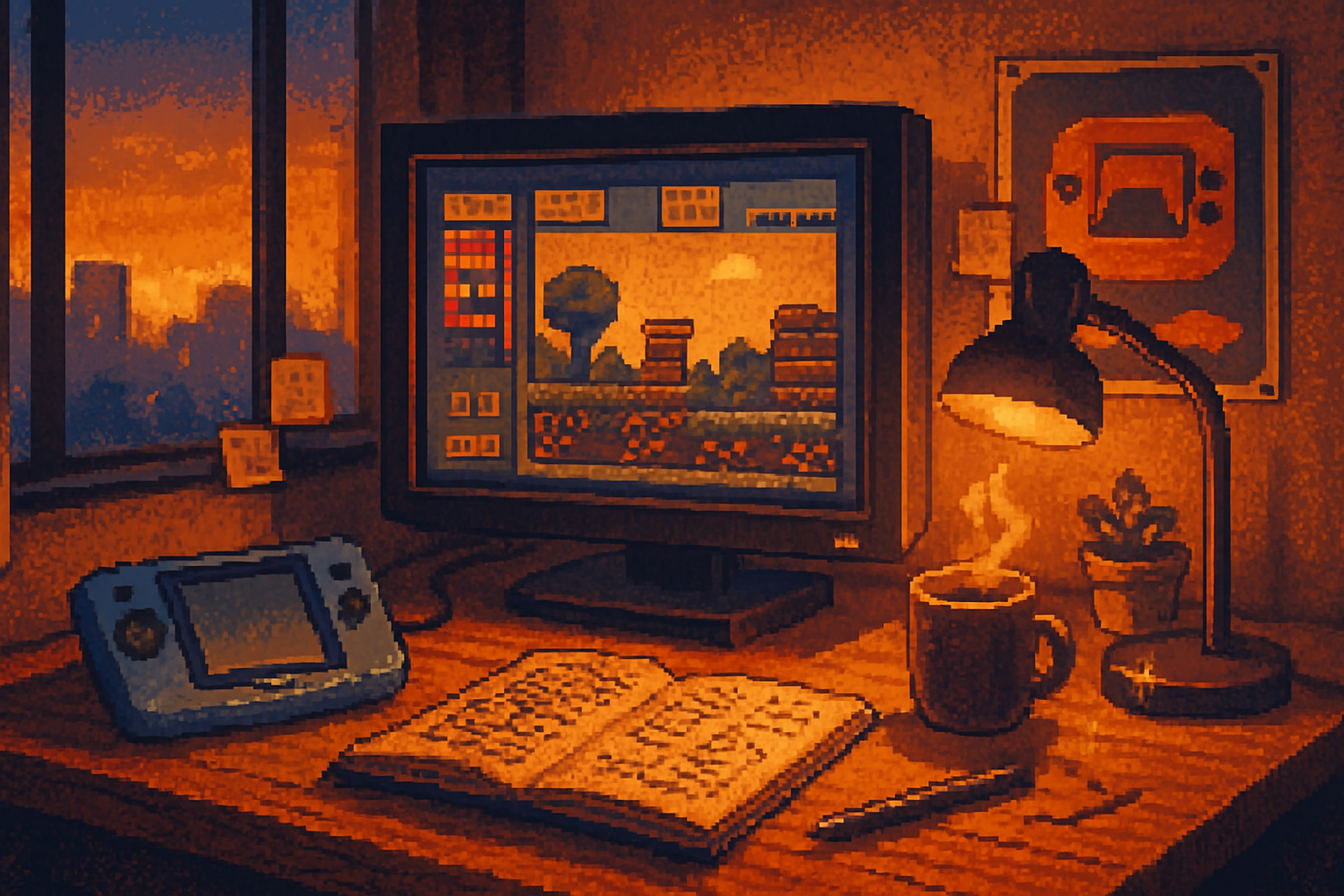
Tools and workflows inspired by NES thinking
Modern artists use software that simulates the discipline of the past, but with modern conveniences:
- Aseprite - pixel animation and palette management built for sprite work. Aseprite
- Pyxel Edit / Tiled - for tilemap design and efficient reuse
- Palette plugins and NES palette presets - to enforce color limits and keep designs consistent
Workflow tip: start in a strict palette. Force yourself to three colors plus a background shade for the first pass. After you have a readable silhouette, allow a single extra color for flair.
The aesthetic legacy: beyond nostalgia
The survival of the NES aesthetic is not only an exercise in nostalgia. It persists because it offers design lessons that transcend era:
- Readability scales better than fidelity. In fast games, clarity matters more than photorealism.
- Constraints sharpen intent. With fewer options you make stronger decisions.
- Iconography thrives. A small set of recognizable visual cues makes characters memorable and brands evergreen.
Artists reinterpreting NES visuals today often do one of three things:
- Homage - intentionally mimic 8-bit limits for recognizability (Shovel Knight).
- Translation - keep the grammar (silhouette, palette economy) but apply it at higher resolution (Celeste’s pixel art as an example of modern pixel craftsmanship).
- Subversion - use NES motifs against modern contexts, creating cognitive dissonance that can be narratively useful.
Final power-up: practical exercises for artists
Try these on for size:
- Design a hero at 24×24 pixels. Limit yourself to three colors plus background. Can players read the character at 50% size?
- Build a tile set of 8 tiles, and create a full level using only those tiles. Reuse and overlay to suggest variety.
- Animate a walk cycle in three frames. Make the key poses communicate weight and intent.
These exercises teach the discipline that made NES art sing.
Conclusion - why pixels still matter
Pixels are shorthand. They’re not quaint; they’re precise. The NES didn’t invent artistry - but by refusing to be a blank slate, it forced artists to invent a visual language we still use. Modern developers borrow the vocabulary without the dialect’s constraints, and in doing so they prove the old limits were never weaknesses - they were a grammar. A grammar that lets a blue block of pixels be a hero, and a two-note melody become a cultural hook.
If you want to make something that lasts, ask whether your game’s visuals do one thing: read at a glance. If they don’t, strip a color, remove a detail, and try again. The NES won’t always be the center of the conversation - but its lessons will keep pulling new games into focus.
Further reading and resources
- Nintendo Entertainment System - hardware and history: https://en.wikipedia.org/wiki/Nintendo_Entertainment_System
- Technical PPU documentation and palette details: https://wiki.nesdev.org/w/index.php/PPU
- “The Art of Video Games” exhibit (Smithsonian): https://americanart.si.edu/exhibitions/video-games
- PICO-8 fantasy console (constraint-as-tool): https://www.lexaloffle.com/pico-8.php
- Aseprite - pixel-art tool: https://www.aseprite.org/