· retrogaming · 7 min read
From Pixels to Pixels: How Sega Game Gear Classics Inspired Modern Indie Games
How a battery-hungry pocket Sega console taught a generation of makers to think small, color boldly, and design games that fit in a single glance. An essay on the Game Gear’s aesthetic and mechanical fingerprints in today’s indie scene, with developer vignettes and practical design advice.
A thrift-store miracle and a lesson in limits
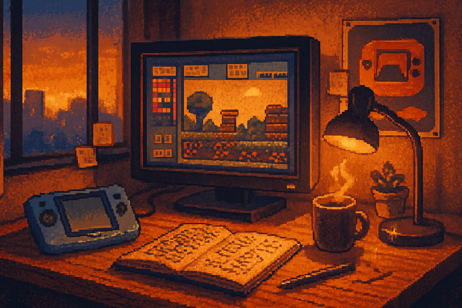
I found one in a cardboard box at a flea market: a scuffed, cobalt-blue Game Gear with two dead AAs still in the battery compartment and a sticky Start button. Booting it felt like sticking my head back into someone else’s childhood - noisy, bright, and stubbornly uncompromising. The screen cropped the world into a narrow window; every pixel mattered.
That cramped, stubborn window is the secret sauce. The Sega Game Gear was a technical compromise (and a commercial underdog), but its constraints forced designers to be economical: bold color, tight level design, readable sprites, and picks for pacing that favored short, intense play sessions. Those rules-born of plastic, heat, and battery drain-are the same little rules that indie teams rediscover when they want to make something that hits quickly and lingers.
This essay traces that lineage: how the Game Gear’s visual and mechanical DNA has reappeared in modern indie titles, why those features matter today, and what contemporary creators borrow (and refuse) from Sega’s pocket relic.
Tiny console, outsized lessons: what the Game Gear taught designers
Sega’s Game Gear (1990) was an 8-bit handheld that tried to outshine Nintendo’s Game Boy with a backlit, full-color display. It was impressive in the moment, but penalized by poor battery life and a bulky body. What mattered was less its market fate and more the constraints it created for gameplay and art:
- Color economy. Unlike home consoles that could spread a scene across a big CRT, the Game Gear demanded palettes that read at a glance. Designers learned how to use saturated tones and high-contrast outlines.
- Screen real estate. The visible area forced tight composition. Foreground patterns, enemy placement, and platform spacing were optimized for a single, small viewport.
- Readability over detail. Sprites had to be legible in a few pixels. Animations emphasized silhouette and timing rather than flourishes.
- Short-session design. Portability meant players dropped in and out frequently. Levels and mechanics needed to be engaging in two- to ten-minute bursts.
If you want the forensic details, the Game Gear’s hardware is chronicled here: https://en.wikipedia.org/wiki/Game_Gear. For a broader context on indie games drawing from older hardware aesthetics, see: https://en.wikipedia.org/wiki/Indie_game and https://en.wikipedia.org/wiki/Pixel_art.
Why indies keep borrowing from a busted blue brick
There are three reasons modern indie developers return to Game Gear-like sensibilities:
- Constraints breed clarity. When you force decisions-limited palette, small resolution-you prune indecision and focus on a single readable idea per screen.
- Emotional shorthand. The saturated, high-contrast look telegraphs feelings fast - menace, speed, or whimsy in one glance. It’s efficient storytelling when screen time is short.
- Portable-first habits. Today’s players often game on subway commutes, lunch breaks, and short commutes. The Game Gear’s session design is a natural fit for mobile-first expectations.
But it’s not just nostalgia. The Game Gear aesthetic addresses present problems: discoverability in crowded marketplaces, low production budgets, and the need for instantly comprehensible visuals across tiny app thumbnails and streaming thumbnails.
Conversations at the pixel forge (fictionalized vignettes)
Below are three short developer vignettes. These are composite conversations that reflect common experiences among indie creators who cite retro handhelds as reference points.
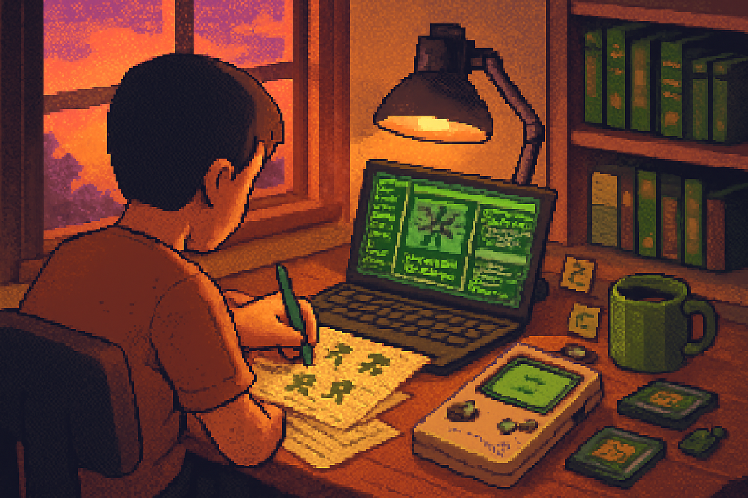
Maya Ortiz - lead designer, Tiny Drift Studios
“We designed our platformer around one truth: players will see the screen for a second while on the bus. So every decision had to land fast. The Game Gear taught me to treat the viewport like a billboard. If a threat doesn’t read in one beat, it doesn’t belong.”
Maya’s team used hard outlines and boosted midtones to make enemies and jump arcs readable at low resolution. They limited each level to three interactive elements at any time: enemy, obstacle, and collectible-an explicit nod to the Game Gear’s economy.
Noah Kim - solo dev, Lumen & Co.
“Aspect ratio is underrated. The Game Gear forced a tall, portrait-friendly framing in some stages and a narrow horizontal in others. We mimicked that variable framing to design ‘pocket levels’-short, self-contained rooms that felt like home-cooked versions of Mega Drive stages.”
Noah emphasized UI minimalism: no HUD clutter, only contextual icons that appear when necessary. The result is a game that feels calm at launch but tense the moment you touch the controls-like the Game Gear’s sudden focus amid chaotic color.
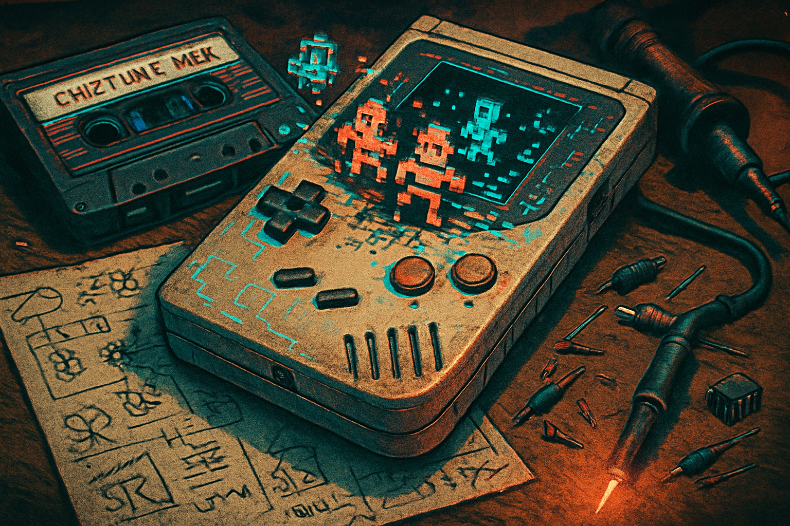
Etsuo Tanaka - composer & coder, Folded Pixel
“Sonically, the Game Gear is a lesson in limitations. Its PSG sound had a particular twang that left space for melody rather than fidelity. We used a modern chiptune engine but intentionally limited channels and waveforms to capture that nostalgic sparseness.”
Etsuo’s soundtrack avoids lush pads; instead it favors short motifs repeated and varied. The aesthetics of empty sonic space mirror the visual economy on screen.
Concrete design techniques borrowed from Game Gear classics
If you want to channel Game Gear energy without copying it blindly, try these practical techniques:
- Resolution-first mockups - Start your level design in a 160×144-ish canvas (Game Gear’s visible area varies in emulation). Design every screen to be readable there before scaling up.
- Palette discipline - Restrict palettes to 6–12 dominant colors per scene. Use one accent color for interactive objects.
- Silhouette testing - Reduce sprites to monochrome silhouettes during early testing. If the silhouette communicates the action, the sprite will work scaled back up.
- Micro-session loops - Design mechanics so that a meaningful action can occur in 30–90 seconds. Build larger flows from concatenated micro-sessions.
- Intentional audio scarcity - Limit concurrent sound channels and focus on distinct, rhythmic hits that cut through the music.
- Screen framing as gameplay - Use the viewport edges to telegraph incoming threats-don’t rely on offscreen cameras the player can’t scan at a glance.
What to avoid: nostalgia as wallpaper
There’s a common trap: slapping scanlines, cheap CRT filters, and a Game Gear-blue palette over a modern design and calling it retro. That’s decoration, not method. Avoid these mistakes:
- Cosmetic mimicry without constraint. If you don’t adopt rules (like palette limits or session design), the aesthetic will feel empty.
- Overcrowding for the sake of detail. More pixels don’t make a scene more readable.
- Using hardware limitations as a creative excuse. The point of constraints is to force decisions, not to handwave them away.
Case studies: a few ways Game Gear fingerprints show up in modern releases
- Platformers that emphasize silhouette and pacing over animation frippery. (See countless pixel indie titles that choose readable enemy shapes over elaborate frames.)
- Mobile puzzle games that present one-screen problems with bold color rules - the carriage of Game Gear’s quick pick-up sessions.
- Chiptune-driven soundtracks that intentionally limit channels and timbres to mimic PSG clarity.
If you look at the indie landscape, the influence is often structural rather than literal. It’s about a philosophy of design: reduce, highlight, and make impact immediate.
A modest manifesto: what modern creators can steal from the Game Gear
- Think in viewports, not rooms. Design the player’s experience as a single composed image.
- Make every color earn its place. If a hue doesn’t communicate gameplay, cut it.
- Prioritize a single, memorable mechanic per session. Complexity can be layered later.
- Use constraints as a creative engine, not a comfort blanket.
These are not rules to shackle creativity but tools to sharpen it. The Game Gear didn’t make better games because it was the most powerful machine; it made designers work with what they had and produce clarity out of scarcity.
Final frame
The Game Gear was a flawed product that taught durable lessons. Its heritage lives in tiny indie studios that prefer surgical clarity over glacial scope, in soundtracks that say more with less, and in levels composed like postage-stamp posters.
The next time you see a bruised-blue handheld at a garage sale, remember: it’s not just nostalgia you’re holding. It’s a blueprint for how to trim a game down to its heart and make every pixel pulsing with intent.