· culture · 6 min read
Retro Rebellion: How 90s Minimalism Influences Modern Day Tech Activism
The clean, spare interfaces of the 1990s - born of constraints, clarity, and a stubborn devotion to usability - offer a surprisingly potent playbook for today's privacy-focused tech activists. This piece traces the lineage and extracts concrete design rules for building ethical, user-first digital tools.
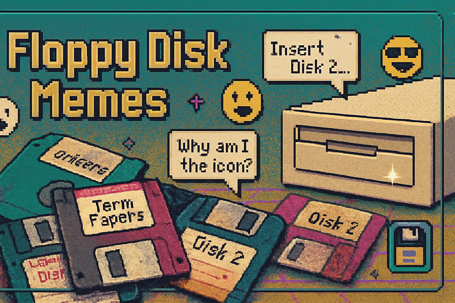
I found a cracked Netscape Navigator CD in a thrift shop last year. I booted an ancient laptop, typed an address into an address bar that still felt honest, and the web felt impossibly simple: one clear task, one obvious affordance, no notification hell, no dark-pattern bribery. It was like watching a public square before billboards learned to scream.
That feeling - the austere clarity of interfaces and interactions from the 1990s - is not just stylish nostalgia. It’s a disciplined, user-centered design language that modern tech activism can and should borrow. If privacy is an ethical stance, minimalism is a strategy: reduce surface area, reduce deception, increase comprehension.
The 90s minimalism I actually mean
When people say “90s design” they often mean everything from gaudy geometric web backgrounds to early skeuomorphism. I mean the opposite: the restrained, workmanlike minimalism that emerged across hardware and software in response to constraints and a growing human-centered design ethic.
Key influences and precursors:
- Dieter Rams’ principles of good design - the idea that less but better matters - filtered through consumer electronics and UI thinking (Vitsoe/Dieter Rams).
- Don Norman and the rise of user-centered thinking, which emphasized affordances, mental models, and error prevention (Don Norman).
- The early Web’s blank-slate pages and single-purpose tools - search engines like Google launched with one obvious box, because it worked.
- The 1990s crypto and digital-rights movements - tools like PGP (1991) and organizations like the Electronic Frontier Foundation (founded 1990) that insisted users could - and should - control their digital self (
There was nothing quaint about this restraint. It was tactical: fewer features, cleaner mental models, and clearer defaults made software usable and trustworthy.
Why minimalism is a natural ally to tech activism
Tech activism argues that technology should respect human dignity, privacy, and autonomy. Minimalism advances that argument in three tight moves:
- Clarity beats obfuscation. Minimal interfaces make choices visible. If you want users to opt out of tracking, you can’t bury it beneath six nested menus.
- Less surface area = less attack surface. Every unnecessary feature is an extra place for bugs, leaks, and surveillance.
- Defaults matter morally. A minimal product encourages clear, privacy-friendly defaults instead of manipulative opt-outs.
Put bluntly: you cannot credibly claim to put users first while designing labyrinthine settings pages that require a decoding ritual worthy of an occult society.
Concrete 90s-inspired design principles for privacy-first products
Below are practical, actionable principles product teams can steal from the 90s minimalists.
- Reduce the UI to its core task.
- Ask - what is the one thing the user needs to do? Center it. Sidebars and cruft can wait.
- Make privacy visually and interactively obvious.
- Use clear icons, short microcopy, and immediate feedback when data is collected or shared.
- Favor progressive disclosure over hidden complexity.
- Hide advanced options behind a clear “Advanced” toggle rather than burying them in menus.
- Set privacy-protecting defaults.
- Defaults are persuasive. Make the safe choice the path of least resistance.
- Design affordances that teach.
- Let the interface educate rather than obfuscate. Tooltips, inline explanations, and simple metaphors help.
- Embrace transparent failure modes.
- If a feature fails or blocks a request (e.g., blocked tracking), show a simple reason. Leave users in control.
- Keep the surface area small.
- Fewer integrated features means fewer permissions, fewer third-party calls, fewer ways to leak data.
- Make cryptography social, not ceremonial.
- The 90s crypto movement proved tech can protect users - but not if it’s unusable. Wrap crypto in honest, discrete UI that teaches gradually.
These are not just design dicta; they are the architecture of trust.
Case studies: when retro minimalism succeeds (and sometimes still stumbles)
- Signal
- Minimal, single-purpose, and relentlessly focused on private messaging. Signal’s interface keeps attention on conversations and the privacy affordances are visible, not performative (Signal).
- DuckDuckGo
- A search engine that trades the ad-supported surveillance model for an economy of simple, privacy-forward choices. The homepage is a lesson in the power of a single focused task (DuckDuckGo).
- Brave
- A browser that foregrounds blocking and control. Its approach shows both the power and limits of minimalism - removing trackers is simple; remaking the economics of the Web is not (
A cautionary note: PGP was brilliant, indispensable, and famously unusable for most people. Even perfect technology fails if the UX is hostile. Minimalism without careful onboarding and humane metaphors can be cold and exclusionary.
A tactical checklist for product teams
If you’re building a privacy-first product and want to apply 90s minimalism as a method, try this checklist during discovery and design sprints:
- Define the single user goal for the core flow and remove everything that doesn’t support it.
- Audit every UI element against a privacy-impact rubric - does this increase data collection or cognitive burden?
- Set privacy-protecting defaults and document why each default exists.
- Prototype with actual non-technical users; measure comprehension of privacy affordances within five minutes.
- Use plain language for permissions and settings; outlaw euphemism and legalese in UI copy.
- Run a third-party dependency audit - fewer CDNs, fewer trackers, fewer servers.
- Treat error states as opportunities to educate - “This blocked tracker tried to fingerprint you - here’s what that means.”
Trade-offs and the danger of tasteful greenwashing
Minimalism can be faked. A product can look beautifully simple while funneling data to opaque ad networks. That is aesthetic liberalism: pretty on the surface, mendacious underneath.
Two hard truths:
- Simplicity can hide surveillance if you design permissive back-ends. Minimal UI is not a substitute for privacy engineering.
- Over-simplification can exclude. Reducing options may help novices but frustrate power users. The answer is progressive disclosure, not paternalism.
Ethics require both form and substance.
Design is politics - but also arithmetic
Minimalism isn’t a nostalgic style choice. It’s a set of constraints that map directly to risk and agency. Every button removed is a potential leak closed. Every clear affordance is a moment where a user retains control instead of being nudged, tricked, or sold.
The digital civil liberties movement of the 1990s - PGP, early EFF battles, the cypherpunks’ insistence on usable encryption - bequeathed us a thesis: privacy is possible, but only if tools are built for real humans. That thesis is as true now as it was when modems screamed and web pages were plain HTML.
We can be fashionable about it. We can wear the spare aesthetics of a vintage interface like a political uniform. But the lure of style must not outrun the work. Minimalism is not merely an aesthetic wink; it is a tactical stance.
If you want to build products that honor user sovereignty, start by asking how much you can remove. Then remove more.
References
- Dieter Rams - Principles of Good Design: https://www.vitsoe.com/gb/about/dieter-rams
- Don Norman / JND - user-centered design writings: https://jnd.org/
- Electronic Frontier Foundation - about: https://www.eff.org/about
- Pretty Good Privacy (PGP) - history: https://en.wikipedia.org/wiki/Pretty_Good_Privacy
- Signal: https://signal.org/
- DuckDuckGo: https://duckduckgo.com
- Brave: https://brave.com/