· retrotech · 6 min read
Reminiscing the Skins: A Look Back at Windows Media Player's Iconic Aesthetics
A nostalgic dive into the colorful, sometimes garish world of Windows Media Player skins - how they let users declare identity through interface, why that freedom faded, and what we lost when app UIs became identical.
It began with a neon swoosh and a badly anti-aliased play button.
I remember crouching over my cousin’s desktop in 2002 as she clicked ‘Apply’ and the whole player metamorphosed into something that looked like a chrome spaceship. The equalizer bars glowed hot pink. The playlist slid out like a secret drawer. For three afternoons we curated the perfect look - more important than the music itself.
That small ritual - installing and tweaking a skin - was not about functionality. It was a public act of identity: a wink to friends, a declaration on a classroom desktop, a private signature you left on your machine. Windows Media Player’s skins did something designers hadn’t fully admitted: they turned software into jewelry.
A quick primer: what were skins, and why did they matter?
Skins are user-changeable interfaces that replace an app’s default look with a custom visual theme. In the late 1990s and early 2000s, a triumvirate of cultural forces made skins ubiquitous:
- The rise of desktop media players (people ripping CDs, building MP3 libraries).
- The aesthetic chaos of Windows XP and desktop theming - everything was up for reimagining.
- A thriving, DIY online community that loved downloading, swapping, and making skins.
Windows Media Player (WMP) rode that wave. Alongside contemporaries like Winamp, WMP offered alternate “skins” that changed buttons, layouts, colors, and often animations. These were not mere color schemes; they were whole new instruments for expression.
For many, a skin was shorthand: goth, iTunes-clean, cyber, minimalist, techno, anime. Installing one was as intimate as choosing a ringtone or as conspicuous as slapping a bumper sticker on your laptop.
The aesthetics: earnest, tacky, brilliant
Skins ranged from elegantly restrained to aggressively baroque. A few recurring visual families dominated the era:
- Glass and chrome - metallic panels with reflective highlights, a late-modern optimism.
- Neon and matrix - bright accents, glowing buttons, motion that suggested speed.
- Skeuomorphic kitsch - sliders that looked like old radios, faux-wood panels, stitched leather.
- Minimal “skins” that tried (and sometimes failed) to look like an ‘appliance’ rather than software.
And then there was the delightful kitsch - animated mascots, faux-3D beads, and accidental masterpieces where a designer discovered a genuinely beautiful form while trying to out-neon their competitors.
The visual decisions were often loud because they could be. Skins allowed for motion, texture, and composition in ways that static system themes did not. In short: they gave software personality.
Why skins mattered more than you think
Skins did three important things for users:
Identity work - People performed themselves through their interface. A player that looked like a minimalist living-room speaker said something different about you than one dripping in cyberpunk neon.
Ownership - Installing a skin felt like hacking your environment. You weren’t a passive consumer of a corporate UI - you were an author of your desktop.
Community - Skins were distributed, discussed, and remixed. Fan sites and message boards grew around sharing favorite themes and teaching novices how to make their own.
The result was an ecosystem where aesthetics and function co-evolved. Some skins introduced ingenious layout ideas (compact modes, tiny floating controls, integrated visualizers) that influenced later design thinking.
The cultural siblings: Winamp and the larger scene
It’s important to remember WMP did not exist in a vacuum. Winamp - the king of skins in the late ’90s - taught users to expect customization. Winamp’s community made skinning an art form, and WMP absorbed the lesson: people wanted to curate their software as they did their mixtapes.
This was a pre-mobile era where the desktop was a canvas. Social identity spilled onto the machine. The music player was both playback tool and billboard.
Why modern players abandoned this freedom
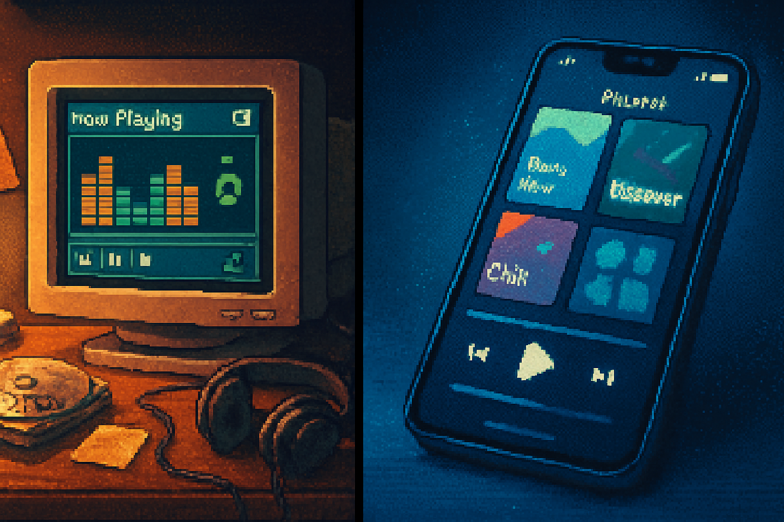
If you hop into Spotify or Apple Music today, you’ll notice a profound sameness. Here’s why skins went out of fashion:
- Platform consistency - Companies prioritize predictable interfaces so users can switch devices and still know where the play button lives. Uniformity reduces support costs and confusion.
- Brand control - Large platforms build design systems to preserve brand identity - every variation risks diluting the platform’s look and feel.
- Mobile chemistry - On phones, screen space and interaction patterns constrain radical reskinning. Gesture-driven apps don’t lend themselves to gaudy chrome.
- Security and stability - Allowing arbitrary UI replacements can become an attack surface or source of bugs across OS versions.
- Monetization and UX testing - Companies A/B test UIs to drive engagement and ad revenue; allowing wild variations complicates that.
In short: the economics and constraints of modern app ecosystems favor sameness over personal bricolage.
What we lost (and what we gained)
Lost:
- Playful personalization - the thrill of swapping skins was creative, social, and slightly subversive.
- Low-barrier design literacy - discovering what made a good interface was once something you learned by doing.
- Serendipity - encountering a friend’s wildly different UI was a small jolt, a conversation starter.
Gained:
- Predictability - interfaces that work the same across millions of users.
- Accessibility and consistency - standardized components can be better tested for users with disabilities.
- Better cross-platform experiences - a uniform design language makes the app feel coherent across devices.
It’s not all nostalgia talking: in many ways, the trade-offs were rational. But the cost included a softer, quieter desktop culture.
Could skins make a comeback?
Yes - but not the old binary “upload a .skin file and watch your software explode into neon.” A modern renaissance would look different:
- Theming systems with guardrails - allow color palettes, icon packs, and layout switches while preserving accessibility and core affordances.
- Community marketplaces - curated, reviewed themes that users can download safely.
- CSS-style theming for desktop apps - a designers’ playground that keeps core controls consistent while letting surface details vary.
- User profiles that carry theme preferences across devices - imagine logging into a streaming app and your ‘skinlight’ theme follows you.
Companies could give users a sense of authorship without sacrificing the commercial and technical benefits of standardization. It would require product managers to treat aesthetics as an engagement channel rather than just a branding detail.
Final note: aesthetics as a human right (almost)
We often talk about features and speed and big-picture UX metrics when we discuss software. But interfaces are also skin-deep: they signal who we are and how we want to be seen. Windows Media Player skins were, in their own silly, neon-lit way, a technology of self-presentation.
When everything becomes homogenized for reasons of scale, we lose a certain public intimacy - the tiny, idiosyncratic choices that made a computer feel like yours. That loss is not catastrophic. But it is worth remembering the small economies of attention and personality that once made desktop computing such a lively place.
If you still have an old machine or a forgotten archive, try installing a classic skin and listen for the memory it unlocks. The music will be the same, but the player will be a different person.
References


