· retrotech · 6 min read
Pixelated Memories: Revisiting Early Windows Editions of Adobe Photoshop
A nostalgic exploration of the early Windows editions of Adobe Photoshop and how the technical limits of late-'90s and early-2000s systems shaped pixel art and web graphics. Includes composite interviews with designers who began their careers on these versions and reflections on the era's enduring influence.
Introduction
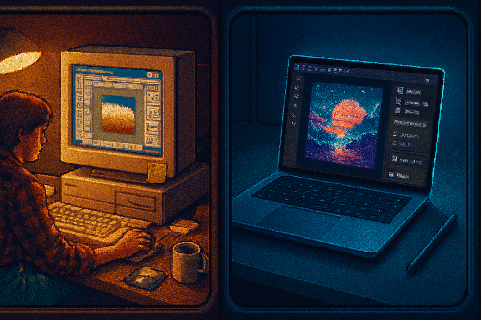
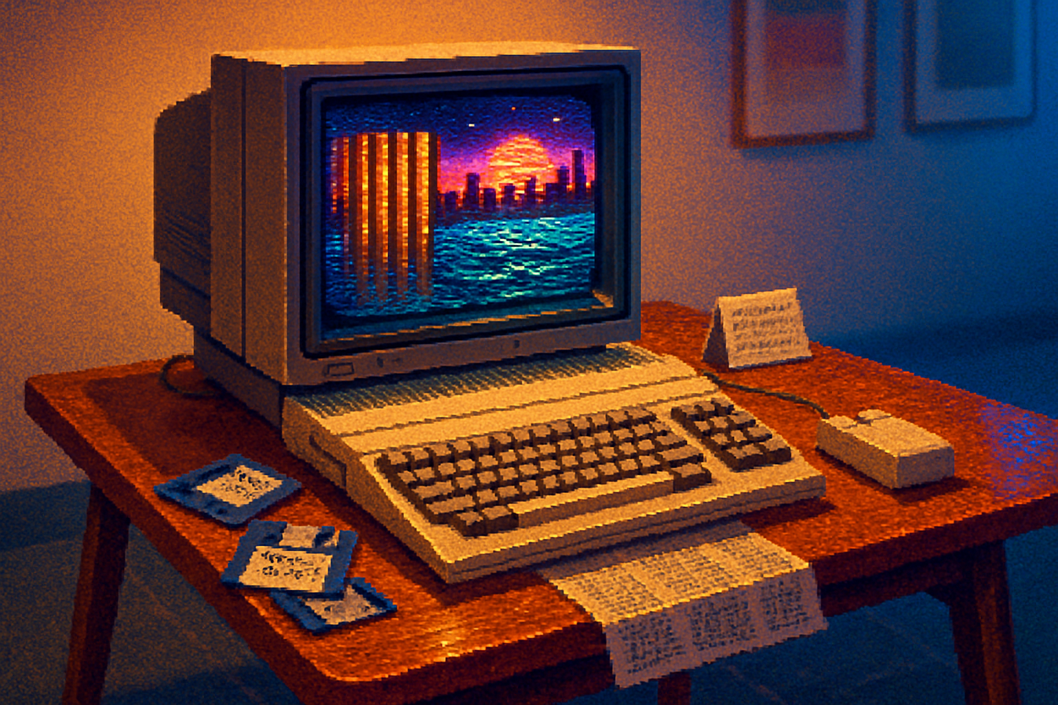
There’s a particular kind of nostalgia that comes from looking at a low-res GIF, a honed 8-bit icon or a web banner that looks like it was stitched together from tiny squares. For many designers who came of age in the late 1990s and early 2000s, those artifacts were more than aesthetics - they were the direct result of working inside early Windows editions of Adobe Photoshop, constrained by modest hardware, limited color palettes, and software tools that were still evolving rapidly.
This article revisits that era: the tools, the workflows, the pixel-driven aesthetics, and the designers who learned their craft within those constraints. The interviews below are composite and anonymized recollections that capture common experiences from many creatives who started with early Windows Photoshop builds.
For context on Photoshop’s long evolution, see the general history of the application: https://en.wikipedia.org/wiki/Adobe_Photoshop and for the pixel art movement: https://en.wikipedia.org/wiki/Pixel_art.
Why the limits mattered: technical realities that shaped aesthetics
Late-’90s Windows machines were often limited in several key ways:
- Color depth and palette constraints - many monitors and systems commonly used 256-color modes or 16-bit displays, which influenced designers to work with limited palettes and indexed color modes.
- Low screen resolutions - working at smaller canvases and previewing at actual size made every pixel count.
- Slower processors and small memory footprints - complex filters and big images were expensive in time and resources, encouraging iterative, surgical edits rather than brute-force experimentation.
- File size concerns - slow networks and dial-up connections made small, optimized assets essential for web use.
Those limitations weren’t merely technical annoyances; they became defining features. Designers learned to simplify, to invent visual tricks, and to celebrate the grid.
Tools and workflows in early Windows Photoshop
Early Windows editions of Photoshop brought the powerful Mac-centered app to a vastly larger audience. While the feature set steadily expanded, many designers relied on a handful of core techniques:
- Pixel-level painting with the Pencil tool and hard brushes - anti-aliasing was often turned off to preserve crisp edges.
- Indexed color workflows - artists would create in RGB but frequently convert to indexed palettes to see how colors reduced and to prepare web graphics.
- Layer-light compositing - as layers became more robust, some designers still fought with limited history states and cautious saves.
- Manual dithering and pattern fills - to simulate gradients or texture in restricted palettes.
- Slicing images for the web and optimizing with GIF/PNG-8 or JPEG for photographs.
These workflows encouraged discipline: planning compositions around a readable pixel grid, choosing fewer colors with high contrast, and crafting icons and interface elements that worked at small sizes.
The cultural context: web graphics, demo scenes, and the rise of pixel appreciation
The late ’90s web was a collage of tiled backgrounds, animated GIFs, and chunky icons. The aesthetic of early websites was partly dictated by limitations (file size and browser capabilities) but also by a DIY culture: amateur webmasters, hobbyist GIF artists, and early digital communities shared tips and resources.
Meanwhile, parallel scenes - such as the demo and tracker communities on PCs - celebrated compact creativity and low-level optimization. The pixel aesthetic migrated across contexts, from splashy banner ads to game sprites and GUI icons.
For more on pixel art and its roots, read: https://en.wikipedia.org/wiki/Pixel_art and on early web design: https://en.wikipedia.org/wiki/Web_design.
Interview excerpts (composite/anonymized)
Note: The following passages are composite recollections gathered from multiple designers who started their careers using early Windows editions of Photoshop. Names are representative.
Maya (started freelancing, 1997)
“I remember toggling between 8-bit preview and full RGB just to see how a banner would compress on someone’s 56k connection. You had to think like a browser. A JPEG that looked great on screen could become a blotch once the user loaded it; GIFs were king for UI elements. We learned to hate gradients - and to love clever dithering.”
Luca (UI designer for a small software house, 1999)
“We did most of our icons at 16x16 or 32x32. Photoshop’s brush engine felt heavy for that scale; you’d end up zoomed in a lot and placing pixels by hand. The Pencil tool and a steady eye were everything. If something read well at small sizes, it was considered good design.”
Aisha (early web designer and net-artist, 2001)
“There was a joy to the limitations. Because you couldn’t rely on heavy effects, you focused on composition and color theory. Also, file-naming and organizational discipline were survival skills - every asset had to be accounted for in an era before modern asset pipelines.”
How early constraints informed enduring design habits
Many designers who started in this period still carry forward habits forged under constraint:
- Economy of color - using fewer, more deliberate colors improves readability and brand clarity.
- Pixel-awareness - understanding how shapes read at small sizes improves iconography and UI.
- Optimization-first thinking - keeping file size and load speed in mind benefits modern responsive design.
- Manual problem solving - a tendency to prototype and iterate with simple tools rather than relying immediately on complex plugins.
These are not just nostalgic affectations - they’re practical strengths in contemporary workflows where performance and clarity matter.
The technical lineage: features that modern designers inherited
Over time, Photoshop added many features (more robust layers, better text handling, vector support, layer styles, advanced color management). Even so, the basic skills learned in early editions - pixel-level control, palette discipline, and efficient asset production - remain relevant. Modern tools simply let you work faster and with more nondestructive freedom.
For those curious about the broader release history and feature timeline, Adobe and community resources track Photoshop’s evolution: https://www.adobe.com/creativecloud/design/discover/photoshop-history.html and https://en.wikipedia.org/wiki/Adobe_Photoshop.
Lessons and exercises for modern artists who love that era’s aesthetic
If you want to practice or evoke late-’90s/early-2000s Windows Photoshop aesthetics, try these exercises:
- Work in a strictly limited palette (8–16 colors). Create an interface element or icon and force yourself to avoid blending.
- Produce a 32x32 sprite or favicon and edit at 800% zoom with the Pencil tool. Export at actual size and judge legibility.
- Recreate a small web banner with dithering patterns and save as indexed PNG-8 or GIF to experience color reduction artifacts.
- Design a tiny GUI mockup (e.g., a toolbar) constrained to 640×480 canvas space and practice spacing and hierarchy in small dimensions.
These exercises sharpen decision-making and help you appreciate how constraints can inspire creativity.
Legacy: from pixel art revival to contemporary respect
The pixel-forward aesthetics of that era have seen repeated revivals: indie game sprite art, retro UI experiments, and the mainstream embrace of minimal, grid-based icon systems. What began as necessity matured into a recognized design language.
While software and hardware have moved far beyond those limits, revisiting those workflows is less about imitation and more about learning a discipline: to craft clear, optimized visuals that respect context and medium.
Resources
- Adobe Photoshop history overview: https://www.adobe.com/creativecloud/design/discover/photoshop-history.html
- Adobe Photoshop (general info): https://en.wikipedia.org/wiki/Adobe_Photoshop
- Pixel art (movement and techniques): https://en.wikipedia.org/wiki/Pixel_art
- Web design history and constraints: https://en.wikipedia.org/wiki/Web_design