· retrotech · 7 min read
The Amstrad CPC's Influence on Modern Indie Games
How the Amstrad CPC’s technical quirks - its 27-color palette, three video modes, and PSG sound - seeded a stylistic and mechanical language that indie developers keep revisiting today. This article traces that lineage and offers practical lessons for makers who want to use constraint as a creative engine.
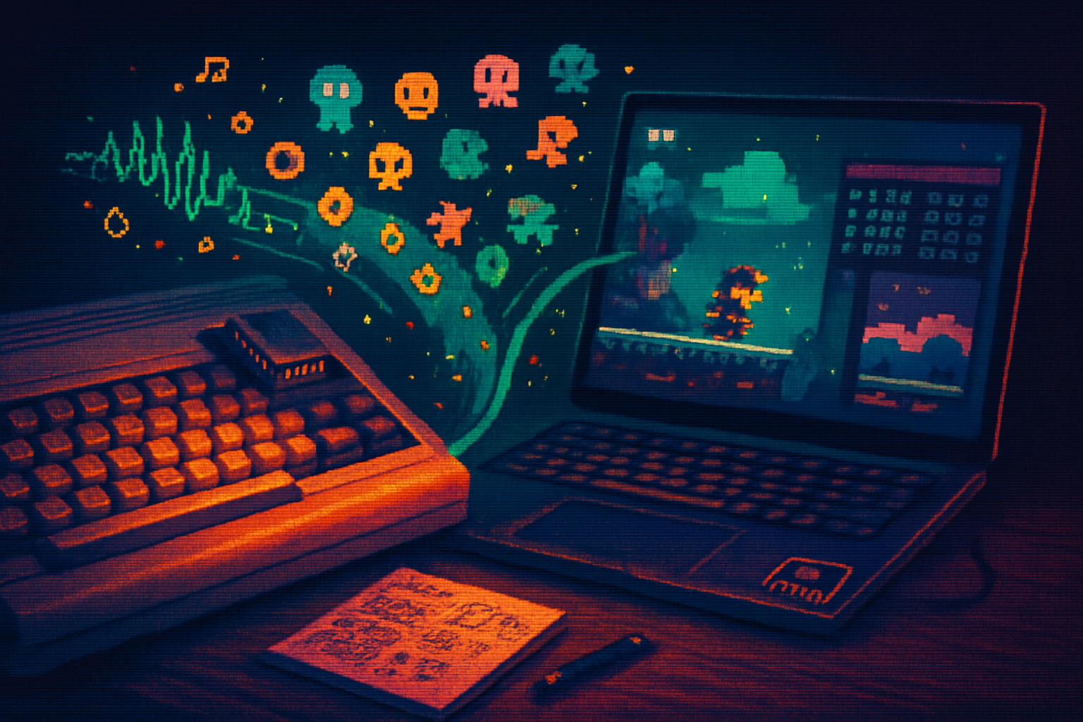
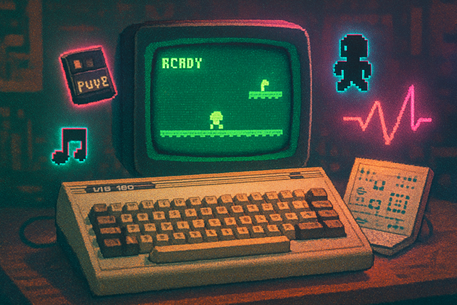
A cassette hissed. The screen woke in a blocky bloom of colors that looked like someone had mixed crayons in a bathtub. For a generation of bedroom programmers the Amstrad CPC wasn’t a machine that merely ran games - it taught a grammar.
The CPC taught you to do more with less. It didn’t forgive sloppiness. It rewarded cleverness. And, decades later, that particular brand of stingy elegance is back - not as nostalgia-tripping kitsch but as a deliberate design choice in the indie scene.
The short technical story (so we can spend the rest of our time on the fun parts)
If you want to understand why the CPC looks the way it does, you need to know three, mildly annoying facts about its hardware:
- The CPC used a Z80 CPU and typically came in 64K or 128K configurations. (It wasn’t trying to impress anyone with raw horsepower.)
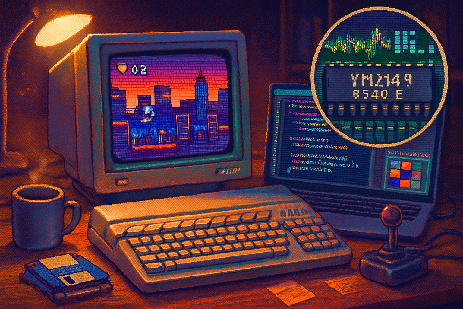
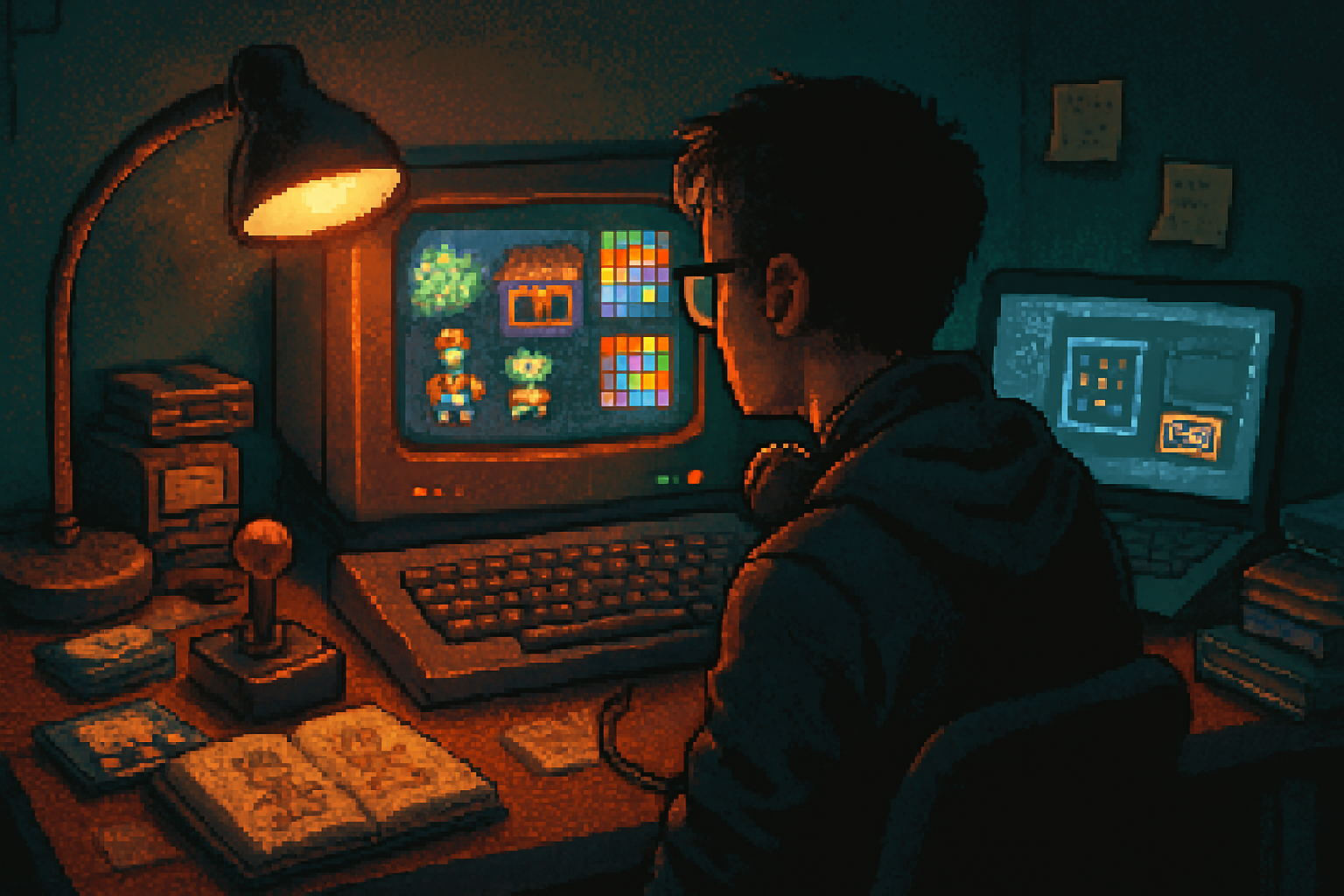
- Its display used three modes - Mode 0 (160×200, 16 colors), Mode 1 (320×200, 4 colors), and Mode 2 (640×200, 2 colors). That tradeoff between resolution and palette is the device’s signature constraint.
- The palette itself contained 27 relatively limited hues. Sound was handled by an AY-3-8912 PSG chip, which produced the crunchy, satisfying chiptune timbres that still get remixed by modern musicians.
(For the hardware nerds: see the Amstrad CPC overview and technical notes on Wikipedia and CPCWiki.)
- https://en.wikipedia.org/wiki/Amstrad_CPC
- https://www.cpcwiki.eu/
- https://en.wikipedia.org/wiki/AY-3-8912
Why constraints breed style (and why designers love them)
Constraints are not bugs; they are prompts. Imagine being a painter told you could use only 27 pigments and you had to make a living portrait. That narrowing of options forces decisions that, if made well, read as confident and stylized rather than incomplete.
A few effects of the CPC’s limitations that became design techniques:
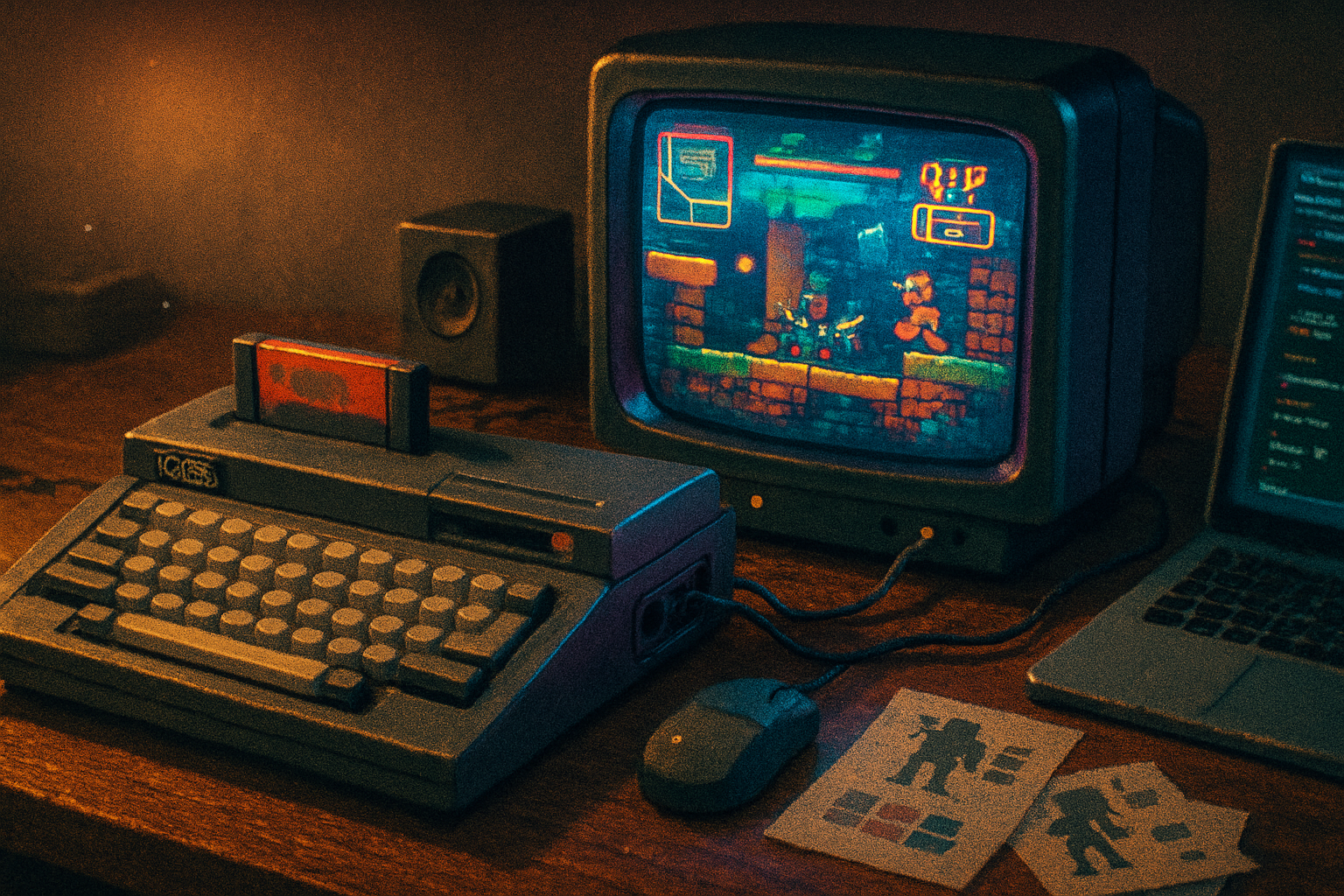
- Strong silhouette and readability - low resolution + chunky pixels made legibility the first priority. Sprites had to be readable at a glance.
- Economy of color - limited palettes pushed artists toward high-contrast combinations and memorable palettes rather than photorealistic shading.
- Tile-first thinking - memory constraints encouraged tile-based maps and reusable art - a practice that is both efficient and aesthetic.
- Rhythm in audio - PSG limitations prompted composition that emphasized melody and rhythm over lush orchestration; chiptune became its own musical language.
These are not primitive compromises. They’re a discipline. And disciplines give artists distinctive voices.
How that language crept into modern indie games
It’s easy to point at pixel art and call it retro. But what many indies borrow from the CPC is deeper than pixels - it’s a philosophy of constraints.
- Palette-minded visual design
Indies wanting a distinct visual identity will pick a small palette (sometimes inspired by the CPC’s 27 colors) and commit to it. That constraint turns color into a semantic tool: one color means hazard, one color means health, one color is background. The result is clarity and instant comprehension.
- Chunky readability for UI and action
Fast-action indie titles often borrow the CPC-era idea that you should be able to identify threats and read the screen in half a second. That legacy shows up in tight hitboxes, bold outlines, and a refusal to over-animate everything at once.
- Sound shaped by limits
The PSG’s modest toolkit is echoed in the chiptune and minimal-synth soundtracks of many indie releases. The melody-first approach fits gameplay loops where audio must be communicative - telling you hits, jumps, and level transitions without drowning the player.
- Fantasy consoles and the art of deliberate limitation
Projects like PICO-8 have turned constraint into an explicit creative framework. PICO-8 isn’t an Amstrad CPC clone, but it channels the same ideology: a tiny screen, a tiny palette, and a tiny memory budget become a design language. Many developers prototype games on PICO-8 or adopt its aesthetic when they want that handmade feel. (See: https://www.lexaloffle.com/pico-8.php)
Concrete techniques indie developers steal from the CPC
If you want to harness the CPC’s mojo, here are practical, actionable moves - not nostalgia exercises.
- Choose a strict palette and never cheat. Set a rule - 16 colors max, or even 8. Use contrast to separate gameplay layers.
- Favor tiles and modular art. Reuse is not laziness; it’s rhythm. Shared tiles make worlds feel coherent.
- Design for silhouette first. If you can’t tell what an enemy is in a one-inch thumbnail, redraw it.
- Limit animation frames. Fewer frames make actions feel punchier and conserve ‘visual attention’ for important cues.
- Make sound cues melodic and terse. A two-note motif that signifies danger is better than a four-track ambient mess.
- Prototype with a fantasy console. Constraints help you prioritize mechanics; PICO-8 or similar frameworks are cheap labs for creative limits.
The indie games that carry the legacy (without pretending to be museums)
Rather than listing games that are carbon copies of CPC titles (there are few), notice that the CPC’s fingerprints are everywhere:
- Titles that use bold, small palettes and emphasize readability borrow the CPC’s visual grammar.
- Games that use tile-based level editors and chunked spritework adopt the same production efficiencies.
- Chiptune-forward soundtracks reuse the PSG-era mindset of melody-first composition.
There’s also a vibrant retro-hardware homebrew scene where contemporary developers still build new games for the Amstrad CPC community - a living proof that the machine’s design still resonates. See community sites and archives at CPCWiki for modern homebrew releases.
A quick case study in design tradeoffs
Imagine you’re building a single-screen action game. You can:
- Use a 16-color, low-res look (a la CPC Mode 0) and prioritize clarity, or
- Use high-res, low-color mode and go for crisp detail.
Choose Mode 0-like constraints and you get:
- Immediate object recognition at a glance
- Easier level readability and faster gameplay loops
- A distinct, cohesive look that stands out in store thumbnails
The CPC didn’t force you to make these choices for their own sake. It forced them because it had to. That pressure is precisely what you should simulate when you want design choices to be meaningful.
Why the retro comeback endures (beyond kitsch)
There are three complementary reasons this aesthetic keeps coming back:
- Psychological legibility - Players can parse a scene faster when the visuals are economical. That improves playability as much as it pleases nostalgia.
- Production efficiency - Small palettes and tile systems reduce asset bloat, which matters to tiny teams and solo devs.
- Cultural cachet - Retro aesthetics signal craft. A game that looks like it was designed under a constraint communicates purpose and taste.
In short, retro looks are not cheap appeals to sentiment - they are strategic design choices.
Where this goes next
We are seeing hybrid approaches: retro palettes married to modern lighting; chunked sprites animated with high-end tweening; PSG tones layered beneath orchestral swells. The lesson from the CPC is not that you must be stingy - it’s that limits, applied intentionally, make your choices legible and your voice identifiable.
If there’s one final, slightly cruel observation: most contemporary AAA productions can buy the look of retro - shaders, filters, and marketing teams will produce ‘nostalgic’ texture packs by the crate. They cannot buy the discipline that the Amstrad’s constraints instilled. That discipline is cheap in money and rich in design.
Takeaways for makers
- Embrace a constraint and stick with it. Let it guide your palette, level structure, and sound.
- Prioritize silhouette and contrast. If the player can’t instantly parse the screen, you have not designed well, you have merely decorated.
- Use fantasy consoles or actual retro toolchains to teach you humility. Constraints will do what gentle editors rarely do - force you to iterate.
The Amstrad CPC’s legacy is not pixels on a screen; it’s a stubborn credo: design with boundaries, and those boundaries will make your choices sing.