· retrotech · 5 min read
Nostalgia Browsing: How Infoseek Shaped Our Early Internet Experience
A wistful look at Infoseek - the lean, efficient search engine that felt like a flashlight in the murky, dial-up web - and how its interface, priorities, and products left fingerprints on the sites and search engines that followed.
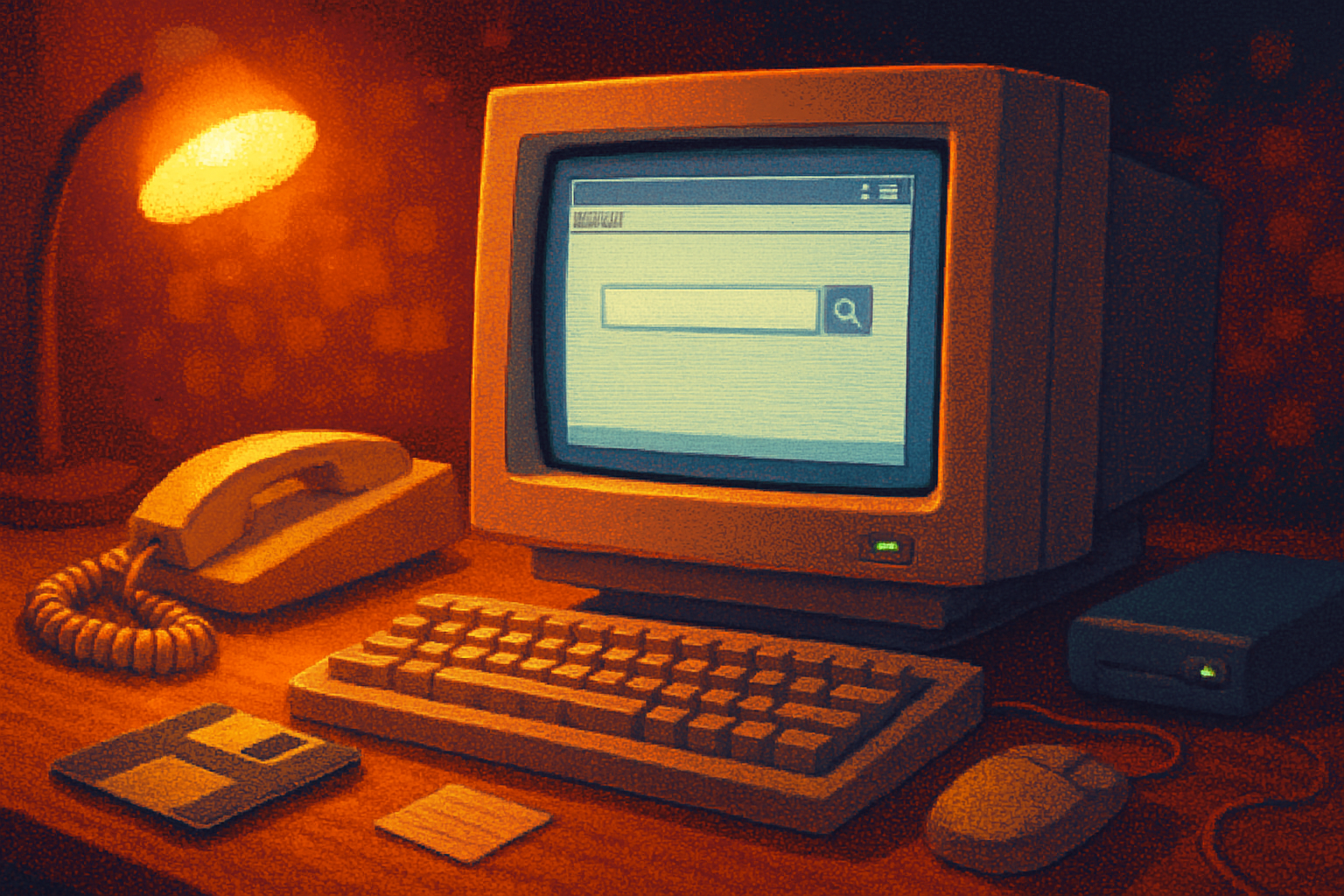
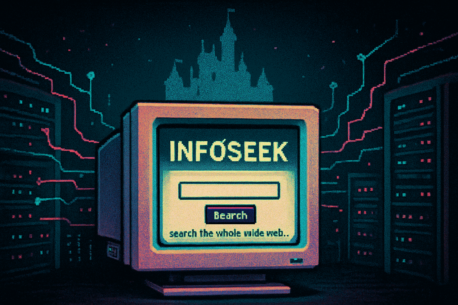
I still remember the sound: a long, hiccuping serenade from my modem, followed by the simple relief of seeing a clean search box on a freshly loaded page. Somewhere between the clacks of a Netscape browser and the glow of a CRT, Infoseek sat like an honest lamp - no carnival of banners, no sprawling portal sections, just a promise: type a thing, find a thing.
That image - a small, square box and a decisive button - is the real artifact. Not the logo, not the marketing, but the interface that taught a generation what searching on the internet should feel like.
Why Infoseek mattered (beyond nostalgia)
Infoseek launched in the early consumer web era and is often treated as a footnote next to the later domination of Google. That’s unfair. Infoseek’s choices were symptoms of a larger UX philosophy that would echo through later designs.
- Single-minded focus. The homepage centered on search. No sprawling newsfeed, no attempt to be everything to everybody. That clarity mattered in a time when pages took precious seconds to load.
- Speed and perceived speed. When your connection could drop the phone line if someone else picked up, latency was existential. Infoseek emphasized snappy results and a lean presentation.
- Product diversification with practical roots. The company didn’t just index the web - it built tools like Ultraseek for site search and licensing that pushed search tech into publishers’ hands.
For a concise history and the company’s arc - from startup to being folded into Disney’s online ambitions - see the Infoseek page on Wikipedia and the broader timeline of search engines for context: Infoseek - Wikipedia, History of search engines - Wikipedia.
The interface lesson: Less circus, more flashlight
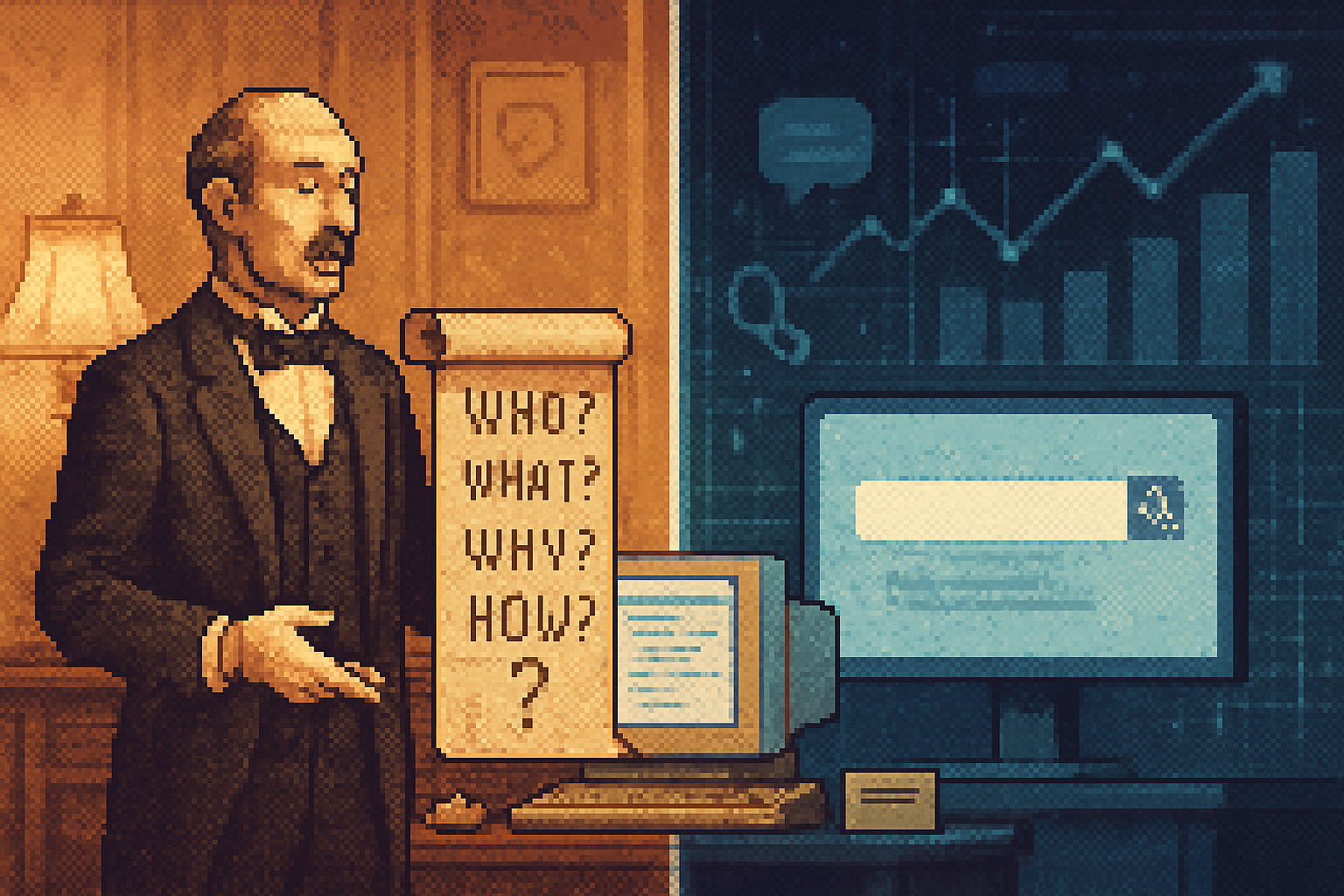
Think of search as a flashlight in a dark hallway. Infoseek treated the flashlight seriously. The UI taught three lessons that carried forward:
- Minimalism is utility, not aesthetics. A single clear input reduces cognitive friction. Google later refined this into near-religion; Infoseek practiced it early because bandwidth punished ornament.
- Results-first design. People wanted answers, not portals. Pages that prioritized the result list over peripheral content felt faster and more honest.
- Sane defaults beat feature bloat. Infoseek offered simple facets and quick filtering before the word “UX” was a marketing bullet point.
These lessons were small, practical, and contagious. Designers copying what felt good on 28.8 kbps would later codify those instincts into mainstream search UX.
Ultraseek and the spread of search-as-service
One important, underappreciated ripple from Infoseek was Ultraseek - a product line that allowed sites to embed a capable search engine on their own domains. This mattered because:
- Many early publisher sites could not build or maintain their own index. Ultraseek lowered the technical bar.
- It exported search thinking into private ecosystems - the idea that internal site search must be intentional, fast, and tuned to user intent.
You can trace the architecture of modern in-site search - fast, forgiving, and engineered for human queries - back through tools like Ultraseek to the work Infoseek did in the 1990s.
(For background, see archived references and histories on Infoseek and related products: Internet Archive - Infoseek snapshots.)
Monetization and the shaping of what search prioritized
The late 1990s were a money-lust era. Everyone wanted to be the central gateway to eyeballs. Infoseek experimented with advertising models, sponsorship, and partnerships - practices that would eventually crystalize into the paid-search economy.
A few practical consequences:
- Placement and visual hierarchy mattered; monetization needed to be visible but not utterly hostile to relevancy.
- Search engines became not only answer machines but also marketplaces - a dual identity that required trade-offs between purity and profit.
This tension is older than Google, and Infoseek’s experiments helped normalize the notion that search interfaces would be commercial spaces.
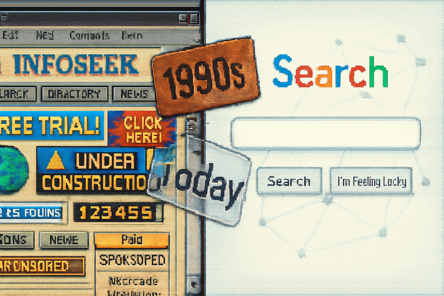
Design echoes you still live with
If you use a search engine, a marketplace, or a site with a small, polite search box in the header, you’re living inside Infoseek’s distant design DNA. Specific echoes include:
- The single, centered search box on a blank canvas.
- Short, context-rich snippets accompanying results rather than walls of raw links.
- Fast, deterministic behaviors - predictable result ordering, simple pagination, and clear query feedback.
- The idea that site-level search should be a distinct product (rather than an afterthought).
These are not novelities invented in a vacuum; they were iterated on across many projects. But Infoseek was among the early practitioners who made them feel right in the real world.
What we lost when the internet grew up
Nostalgia tends to romanticize. But there’s a concrete loss when the web went from sparse pages to dense, personalized highways:
- Tactile clarity. Early pages prioritized signal to the exclusion of noise. Today, algorithmic personalization means we rarely share the same blank starting point.
- Lightweight expectations. When pages were simple, sites optimized for predictability and performance by necessity. That discipline relaxed as broadband and ad-tech arrived.
- A sense of shared discovery. Early searches were communal in the sense that results were public artifacts; personalization fragmented that shared reference frame.
Those losses weigh differently depending on what you value. Convenience wins in many cases. But the aesthetic and ethical trade-offs - what we hand over to algorithms and ad networks for the sake of convenience - are legacies of the era that followed Infoseek.
The proper way to remember Infoseek
Don’t remember Infoseek as a quaint curiosity. Remember it as an early case study in honest constraints:
- Constrained bandwidth forced clarity.
- Commercial pressure forced experimentation.
- The need for search inside sites forced practical product work.
These constraints revealed what worked. They helped set a reference for the basic search experience: clean input, fast response, and results that do most of the talking.
If you feel a little pang of nostalgia when you see a spare search box today, that’s not just sentimentality. It’s institutional memory. Design patterns survive because they solve human problems. Infoseek was one of the early places we learned how to ask a question of the web and trust that, sometimes, it would answer.
References
- Infoseek - Wikipedia: https://en.wikipedia.org/wiki/Infoseek
- History of search engines - Wikipedia: https://en.wikipedia.org/wiki/History_of_search_engines
- Archive snapshots of Infoseek pages: https://web.archive.org/web/*/infoseek.com