· retrotech · 6 min read
Hotmail vs. Gmail: A Nostalgic Comparison and What It Means for Today’s Email Users
A walk down the email lane: from Hotmail’s clean, no-frills inbox to Gmail’s search-first, feature-rich ecosystem. What got lost in the transition, and how modern users can reclaim the clarity of early webmail without giving up today’s power.
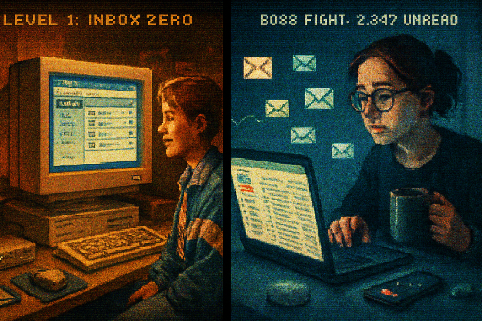
I still remember the thrill: an inbox that wasn’t tied to my ISP. I typed a username into a little web form - something embarrassingly earnest like skaterkid98 - clicked Submit, and suddenly the internet felt like a place I owned. That service was Hotmail. It was simple. It worked. It felt like a small victory.
A decade later, my inbox is smarter than I am. It files, suggests, nudges, hides, and sells. That change - from the innocent confidence of Hotmail to the omniscient utility of Gmail - is a useful story about product design, attention, and what users actually want.
A quick origin story (because context matters)
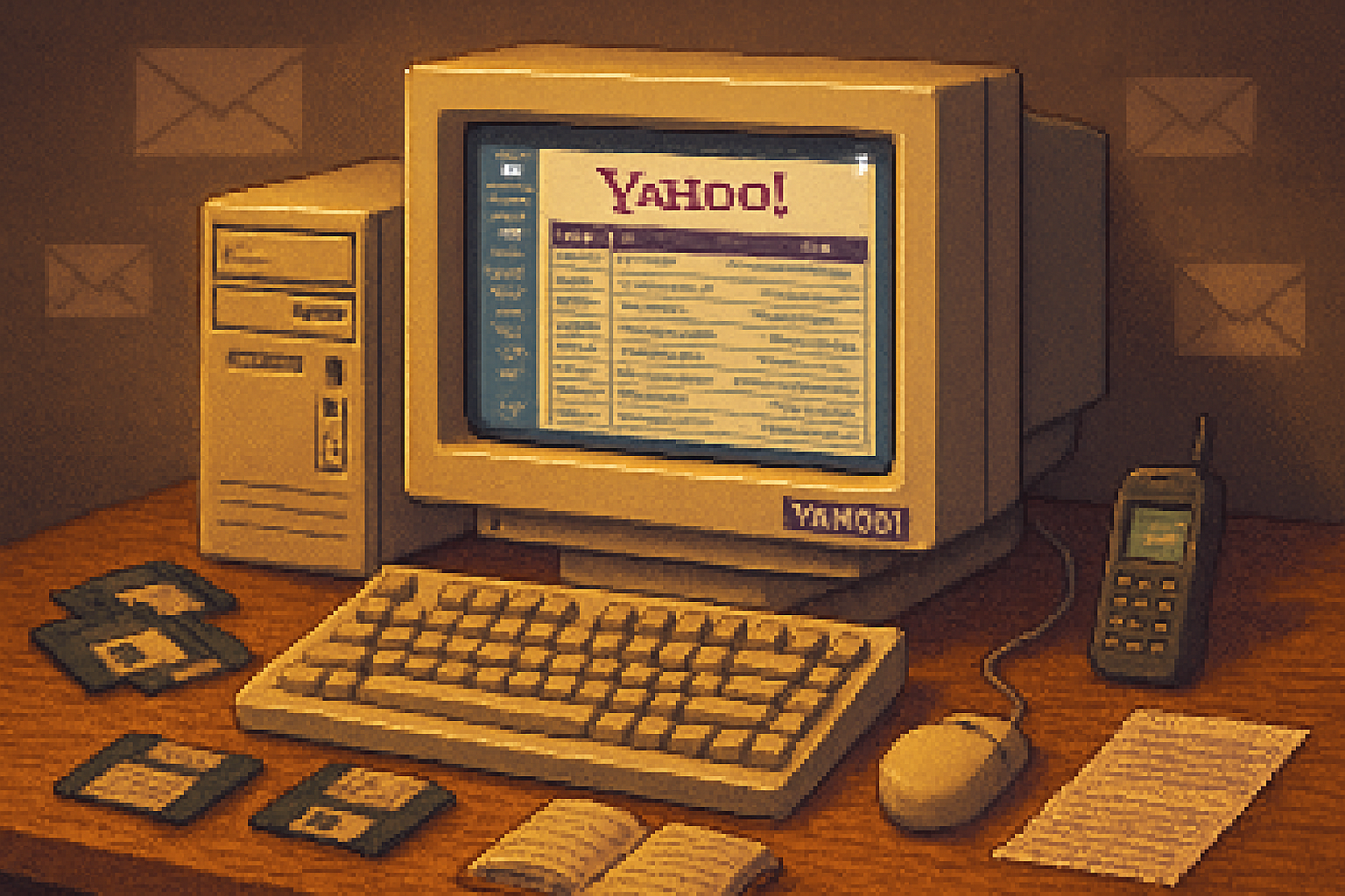
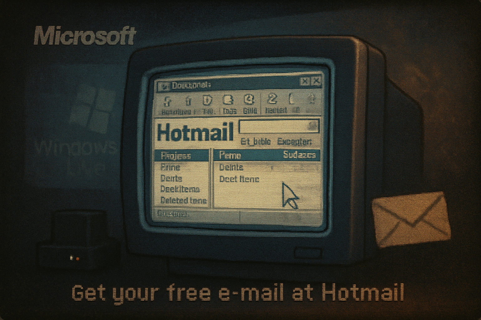
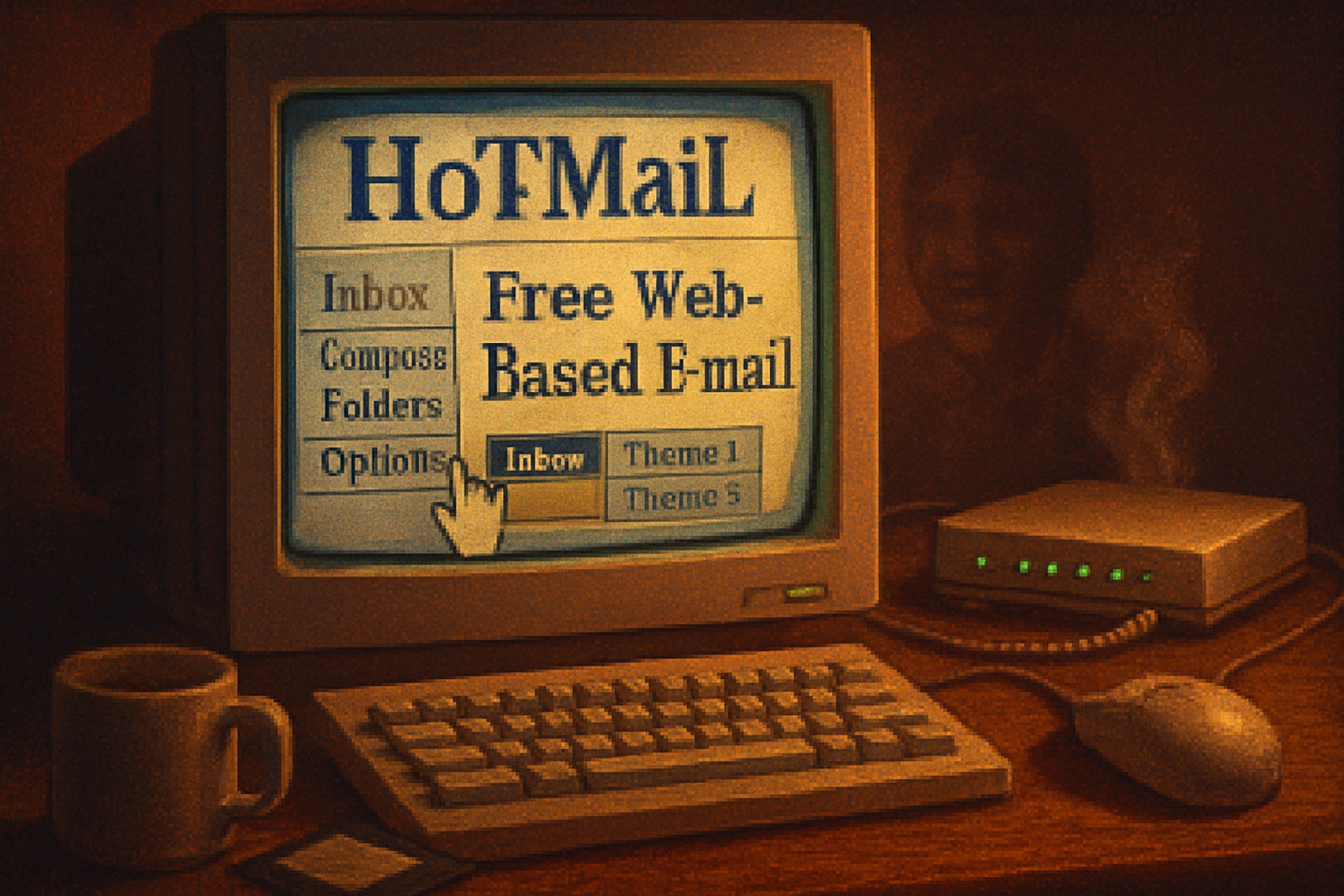
Hotmail (originally HoTMaiL) launched in 1996, founded by Sabeer Bhatia and Jack Smith as a web-based, ISP-independent email service. It sold the idea of freedom from dial-up providers and corporate servers - an email you could access from anywhere. Microsoft acquired Hotmail in late 1997 for around $400 million and later rebranded it to Outlook.com in 2013.
Gmail arrived in 2004, created by Paul Buchheit inside Google. It disrupted expectations with 1 GB of free storage, powerful search, threaded conversations, and an invitation-only launch that made it feel exclusive. Gmail’s design philosophy leaned into search, automation, and integration with a growing suite of Google services. Gmail - Wikipedia
Hotmail’s appeal: simplicity as product
Hotmail was not pretty by today’s standards. It was lean. That leanness was its virtue.
- Single-minded UI - Inbox, Sent, Drafts, Trash. Folders were literal filing cabinets.
- Predictable behavior - click a folder, see messages. There were no predictive nudges or tabs to re-interpret your intent.
- Low cognitive load - few options, few toggles, few surprises.
- The promise of portability - you didn’t have to beg your ISP for a mailbox.
To users of the late 1990s and early 2000s, that felt like control. It was email as a tool, not as an OS for your social life.
Gmail’s revolution: complexity as capability
Gmail didn’t just add features. It reimagined what webmail could be.
- Storage and search - 1 GB (then huge) + Google search meant you could hoard instead of prune.
- Conversation view - threads grouped messages, changing how people scanned email.
- Labels vs. folders - many-to-many organization - more flexible but also conceptually harder for people who think in folders.
- Automation and AI - powerful spam filtering, priority inbox, smart replies, and now Smart Compose.
- Ecosystem integration - Calendar, Drive, Meet; email became one node in a larger suite.
Gmail assumed users would prefer intelligent sorting over manual discipline. In many ways, it was right. But the tradeoff was obvious: increased capability, increased cognitive complexity.
Feature face-off: the things people actually talk about
Organization
- Hotmail - folders. Familiar, physical metaphor, easy to teach.
- Gmail - labels + search. More powerful, less literal.
Interface
- Hotmail - sparse, direct.
- Gmail - layered, feature-rich, customizable.
Storage and archival
- Hotmail - limited expectations; users deleted or downloaded.
- Gmail - more storage => hoarding normalized.
Discoverability vs. control
- Hotmail - what you see is what you get.
- Gmail - features are hidden behind menus and algorithmic choices.
Integration
- Hotmail - mostly standalone (later Outlook added ecosystem features).
- Gmail - tightly integrated with Google’s services - convenient, and a lock-in mechanism.
What old-school users miss (and why it matters)
Nostalgia is rarely about pixels. People mourn Hotmail for reasons that are psychological, not technical:
- Predictability - With fewer options, outcomes felt obvious. There were fewer surprises, and surprises in an inbox are almost always bad.
- Low friction - A single action - move to folder - solved a problem. No rules, no labels, no toggles.
- Focus - Email was email. No chat sidebars, no meeting suggestions, no read receipts asking for attention.
- Less surveillance theatre - The early webmail experience felt less like a pipeline for behavioral data.
This longing isn’t a demand to literally return to 1998. It’s a desire for clarity and agency.
Why modern complexity is defensible (and sometimes necessary)
Gmail’s features exist for reasons:
- Spam is now an industrial-scale problem. Gmail’s filters are better because they needed to be.
- People use email for many tasks - transactional receipts, newsletters, work collaboration - and automation helps.
- Mobile usage demanded richer synchronization, push notifications, and responsive design.
In short: the world got more complicated, and email vendors responded. The question is whether the response respected user attention and control.
How to get Hotmail-like simplicity without abandoning Gmail
If you’re a Gmail user longing for the calm of Hotmail, you don’t need to flee to a time machine. Try these practical moves:
- Turn off Categories (Tabs)
- Settings → Inbox → uncheck Categories (Primary, Social, Promotions).
- Disable Conversation View
- Settings → General → Conversation View - turn off.
- Reduce visual clutter
- Display density → Compact. Choose a simple, no-image theme.
- Turn off Smart Features and Personalization
- Settings → See all Settings → General and Accounts & Import → disable Smart Reply/Smart Compose and personalization where possible.
- Use strict filters as folders
- Create filters that archive or label as they arrive; treat labels like folders by using one label per topic.
- Consider a dedicated minimal client
- Use a light IMAP client (Thunderbird, Apple Mail, or a focused mobile app) to remove the web UI distractions.
- Archive aggressively
- Make archiving the default “done” action so your inbox becomes an action queue, not a filing cabinet.
These steps won’t make Gmail Hotmail, but they will recover some of that low-friction clarity.
Product lessons for designers (and a warning for users)
- Simplicity is a feature. Resist the cult of feature completeness; add only when value clearly exceeds cognitive cost.
- Progressive disclosure is an act of respect. Hide advanced features, don’t bury the basics.
- Defaults are moral choices. When your product automates behavior, you are shaping habits.
- Interoperability matters. Portability and open protocols reduce vendor lock-in and preserve user agency.
Users should be skeptical when services conflate convenience with inevitability. Today’s “helpful” features can be tomorrow’s attention tax.
A parting anecdote and final judgment
I checked an old Hotmail address the other day - purely for archaeological curiosity - and felt, for a few minutes, the same small private triumph I had at sixteen. The messages were dusty, the interface quaint, and the absence of constant urge-notifications felt like breathing in a quiet room.
Gmail is a more capable, more necessary product for life in 2026. It solves problems that didn’t exist in 1998. But the lesson of Hotmail endures: if your tools make you feel possessed more often than equipped, they have failed you.
Designers should remember that features without humility become noise. Users should remember that control is a practice: it’s enacted in settings, filters, and the occasional digital fast.
If you want fewer nudges and more predictability, stop waiting for the inbox to change. Change your inbox.
References
- Hotmail - Wikipedia: https://en.wikipedia.org/wiki/Hotmail
- Gmail - Wikipedia: https://en.wikipedia.org/wiki/Gmail
- Google’s Gmail launch coverage (New York Times, 2004): https://www.nytimes.com/2004/04/01/technology/google-s-endless-inbox.html