· culture · 7 min read
The Art of Lynx: A Look at the Unique Visual Style of Atari’s Handheld
How a short-lived, underdog handheld pushed color, scale and texture into compact cartridges - and how artists and fans keep its bruised-but-brilliant aesthetic alive.
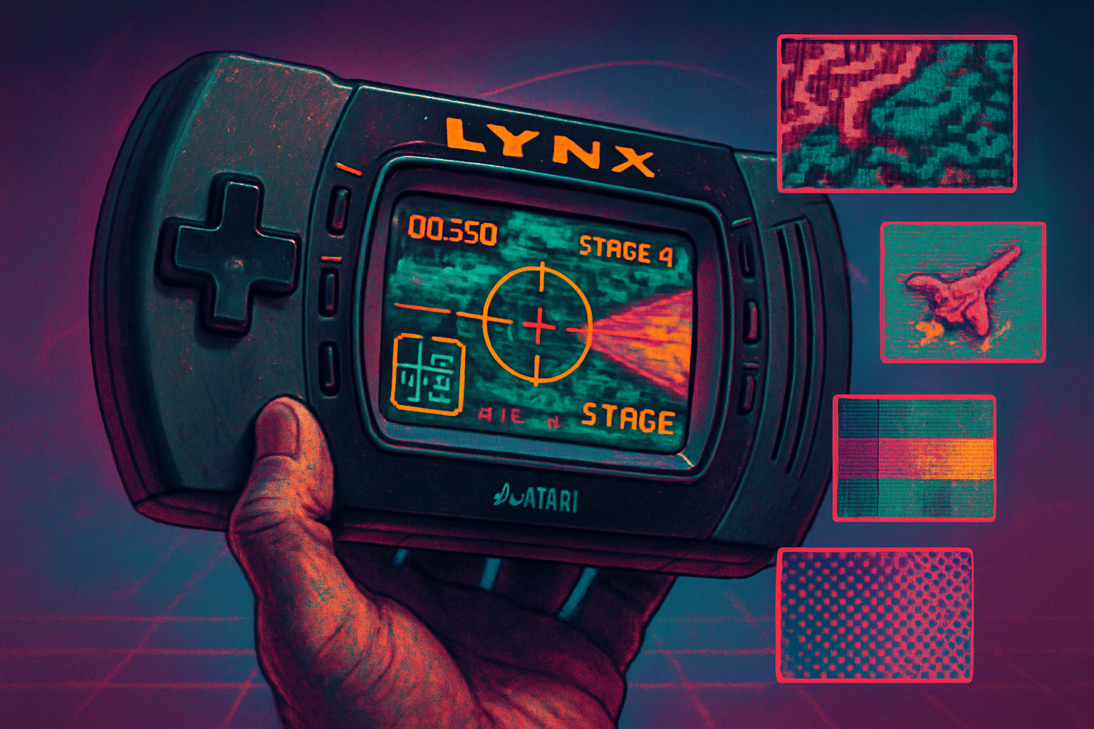
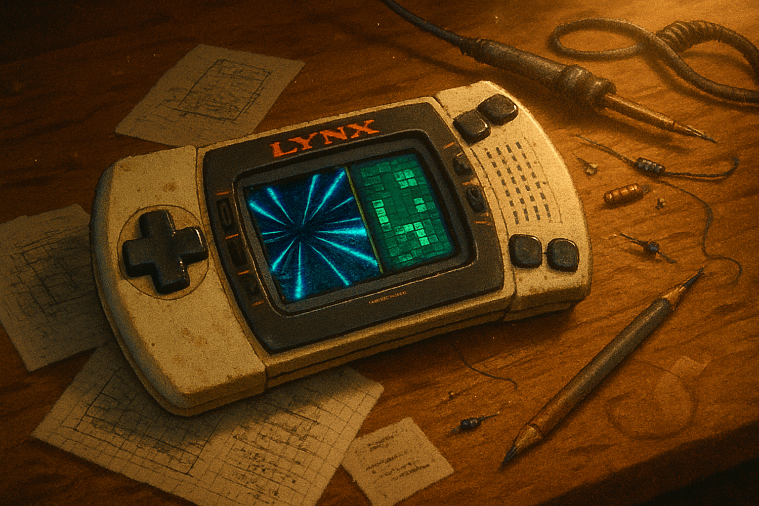
I still remember the Lynx the way one remembers a stranger who must have been important: found half-buried in a box of VHS tapes at a flea market, its screen smeared, its plastic bearing the soft dents of a life lived. I powered it on. The colors hit like someone turning up the saturation on reality. It didn’t look like anything else in the pocket-sized world of 1990.
The Atari Lynx didn’t win the war for handheld supremacy. It lost spectacularly, quietly, and with a dignity that modern consoles reserve for limited editions. But it did leave behind a visual language that still looks defiant. This post walks the battlefield: the hardware choices that shaped a look, the artistic tricks developers used to squeeze cinema from a cartridge, and the online communities - artists, modders, homebrewers - that have kept Lynx style alive and evolving.
Why the Lynx looked the way it did
The Lynx arrived in an era when handhelds were either stubbornly monochrome or trying to mimic a TV set. Atari took a different tack: deliver a small, gloriously colored arcade machine. The visual identity that emerged came from three practical facts:
- Hardware ambition - The Lynx was built to do things many handhelds of the era could not - aggressive sprite work, scaling, and arcade-like effects - which let developers push image complexity beyond the Game Boy’s four shades and Game Gear’s TV-inspired palette.
- Cartridge constraints - Storage and memory were tiny. Developers learned to tease detail out of limited tilesets the way a sculptor teases a figure from marble: remove everything that isn’t essential, emphasize what remains.
- A roster of eccentric games - The Lynx was home to originals and bold arcade ports. That variety encouraged art directors to experiment rather than homogenize.
The result: visuals that read as high-contrast, texture-rich, and sometimes oddly cinematic for a handheld. Dithering became a palette - not a compromise but a stylistic choice.
The techniques that defined the look
Here are a few of the recurring technical and artistic motifs you’ll spot across Lynx titles.
Dithering and micro-patterns - Gradients were expensive. Pixellated dotwork and checkerboard dithers replaced smooth blends, turning limitations into a kind of grain that gave images a tactile, almost printed feel.
Heavy outline and silhouette work - Artists used bold outlines and clear silhouettes to preserve readability on a small screen - especially during fast action. From a distance, a character looked like a clean shape; up close, that shape revealed layered shading.
Dense sprite art - Horsepower allowed for larger, more detailed sprites than many contemporaries. Heads and torsos carried micro-details - stitched jackets, glinting visors, straps - details that read instantly.
Parallax and layered backgrounds - Limited true 3D meant designers simulated depth with parallax scrolling, multi-plate backgrounds, and clever reuse of tiles to suggest distance.
Scaling and pseudo-3D effects - The Lynx’s ability to scale sprites on the fly opened the door to arcade-style zooms and pseudo-3D perspectives - think diving toward the camera or smoothly enlarging enemies - that felt cinematic on a handheld.
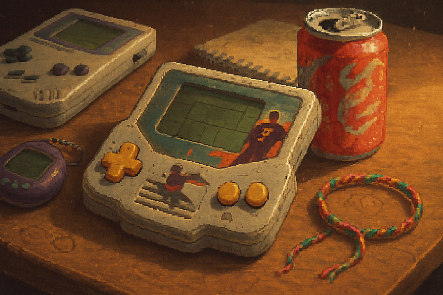
How Lynx art differed from its contemporaries
If the Game Boy spoke in staccato charcoal sketches and the Game Gear sang TV-pop bright, the Lynx often preferred texture and grit.
Color treatment - Rather than aiming for TV-like color accuracy, many Lynx games embraced saturated, high-contrast palettes that read well on the handheld’s display. Colors were used aggressively - to separate planes, to create mood, to make sprites pop.
Detail density - The Lynx could carry more pixels per sprite. Where other handhelds simplified a character, Lynx artists often doubled down on small decorative details - belts, buckles, facial lines - treating sprites like compressed, living illustrations.
Arcade fidelity - Because ports could take advantage of Lynx-specific scaling and effects, games often felt closer to their arcade origins than to the pared-down ports on other handhelds.
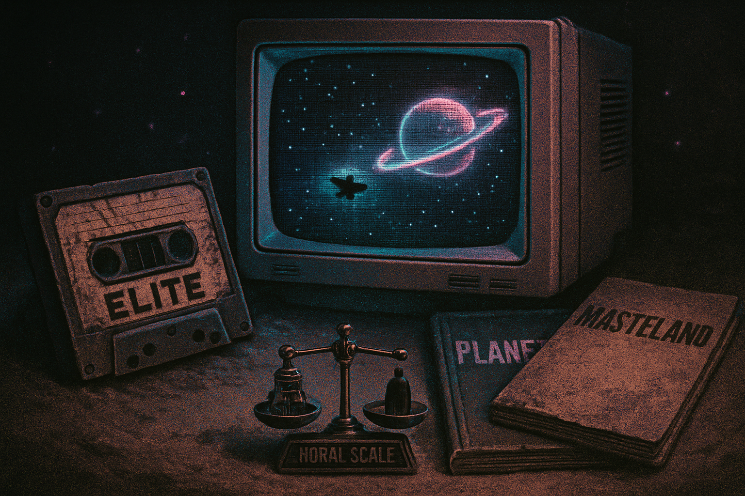
Iconic examples (visual shorthand)
A few titles captured the Lynx look so well they became shorthand for the system’s aesthetic:
- Blue Lightning - a launch-era showcase for speed, scaling, and cockpit effects; the kind of game that announced “we can do arcade-ish pseudo-3D.”
- Electrocop - notable for its gritty, downtown palette and emphasis on readable, chunky sprites during chaotic action.
- Todd’s Adventure in Slime World - an oddball that shows how the Lynx could render weird organic textures and dense, messy worlds with uncanny clarity.
(For more on Lynx hardware and library context, see the Atari Lynx entry on Wikipedia and the longstanding community hub at AtariAge.)
- Wikipedia - Atari Lynx
- AtariAge - Atari community and Lynx forums
When constraints become style: common visual motifs
Certain motifs repeat because they work within constraints and because they look good:
- The “printed comic” shading - Controlled dithers that read like inked cross-hatching.
- Chunky, readable icons - UI and HUD elements that favor gesture over detail. This clarity is part of the charm.
- Palette voice - Many games are immediately identifiable by their palette choices - late-night magentas, greasy browns, acidic greens. The Lynx had favorites.
These choices didn’t just solve technical problems. They created an aesthetic: the Lynx look.
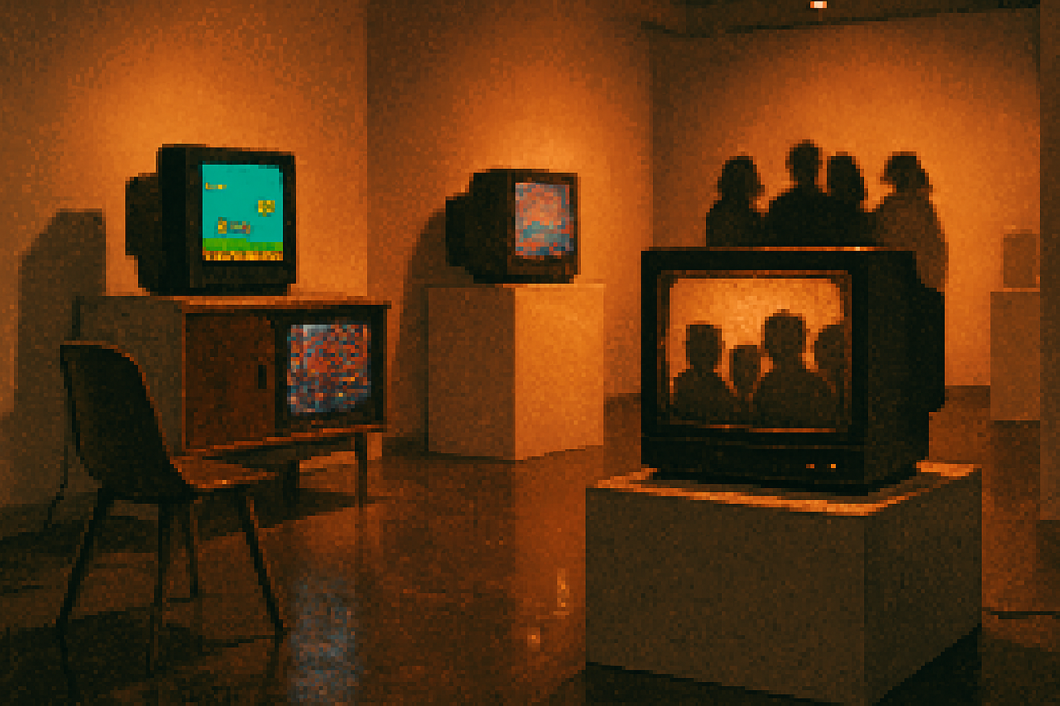
The afterlife: fans, artists, and the contemporary Lynx revival
Hardware obsolescence didn’t kill the visual culture. If anything, it concentrated it. A handful of overlapping communities - forum denizens, pixel-art subcultures, and hardware modders - turned the Lynx into an incubator for creative reinvention.
- AtariAge - The hub where hobbyists trade cartridge art, sprite rips, and homebrew projects. It’s a living museum.
- Pixel-art communities - Sites like PixelJoint and boards on Twitter/Instagram host modern remixes: artists re-color sprites in modern palettes, animate cut-scenes frame-by-frame, or recompose Lynx scenes at higher resolutions.
- Homebrew and remakes - Hobbyist developers reimplement Lynx-era games or create new titles using the same aesthetic rules - the same palette constraints, the same dithering tastes - but with modern design sensibilities.
Fan contributions go beyond nostalgia. They’re reinterpretations: posters, enamel pins, animated shorts, and even 3D-printed figurines that lean into the Lynx’s idiosyncratic proportions and grain.
Why indie and pixel artists still look to the Lynx
Because the Lynx teaches a lesson: limitations focus style. When you must choose which pixel matters, every choice becomes a deliberate act. Contemporary pixel artists borrow Lynx techniques for the same reasons vintage painters favored certain brushes - texture, economy, and voice.
- Economy of detail breeds clarity.
- Color constraints teach boldness.
- Mechanical quirks (scaling, sprite limits) turn into signature moves.
The Lynx aesthetic is never subtle, but it is never vague.
How to study or channel Lynx visuals (practical guide)
If you want to learn from Lynx art or build work that echoes it, try these exercises:
- Palette discipline - Limit yourself to a compact, moody palette (6–10 colors). Force dithering for midtones.
- Dither with purpose - Use patterns to imply texture - cloth, metal, oily puddles - rather than to fake smoothing.
- Emphasize silhouette - Make characters readable at tiny sizes. If your sprite works at postage-stamp scale, it will sing at any size.
- Simulate scaling - Practice sprite zooms or simple pseudo-3D by scaling and redrawing sprites for key frames.
- Study sprite sheets - Rip or find sprite sheets and recreate a frame at double resolution. Notice what’s simplified and what’s preserved.
For resources and communities that host these sprite sheets and tutorials, look at AtariAge and pixel-art communities such as PixelJoint.
Closing: an aesthetic that refuses to be polite
The Lynx didn’t win a popularity contest. It was too loud, too opinionated, and too fond of grit to appeal to everyone. That’s why it still matters.
Its art direction is not a vintage copy of better hardware. It’s a distinct voice: impatient, textured, and occasionally unreadable until you make the effort to look. Fans and artists have turned that voice into a dialect heard in modern pixel work, prints, and even new games.
There’s an honesty to the Lynx look. It wears its compromises like medals. It wants to be seen.
If you crave a design exercise with teeth, try drawing in Lynx mode. Limit your palette, force a dither, and make a silhouette that still reads when squinted at across a flea-market table.
References
- “Atari Lynx” - Wikipedia: https://en.wikipedia.org/wiki/Atari_Lynx
- AtariAge - community hub for Atari systems and Lynx homebrew: https://www.atariage.com/
- PixelJoint - pixel art community and galleries: https://pixeljoint.com/