· retrotech · 6 min read
From DOS to Windows: How Lotus 1-2-3 Paved the Way for User-Friendly Interfaces
Lotus 1-2-3 began life as a lightning-fast, keyboard-driven business spreadsheet for DOS. Its journey into the Windows era forced a rethink of interaction, discoverability, and visual feedback-lessons that shaped modern user-friendly software. This article traces that transition and the design precedents 1-2-3 left behind.
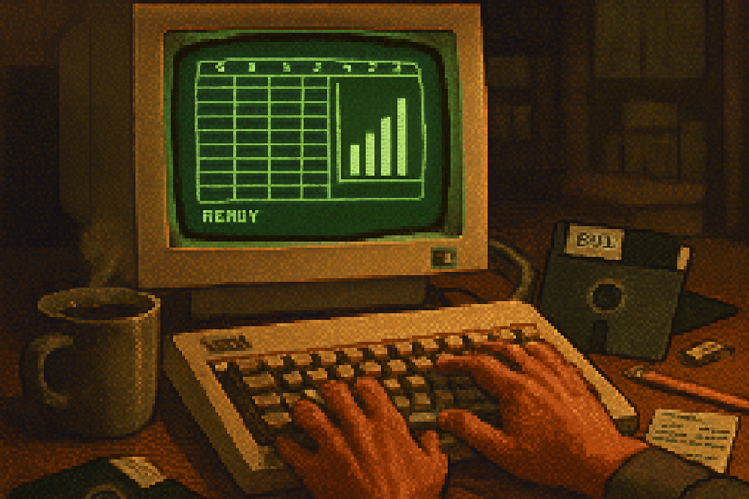
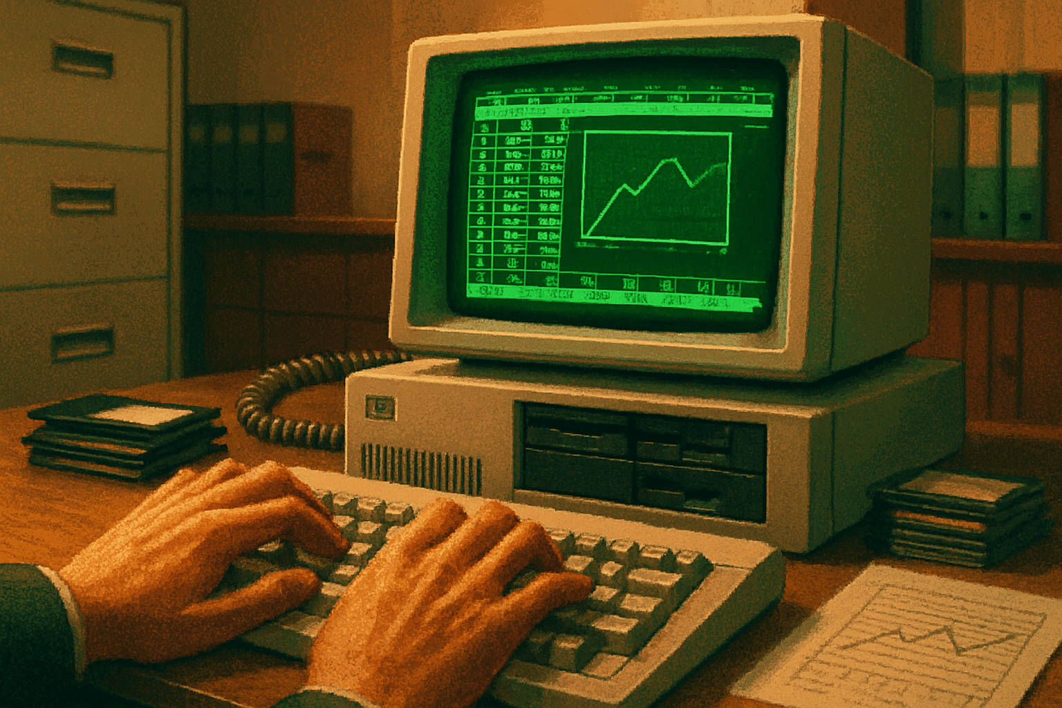
In 1983 a small team at Lotus shipped a program that looked like a calculator on steroids and thought like a mathematician: Lotus 1-2-3. For many office workers it was less an application and more a utility belt - spreadsheets, charting, and macros all in one package. It ran on the text-only, command-heavy world of DOS, where speed and keystrokes trumped elegance.
Fast forward a decade. Graphical user interfaces were no longer academic curiosities; Windows was becoming an everyday workplace environment. Lotus had a decision: keep sharpening its DOS sword, or learn to dance in a ballroom where clicks and windows matter. That leap - awkward, instructive, and ultimately consequential - teaches us why user-friendly software is more than pretty icons.
A brief origin story (because context is a moral teacher)
Lotus 1-2-3 was developed by Lotus Development Corporation, with Jonathan Sachs as the principal programmer, and it quickly became the killer app for business users on the IBM PC era source. Its virtues were obvious:
- Lightning-fast recalculation and memory-efficient code.
- An integrated approach - spreadsheet, graphics, and database-like capabilities in one product.
- A powerful macro language that turned repetitive tasks into single-key actions.
The result: managers who had been hostage to mainframes suddenly had a tool that felt like leverage. The business world noticed. The IBM PC’s commercial adoption accelerated in no small part because of application-level offerings like 1-2-3 source.
Why DOS interfaces were brutally honest-and brutally limiting
DOS-era software had a telling personality: direct, terse, and optimized for keyboard virtuosity.
- Commands and function keys reigned. You typed or pressed-no hand-waving with a mouse.
- Affordances were learned, not visible - discoverability was low; the price of power was memorization.
- Feedback was textual and immediate - recalculation was fast because there was almost nothing else to render.
This was fine when users were specialists who learned the rituals. But it didn’t scale to casual or novice users. The world was about to demand software that served more than the adept.
Enter the GUI: the design vocabulary changes
Graphical user interfaces introduced a different set of values: discoverability, direct manipulation, visual hierarchies, and metaphor. In short: make things obvious so people can get stuff done without a PhD in hotkeys.
The transition from DOS to Windows forced designers to reckon with several new requirements:
- Mouse-driven interactions and pointer affordances (WIMP - windows, icons, menus, pointer).
- Modal vs. modeless dialogues - when does an operation stop everything else?
- Visual metaphors (toolbars, palettes, document windows) that guide user expectations.
- Accessibility and consistency across apps - if every program invented its own rules, the GUI failed.
Microsoft and Apple had already demonstrated that a well-designed GUI could flatten the learning curve. The spreadsheet was a demanding test case: it required high information density, precise selection, and rapid feedback.
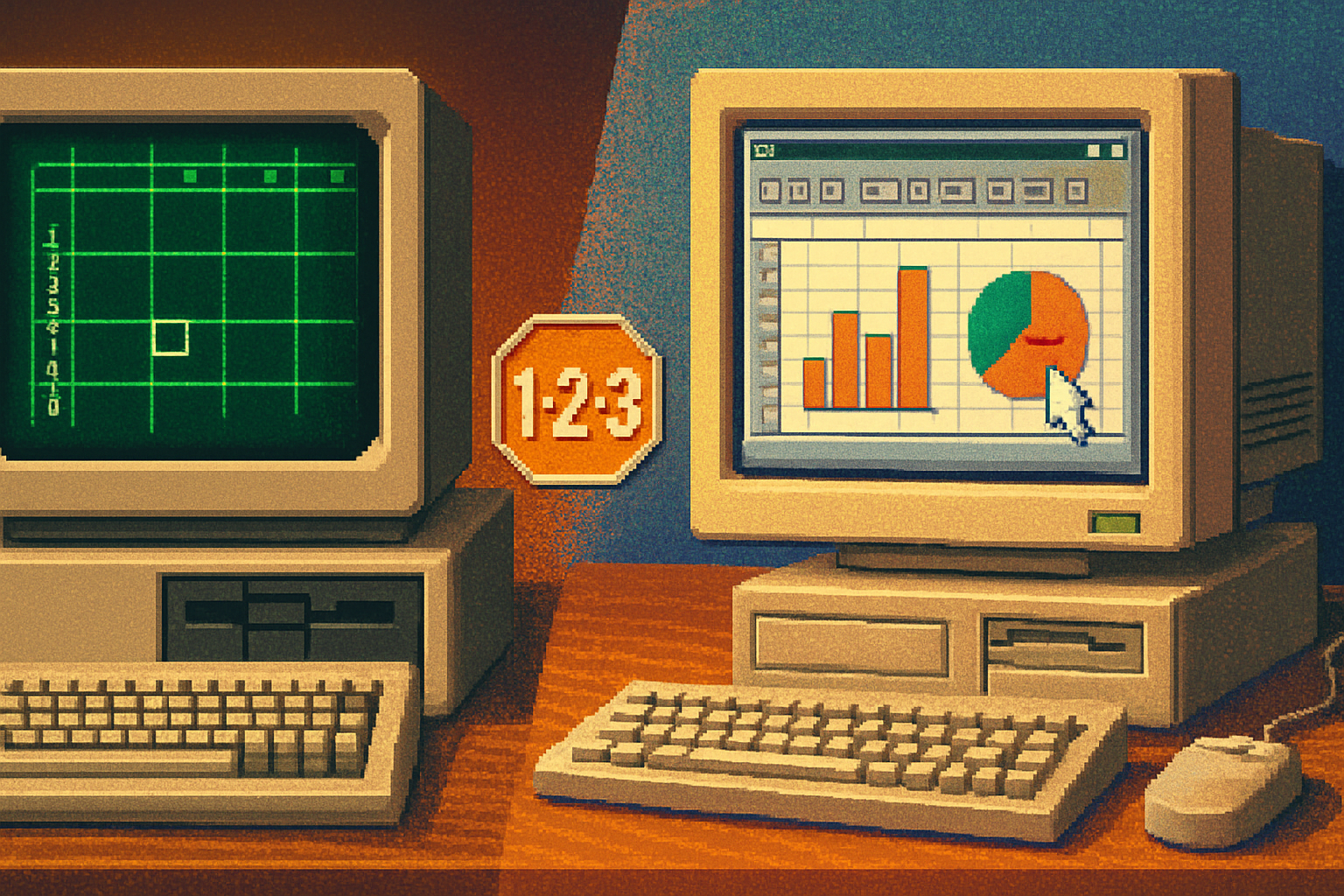
How Lotus adapted: what changed in 1-2-3’s Windows versions
Lotus did not merely paste a skin over its DOS product. Moving 1-2-3 to Windows meant recasting interaction paradigms:
- From keystroke-first to mouse-friendly. Menus, dialog boxes, and clickable toolbars replaced some mnemonic-driven commands.
- Visual charting upgraded from character graphics to rich, resizable charts - immediate visual feedback made data comprehension faster.
- Dialogues and wizards introduced progressive disclosure - instead of dumping every option on the user, the interface guided them through choices.
- Copy, paste, drag, and drop became standard actions, aligning 1-2-3 with user expectations in Windows source on GUI history.
But the port was not trivial. The DOS version’s architecture had been ruthlessly optimized for tight memory and CPU budgets; replicating its speed in a windowed, multitasking environment required rethinking core assumptions.
Design lessons 1-2-3 taught (and why they still matter)
Lotus 1-2-3’s migration highlighted enduring UX principles that persist in modern software design:
- Immediate, visible feedback reduces cognitive load. Spreadsheets succeed when results appear instantly. The same rule governs modern dashboards, search-as-you-type, and live previews.
- Integration beats fragmentation. 1-2-3’s ‘everything-in-one’ model foreshadowed modern platforms where composability and cross-function workflows (data → visualization → automation) are prized.
- Provide power, but make it discoverable. The macro systems were brilliant power tools; Windows-era UI work focused on surfacing those powers without forcing users to memorize arcane commands.
- Consistency fosters trust. When Lotus began obeying Windows conventions (menus in the expected places, standard shortcuts), users felt more competent and more likely to adopt the product.
The strategic misstep that became legend
Here’s the part that reads like a cautionary parable: Lotus was slow to produce a first-class, native Windows version. Microsoft, with Windows and Excel in tow, recognized the platform-level advantage and moved aggressively. The result was predictable: the company that owned the platform could make the application feel native by design - and thereby win hearts and market share. Histories of the era list Lotus’ sluggish Windows strategy among the reasons the company lost dominance to Microsoft source.
This is not a morality tale about good vs bad people. It’s about organizational incentives. Optimizing a product for raw performance (DOS) is a different engineering priority than optimizing for discoverability and integration (Windows). Shifting priorities requires humility, resources, and timing.
Concrete UI changes that rippled outward
Several specific interface advances-some technical, some aesthetic-that were advanced or popularized during the transition:
- Toolbars and palettes became standard - short, obvious controls that reduce reliance on memorized keys.
- Modeless editing and richer selection affordances (drag to select ranges, context-aware menus) made exploration safer and faster.
- Chart wizards and templating showed the value of task-focused workflows - guide the user through a common problem instead of exposing every option at once.
- Copy/paste and interoperability standards helped software ecosystems behave like neighborhoods rather than islands.
These patterns are now the default expectations of business users. The modern spreadsheet - whether Excel, Google Sheets, or successors - inherits this DNA.
The quiet legacy: not just features, but attitudes
Lotus 1-2-3’s real contribution isn’t a single menu item or toolbar. It’s an attitude: software should save human effort by combining power with clarity.
- It taught vendors that business software must be approachable to non-specialists.
- It showed that integrating visualization into computation changes how people reason about numbers.
- It turned automation (macros) from a toy into a necessity - the ancestor of today’s macros, scripts, and no-code automation tools.
Even as Lotus’ market share dwindled, those lessons propagated. When you click a chart in Google Sheets and watch it update as you change a cell, you’re experiencing a lineage that runs through 1-2-3.
Conclusions - the tidy moral
Moving from DOS to Windows was like teaching a steam locomotive to dance ballet: the machine still had to haul the load, but now it also had to look graceful doing it. Lotus 1-2-3 was the locomotive; the GUI was ballet. The choreography forced software designers to value discoverability, visual feedback, and graceful affordances.
Lotus didn’t win every battle, and competitive realities favored the vendor who controlled the platform. But the company’s early insistence that spreadsheets be integrated, fast, and automatable left a mark on how software treats human work. User-friendly interfaces are not magic; they’re the result of trade-offs and choices. Lotus 1-2-3 is one of the historical moments where those choices began to favor the user.
References
- Lotus 1-2-3 - Wikipedia: https://en.wikipedia.org/wiki/Lotus_1-2-3
- VisiCalc - Wikipedia (context on spreadsheets and business adoption): https://en.wikipedia.org/wiki/VisiCalc
- Graphical user interface - Wikipedia: https://en.wikipedia.org/wiki/Graphical_user_interface
- Microsoft Excel - Wikipedia (competition and Windows strategy): https://en.wikipedia.org/wiki/Microsoft_Excel